
Posted on July 21, 2023 by KylieMawdsley
A SURPRISING SHADE OF ORANGE (WE’RE GETTIN’ DIRTY)
If you’re surprised that ORANGE is the inspiration for Sherwin Williams 2024 Color of the Year – join the club (this Lowe’s HGTV HOME version of Sherwin Williams).
Am I a bit disappointed in Persimmon?
Yes. I strongly believe any Color of the Year should get you EXCITED TO PAINT. According to my Instagram followers, this shade has people as excited as a nudist in a clothing store. According to one astute follower, this color looks like Big Mac’s special sauce (nom nom).
How does a color get people excited?
By being useable on a large-scale – walls, cabinets, exteriors, doors, furniture – the more usable a color is, the more homes it can satisfy – Persimmon isn’t super usable.
I like Persimmon because it’s a pretty color in general; I just don’t see it being a fan fave. IN FACT, it’s not really THAT different from Sherwin’s 2023 color choice – Redend Point.
I wish paint brands would talk to me.
With over one million page views per MONTH (and subsequent Color Consult requests), I have a bead on what the average homeowner is looking for. Sadly, it ain’t this.
But hey, maybe you’re not so average, so let’s dive deeper to see if Persimmon inspires you to whip out ye old paintbrush.
BEFORE WE GET STARTED…
To show you RELATEABLE & REAL homes, I ONLY use photos from my Online Color Consulting clients. This means I don’t always have the quality photos I need or the RIGHT photos, but DEFINITELY have some SUPER helpful info to help you on your way!
IS PERSIMMON A WARM OR COOL PAINT COLOR?
Persimmon is definitely a warm paint color from the orange family. However, unlike its brighter cousins, Persimmon has a neutral base calming it down, making it a dirty shade of orange. This soothing backdrop gives Persimmon a subtle terra cotta look, although a terra cotta with a ‘bit more orange than average.’
Do I wish it were more muted? YOU BET YOUR BOOTY I DO; hence the reason I’m only slightly inspired. For the average homeowner, the degree of color in Persimmon leaves it a wink less useable.
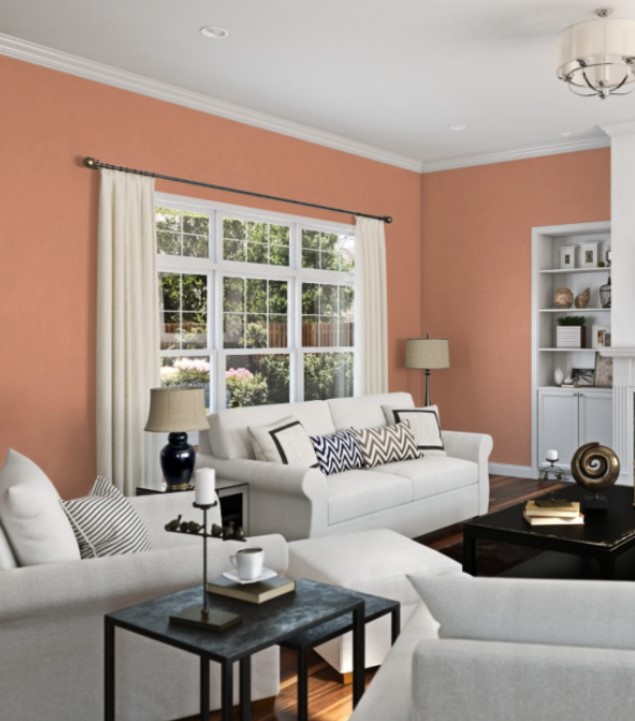
Via Sherwin Williams simulator, as I have no clients who’ve used this shade
As shown in the above simulated image, Persimmon is a bit uneasy with the off-white furniture and slightly grayish trim, and built-in cabinets. It’s also a bit touchy with the subtle cream of the drapes. These are pretty ‘average colors in the average home,’ showing how Persimmon isn’t the EASIEST color to coordinate with.
All of this doesn’t mean Persimmon isn’t PRETTY; it’s just PERSNICKETY
North, East, South, West – Which Paint Color is the Best?
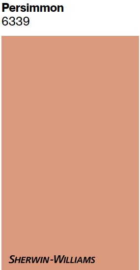
WHAT’S PERSIMMON’S LRV?
Persimmon has an LRV of 39. This puts this lovely shade of orange in the soft, medium depths.
Not sure what LRV is? It could save your paint-lovin’ life – read all about it HERE.
How to Make a Dark Room Look Brighter – and it ain’t with paint!
WHAT UNDERTONES DOES PERSIMMON HAVE?
Persimmon is an orange paint color. Orange can be orange-yellow or orange-pink. Persimmon is orange-pink with a neutral base to take the edge off.
The Ultimate Guide to Paint Colors & Undertones
SAMPLING PERSIMMON WITH PEEL & STICK
SAMPLIZE offers peel-and-stick paint samples that are more AFFORDABLE, EASIER, and more ENVIRONMENTALLY FRIENDLY than traditional paint pots.
- samples arrive ON YOUR DOORSTEP in 1 DAY
- they’re more affordable than the samples pots/rollers/foam boards that are needed for traditional paint sampling
Get your Peel & Stick sample of Persimmon!
WHAT WHITE TRIM COLOR GOES WITH PERSIMMON?
This is a tough one. The most popular white trim colors are bright white or soft, warm white. However, bright white is pretty stark for the softness of Persimmon, and warm whites have YELLOW undertones, not orange-pink ones. There ISN’T a white that I love with Persimmon.
The challenge from here is that if you don’t have white trim, you don’t have a flexible trim color on a large scale. This means that…
OPTION 1 – LISTEN TO PERSIMMON
You pick the BEST trim color to suit Persimmon. This means your Persimmon-painted room will have a different trim color from the rest of your home, as you wouldn’t want to carry this particular trim color through your home (it’s not flexible).
This would be something like Sherwin Williams Nearly Peach, but I would ask the paint store to make me two samples – one sample 25% lighter and one sample 50% lighter. I haven’t seen these in action to say for SURE which one I’d choose. Undertones shift as colors lighten, but this could get you closer to white while having some of the undertones Persimmon loves.
OPTION 2 – PAINT THE WALLS & TRIM THE SAME
You CAN paint the trim the same color as the walls, but it’s definitely not a look I love with a color like this.
OPTION 3 – FIND A HAPPY MEDIUM
Consider painting your trim the best white possible, a white you can use in adjoining rooms, as it’s versatile (even if it’s not Persimmon’s BEST partner). Ultimately, if you consider your home on a large scale, it’s ideal if the same white trim runs throughout.
As a happy medium, I’m eyeing Sherwin Williams White Flour with Persimmon. Not a color I’d use on ALL of my home’s trim, as it’s not super flexible (but it’s not the worst). I still don’t looooove it with Persimmon, as it doesn’t have an orange-pink hue, but it will transition well enough should you use a more versatile white in adjoining rooms. Sometimes a happy medium is the best choice of all.
If I choose from THE most popular, flexible shades of white, I land on Sherwin Williams Pure White (but it’s no screamin’ glory with Persimmon). Actually, I might bump over to Benjamin Moore and go with White Dove.
The ULTIMATE GUIDE to White Paint Colors
IS PERSIMMON A GOOD COLOR FOR THE EXTERIOR OF A HOME?
Long story short (for once) – HECK to the NO! Okay, there could be the odd exception, but this color won’t suit the average home’s exterior.
Again, to show you REAL homes with real budgets, I use my own photos or those from my Online Paint Color Consulting clients. This next image (as well as the others) is just a simulated one from Sherwin Williams…

Is it BAD? No, but people aren’t going to drive by and think this home looks any kind of awesome. It’s not SUPER happy with this bright white trim but is ooookay with the roof. Also, with natural light, it’s bound to look lighter than it does here.
This doesn’t mean it won’t work on YOUR home, but if your home is pretty average for your neighborhood, I’m doubtful.
HOWEVER, let’s talk about your front door…
How Your Home’s Exposure Affects Its Paint Color
IS PERSIMMON A GOOD CHOICE FOR A FRONT DOOR?
Now we’re talking. While I’d hesitate before throwing Persimmon on my siding, it’s an interesting choice for a front door, granted it suits your surrounding brick/stone/roof/siding.
5 Tips for Choosing an Exterior Paint Color
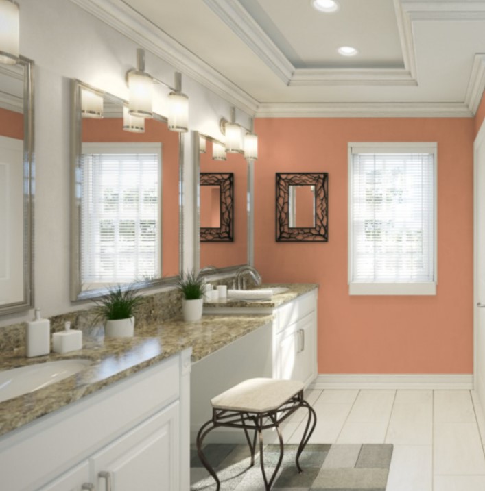
IS PERSIMMON A GOOD COLOR FOR KITCHEN CABINETS OR AN ISLAND?
Again, I really wish brands considered MASS USABILITY when looking for their Colors of the Year. NO, I don’t see Persimmon being popular on kitchen cabinets, islands, or bathroom vanities.
The Best Paint Colors for Kitchen Island & Bathroom Vanities
HOW TO DECORATE YOUR HOME WITH SHERWIN WILLIAMS PERSIMMON
If you’re wondering how to use Persimmon in your home, let’s see where it has the MOST potential…
- as an accent color in linens and decor (which certainly doesn’t sell paint)
- as a ‘whole room’ paint color – it’s not a great accent wall color or for more than one room, really (I mean, you do you, but I wouldn’t)
- on your front door – inside or outside
- maybe some small furniture pieces, like bedroom side tables
- in a palette with other gorgeous earthy-inspired shades…
WHICH PAINT COLORS GO WITH PERSIMMON?
Now THIS is where we get to have some fun! Being a gorgeous shade of orange with a subtle terra cotta vibe, Persimmon has quite a few colorful friends…
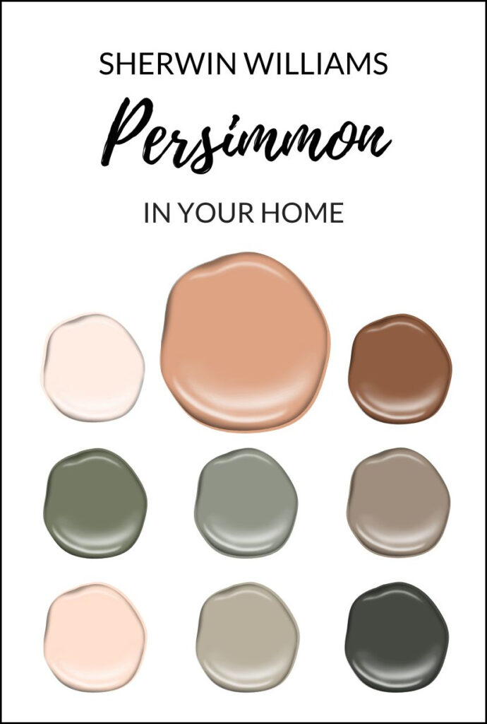
Blobs are just computerized versions of some of the colors below
- muted shades of medium to dark, slightly warm green, like Sherwin Williams Svelte Sage and Connected Gray
- darker shades of orange-pink with similarly dirty undertones, such as Spicy Hue
- cooler shades of green (slightly green-blue) like Sherwin Williams Retreat and the slightly more colorful Underseas
- muted chocolate hues like Sherwin Williams Mocha
- SUPER dark, muted shades of green and greige, such as Sherwin Williams Thunder Gray or Rock Bottom
- light colors with orange-pink hues – in other words, peaches, like Sherwin Williams Spun Sugar and Nearly Peach
- interesting mid-toned greige/tans like Sherwin Williams Urban Jungle, Sherwin Williams Jogging Path, and dark greiges such as Porpoise
However, the real struggle with Persimmon is that there aren’t many light colors that look great. Or there are some, but they’re not colors used in the average home.
For example, Persimmon isn’t great with light gray, greige, taupe, tan, cream, white, or the average beige. Light colors that work best with Persimmon have a DECENT amount of orange-pink undertone – colors that most people are trying to get away from; although if you love peach, you’ll be in your glory!
Sherwin Williams Bauhaus Buff and Fragile Beauty are where Persimmon starts looking better (slightly) while still appealing to the average homeowner; however, these are neutrals with stronger undertones. The majority (i.e., 99.5%) of my Online Paint Color clients prefer neutrals that are more neutral and versatile.
WHAT OTHER COLORS ARE SIMILAR TO PERSIMMON?
Comparing paint colors is the BEST way to choose the one that best suits your home’s finishes. So, if I’m eyeing up Persimmon, I’ll also grab samples of…
- Sherwin Williams Rose Tan (more pink/less orange – also more neutral)
- Sherwin Williams Portrait Tone (only available in a sample pot at your SW store)
- Benjamin Moore Vegetable Patch (a bit darker and more orange)
- Sherwin Williams Subdued Sienna (a touch darker)
- Benjamin Moore Sweet & Sour (less pink than Persimmon/more orange)
FUN FACT: I actually like all of the above MORE than Persimmon.
Why?
Again, I actually love Persimmon, but it has just a TOUCH too much orange (at this particular depth) to be useable on the average wall/exterior/door/cabinet.
By the way, if you’re considering getting one brand to match another’s paint color, I DON’T recommend it. Read why HERE.
READ MORE
Sherwin Williams Evergreen Fog: Color of the Year 2022(and still my fave!)
BEHR’S CRACKED PEPPER: 2024 Color of the Year
The 8 Best Front Door Paint Colors
How to Create a Timeless Home – 4-PART SERIES
Not sure which paint color is best for YOUR home?
Check out my Online Paint Color Consulting – I’d love to help!

Chat soon,

Share this!

Comments
Leave a Reply
More Posts

How to Turn Your House Into a Home: A Case Study
5 WAYS TO CREATE A HOMEY-HOME: A case study of OUR house! Between Pinterest, HGTV, Instagram, and design magazines, it’s easy to get caught up in what’s trendy and hipShare
Read More
KYLIE M’S 5 COLORS OF THE YEAR: 2024 Collection
REAL HOMES, REAL PEOPLE, REAL COLORS! When choosing my top colors for the year, I’m looking for colors that INSPIRE. Colors that talk to people (mind you, every color talksShare
Read More

Are White Walls, Cabinets & Exteriors Still Trendy for 2024?
Is the ALL-WHITE HOME still in style? Is white still in style as a paint color and interior finish? Are people still doing white cabinets, countertops, walls, and exteriors? AreShare
Read More


I am thinking exterior for a beach house in the Caribbean.