
Posted on January 1, 2021 by KylieMawdsley
Tips & Ideas for Understanding LRV & Paint Colours
If you read my last article on LRV and why you should NEVER choose a paint colour without it, you’ve probably got the main idea down pat, which is…
- LRV refers to how light or how dark a paint colour will look once it’s up on the wall (on the large scale)
- the higher the LRV number is, the lighter a colour will look and the more light it will reflect
- the lower the LRV number is, the darker the colour will look and the more light it will absorb
However, in my never-ending goal of being a non-scientific colour nerd, I have figured out a few more things about this crazy thing called LRV.
And btw, if you HAVEN’T read my first article on LRV, I HIGHLY RECOMMEND THAT YOU DO. It sets the bones in place and will give you the info you need to understand the info below. This blog post is more about my wine-infused ramblings and insights into what I’ve discovered about LRV.
Even dark paint colours will reflect light
When I first started learning about LRV, I read that lower LRV numbers ABSORB light, higher LRV numbers reflect light. And this is true…but kind of misleading.
What I’ve discovered is that we get caught up in DARK colours absorbing light, forgetting that they STILL REFLECT IT – even that low LRV colour (say, 5 for example) reflects light. It might not reflect a TON, but it still reflects some. How do I know that? Well, I’ve seen it in action literally THOUSANDS of times now and I think I’ve finally figured it out. Unless you’re dealing with a hardcore black (of which paint companies generally don’t have access to) EVERY colour will reflect SOME amount of light, as long as it’s given light to reflect, because remember…

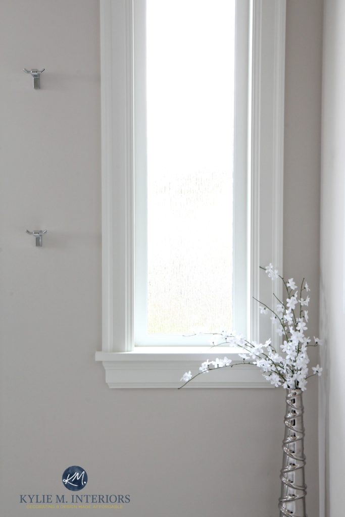
Let’s check out an example that I touched on in my previous LRV blog post. Benjamin Moore Hale Navy has a super low LRV of 6.3, so you’d naturally assume that it would absorb a heck of a lot of light. And it does. However, it still will reflect some light, as shown in this next photo…
If it didn’t reflect light, it wouldn’t look lighter where it does. Top left corner has NO light, so Hale Navy looks blackish. However, in the central area, you can see how Hale Navy lifts up and brightens up when it gets natural light on it. And I’m not talking about the area that is COMPLETELY whited-out by an intense sunray, I’m talking about the wall space around it, where you can really see the navy blue of Hale Navy coming out – oh Hale yes.
When a colour has a low LRV – let’s say it’s a dark colour in between 5-10, it still reflects some light. Its number generally relates to the percentage of light it reflects back. So, if a colour has an LRV of 10, you can expect it to reflect 10% of the light that it’s given – meaning it absorbs 90% of it. Of course, this can shift based on HOW much light its given and WHERE the light hits and and and…there are a lot of variables. However, like any colour, if it’s not given any light, it won’t reflect a thing. THIS IS NOT SCIENTIFIC and is based on almost 20 years of hands-on experience – you can take it or leave it (but you’d be smart to take it – wink wink).
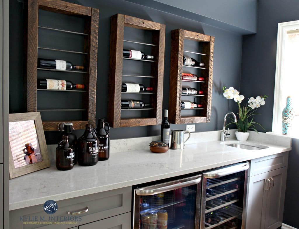
Look at the above photo of the wine bar painted Sherwin Williams Cyberspace (LRV of 6). You’d think it would just be friggin’ dark with an LRV of 6, and it IS on the far left and in the middle where it gets little to no light. But just LOOK at the glory of it on the right! The colour rises UP and brightens, so you can actually see the ‘colour’ of Cyberspace, rather than a slightly blackish colour as shown on the left. Why? BECAUSE IT’S REFLECTING GLORIOUS LIGHT!
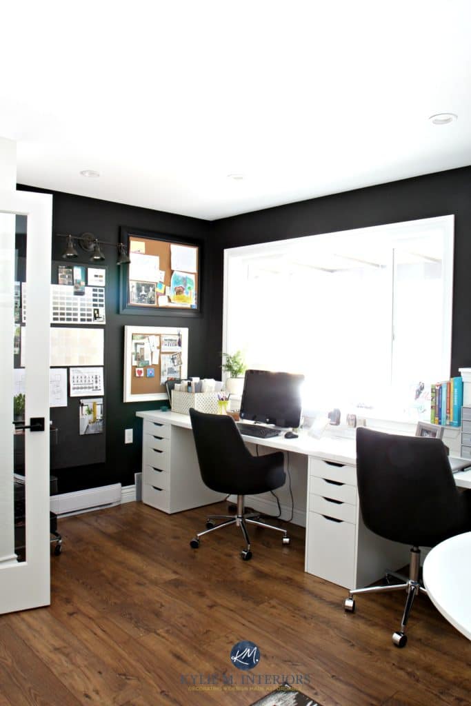
My Home Office Black & White Makeover
Why does this matter to you?
Because you love me and you need to humour the crazy lil’ Ginger.
Really though, let’s say you hire me for E-Design and you want a nice dark gray with subtle undertones for a feature wall. So, I suggest some colours for you. I tell you all about their undertones and what you can expect, you look at them and think, ‘hmmm, those are super dark grays but I just don’t see those undertones she’s talking about‘. OR maybe you say, ‘Kylie told me this was a great colour for me, but it seems too dark, is she drinking again?‘ And then you start painting and you see that on a LARGER scale, the colour has some darned interesting undertones. It has depth and interest and maybe isn’t AS dark/plain as you thought it would be. Basically, on a larger scale, you see that the colour looks different than you thought it would.
That’s because that weee little bit of LRV that it has is working overtime on a small paint chip. On those samples, there isn’t enough surface area for LRV to work its magic, however on the large scale, there is a bigger surface to gather light and then reflect it back – even if it’s a small amount. This can not only make the colour look slightly lighter than you thought it would, but it can also enhance the underlying colours in it, bringing them more to the forefront.
And this is ALSO why you need to do large samples so you can give a colour the chance to work its magic!
How about those paint colours with a HIGH LRV?
Light paint colours will have a higher LRV (approx 60+ range). The higher the number is, the lighter a colour is and the more light it will reflect back at you. In my experience, I’ve found that once we hit approx. 60, the LRV really starts to play a part in how a room can look lighter as long as you have adequate lighting.
HOWEVER, give a paint colour with a high LRV a TON of light and it will wash out – you’ll lose it entirely.
Why does this matter to you?
If you have a really well-lit room and you choose a colour with a high LRV (especially 70+) it WILL wash out. So, the colour that looked PERFECT on a moderately lit wall will wash out ENTIRELY on a well-lit wall.
Sherwin Williams Sea Salt
Is this a problem? Well, if you want a colour to hold itself in any light, it is a problem. However, more importantly, you have to remember that the sun moves (or does the earth move? I can’t remember). Anyways, the look of your natural light (especially east/west/south) will shift throughout the day, which means that your wall that was DAY-GLO in the morning, could look perfect in the afternoon. Your wall that washed out entirely at noon could be the best colour in the morning and afternoon.
What I’m saying is that you have to be patient and know that things will shift.
So, back to that whole LRV, percentage jazz…
My educated guess (without scientific proof) is that if a colour has an LRV of 65, you can expect it to reflect approx. 65% of the light back into the room. And this guess makes sense with the experiences I’ve had. The MASSIVE variable is that it can not only vary depending on HOW MUCH light it gets, but also the temperature of the light and source. For example, light shining in from a window can have a wider path than the path directed out from a lampshade. For MY personal use, I use the LRV to determine the ‘general depth I can expect a paint colour to look in a room with an adequate amount of light – not dark, not obscenely bright’.
BUT (a big one), ALL of the above changes at night time.

How does light reflectance value change at night?
And JUST when you thought you had it ALL figured out – the sun goes down. Regardless of your exposure, the quality of light that you have in the daytime will change in the evening when you only have interior lighting. So here’s what usually happens…
1. Unless you have an absolutely epic lighting plan, you will undoubtedly have some shadowed walls and corners. In these spaces, paint colours will go back to their natural state and maybe even darken up a bit depending on how shaded the area is.
2. On reasonably well-lit walls, the colour will lighten up a bit, but only where the light hits the wall. Light travels at its strongest for approx 3′ and then starts to dim out and your colour will shade accordingly.
What does this mean to you?
- if you work ALL day and spend most of your time in a room at nite, you’ll want to choose the colour that still looks good in the day, but that you LOVE at nite
- you may need to jack up your interior lighting if you want a paint colour to really work the way you want it to, going back to one of my fave sayings…
Does lightening or darkening a paint colour affect its LRV?
YES! When you lighten or darken a paint colour you are changing the way it looks – it will look lighter or darker and will have a different LRV. Again, this is NOT scientific, but based on me fiddlin’ around in my office with samples and here’s what I’ve found…
Benjamin Moore Edgecomb Gray 25% darker
Lightening or darkening a paint colour by 25%
Lightening a paint colour by 25% seems to change its LRV approx. 4 points higher. This can vary depending on how much BLACK is in the paint colour’s recipe. Black reacts more strongly to being lightened than a colour without black in it.
So, if your paint colour starts at an LRV of 60, 25% lighter can make it approx. 64.
Darkening a paint colour by 25% seems to change its LRV approx. 4 points lower. Again, this can vary depending on how much black is in the recipe.
Some paint store employees will tell you that 25% won’t make a noticeable difference, but listen up, Buttercup – it does.
- 25% is not a drastic change – it is a subtle tweak. For some people, a subtle tweak isn’t worth it, but if you are anal (one of my more redeeming qualities) and looking to hit things just right, it could hit the spot. I have 3 colours in my home that I’ve shifted by 25% and it made all the difference for me
- If you are putting colour on one wall and want the 25% lighter version on another wall, you WON’T notice the difference. 25% doesn’t work if you are going for a tone-on-tone look. You WILL notice it if you place the original and the tweaked version next to each other on the same wall. 25% lighter/darker is for an ‘overall change’, not as a way to play with depths from wall-to-wall.
Lightening or darkening a paint colour by 50%
Lightening a paint colour by 50% seems to result in an approx. 8-10 point shift. THIS IS NOT SCIENTIFIC. But let’s be honest, you aren’t here for scientific info, you’re here for some common sense advice and inappropriate comments about hardwood and wine (often combined).
Here’s Benjamin Moore Edgecomb Gray at regular strength…
3 Easy Steps to Getting Your PERFECT Paint Colour
And here’s Edgecomb Gray 50% lighter…
So, if your paint colour starts at approx. 64 (like Edgecomb Gray), you can expect 50% to take it somewhere around 74-ish (math is not my strong point).
Darkening a paint colour by 50% seems to change its LRV approx. 8-10 points lower, and just like with light colours, the amount of black can affect how much of a change you see.
The above doors are BM Revere Pewter 50% darker
BUT, this is where it gets a bit trickier…
Will lightening or darkening a paint colour change the ‘colour’ of it?
Let’s focus on ‘lightening’ for the sake of explanation. When you lighten a colour by 25% you are changing its recipe and the way it looks – and not just regarding LRV. You might also see a subtle shift in undertones, but you’ll still be working with the bones of the original colour.
However, when you lighten a colour by 50%, you are MORE LIKELY to notice a shift in the way the undertones advance or recede. That gray that had a wink of green in it – the green might almost entirely disappear. That greige that leaned more beige, might lean a bit more gray. Again, you are still working off the same colour, but it’s likely that you’ll see slightly different sides of it.

If I were to lighten the above colour (Benjamin Moore Anchor Gray) by 25%, it would look a bit lighter, but essentially the same. However, if I lightened it by 50% it would start looking noticeably different and I BET we’d see less gray and a bit more of the blue-purple undertones!
So, what does ALL of this mean to you?
It means that you can’t make assumptions. Just because I drink a lot of wine…doesn’t mean I won’t sit back with a G & T. Just because Tim works from home now, doesn’t mean he puts pants on. And just because you lighten or darken a colour by 25% or 50%, doesn’t mean you will be left with the SAME COLOUR just lighter or darker. Will it be similar? ABSO-TOOTLY. Will it be THE SAME. No, ma’am.
For example, here’s Benjamin Moore Steel Wool (LRV 19.4) in our entryway (north-facing with pretty good natural lighting).
And here’s Steel Wool, 25% darker in our dining/kitchen upstairs (south-facing with good lighting)…
I wanted a bit more richness and depth out of it in the dining/kitchen, so I went that 25% darker to give it more body without changing too much of the ‘colour’. If I’d gone 50% darker, I would’ve been taking a bit of a risk as not just the DEPTH would change, but the ‘colour’ of it as well.
Are you exhausted yet? If not, hop back and read my original LRV blog post to tighten up your knowledge a bit more.
READ MORE
5 Reasons You Keep Choosing the Wrong Paint Colour
North, East, South, West – Which Paint Colour is the Best?
Gray Paint Colours: The 3 Undertones You Need to Know
Not sure which paint colours are best for YOU and YOUR HOME?
Check out my E-design and Online Color Consulting Packages!

Chat soon,

ORIGINALLY WRITTEN IN 2017, UPDATED IN 2021
Share this!

Comments
Leave a Reply
More Posts

How to Turn Your House Into a Home: A Case Study
5 WAYS TO CREATE A HOMEY-HOME: A case study of OUR house! Between Pinterest, HGTV, Instagram, and design magazines, it’s easy to get caught up in what’s trendy and hipShare
Read More
KYLIE M’S 5 COLORS OF THE YEAR: 2024 Collection
REAL HOMES, REAL PEOPLE, REAL COLORS! When choosing my top colors for the year, I’m looking for colors that INSPIRE. Colors that talk to people (mind you, every color talksShare
Read More

Are White Walls, Cabinets & Exteriors Still Trendy for 2024?
Is the ALL-WHITE HOME still in style? Is white still in style as a paint color and interior finish? Are people still doing white cabinets, countertops, walls, and exteriors? AreShare
Read More


SW bunglehouse blue changes dramatically with natural VS. Interior lighting. Blues tend to be hard to know how the LRV interacts with North and South facing rooms.
Hello!
Great information, thank you for all your efforts posting your knowledge!
I have a question about the almond bathroom tub color scheme, I loved the color Pewter you’ve suggested and will be painting tomorrow. Now curious if I should paint the ceiling and trim white or an off-white or something else? I’m now confused…thanks for any help!
I replaced the toilet earlier this year to a white and it matches the white sink (can’t afford the new surround).
Author
Hi Suzanne! Pewter is a beautiful colour. I might look at a soft white, something like SW Alabaster or BM White Dove as kind of a happy medium between your almond fixtures and your white toilet. if you go too creamy/beige for the trim/ceiling, the toilet will pop. If you go white, then the almond pops!
~Kylie
Finally! A lesson on LRV that actually makes sense! Thank you!
Author
Well thank you Trish, it’s always challenging to relate what’s swimming in my brain into something that actually makes sense 😉 I’m glad it resonated with you!
~Kylie
Friend Kylie!
You ARE a crazy ginger and we love you! I don’t know what I like more about your articles; the info or the laughs! We totally dig the Brewster Gray you helped us with for the kitchen. I will say that as much as I liked the color, I was worried about the LRV. Well… this is what I have come to realize: the more depth of color there is, the more color there is to appreciate.
We are looking forward to more Kylie love with our next project. We owe you some after shots of the kitchen, too. They’re coming soon!
Until then, Friend!
Cheers!
Chris & Tim Garlisch
Author
Well what a fabulous comment to get – hooray! And you know i LOOOOOOVE after photos – it’s like the best part of my job 🙂
Chat soon,
Ky
Hi,
I have read and watched everything you have done! Love your videos. My husband’s company is not doing well and we may have to move. (It’s ok, think positive!) I overdid it with Ben Acadia aka ivory white, it’s on walls, cabinets and trim in our open floorpan SW facing ranch. Do you think SW silver strand, Ben Silver Fox or Harbor gray are too much for resale? I live in a new development and the builder paints every interior SW Kilm beige so I avoid even revere pewter as an over reaction which could be lovely. Thanks
Author
Hi Brooke…hey, I think we’ve chatted before 😉 Okay, so I left you a comment on a different post that I want you to check out re: some workable neutrals for ‘mass appeal’. Check it out and let me know. If you can’t find it, here’s the section I was linking to as it has a bunch of staging tips as well as paint colours! https://www.kylieminteriors.ca/category/tips-ideas/home-staging-ideas/ (as you can tell, this is my evening to catch up on comments 😉
~Kylie
We have steel wool in our little bath and it’s so great! I asked you a longer question but basically if your house were on the market would you leave the steel wool as is? I think it’s lovely! Certainly buyers don’t want an all white house or an all dark house but a mix. I tried to figure your links out for paint color help. If I have a small ranch and need 1 color for the whole area what link would I go to for your help?
Also, when we built we agreed to rounded corners. Don’t ever do that if you are reading this! It is impossible to cleanly change paint colors on rounded walls.
Thanks!
Author
Hey again Brooke! You know, as long as Steel Wool SUITS your bathroom (if it was the right choice for the tile/countertop/etc…) then I would ABSOLUTELY leave it – totally! People DO tend to respond more emotionally to slightly stronger colours, more so than safe neutrals, so a bit here and there won’t hurt! As for a great ‘general’ colour, a lot will depend on your exposures, flooring and all that jazz, but I would definitely look at BM Edgecomb Gray, BM Ballet White, SW Accessible Beige and SW Agreeable Gray. I also have this post here…actually, I’m going to link to the whole SECTION as you might find some other good tidbits! https://www.kylieminteriors.ca/category/tips-ideas/home-staging-ideas/
chat soon 🙂 Kylie
Thanks! I read all of your links, great info. We have moved 17 times in 25 years so I am a master at hiding stuff during showings but the paint gets me every time. BTW a large garbage bag hold a lot of stuff if you put it in your trunk. I once had a comment back that the buyer said “not even a pencil is out of place”. Ha! I was driving all of the clutter around while they were in the house! I have 7 large painted boards on the wall and once I narrow down what I can and cannot live with if we don’t sell I will contact you since we have some time before we find out if the company will make it through or not. It may take me until February at my rate. I have painted some walls 5 times in 8 years so I have a bad track record and have heard the “your house is getting smaller from paint” joke way too many times, not funny people. xo
There is a lot of discussion about how north facing and south facing affect LRV. But what if your kitchen or living room, for example, are east/west facing? How does LRV affect colors then?
Author
Hi Ronda! I do have blog posts for both east and west facing rooms and yes, that is common! It’s about figuring out what time of day you spend the MOST time in the room and focus your efforts a bit more on that. Luckily, it is a bit easier than a north/south and there should be some options that humour both exposures nicely.
~Kylie
East Facing Room: https://www.kylieminteriors.ca/the-best-paint-colours-for-east-facing-rooms/
West Facing Room: https://www.kylieminteriors.ca/the-best-paint-colours-for-west-facing-rooms/
Thank you so much for this information. I never really understood LRV before. This is very helpful for me as I’m in the process of choosing a colour to paint my re-worked laundry space. My entire house (and I do mean entire) is “builder’s beige”; the ceilings, walls, trim, doors. Everything. So now I have the opportunity to choose some colour (I didn’t choose the beige by the way). We are in New Zealand, so have to reverse the north/south points, but I have a north facing room with natural light streaming in from an external glass door. With a young family, I’m in that room practically morning, noon and night doing laundry so will certainly take on board your points about looking to see how the chosen colour looks at different times of day. I’m going for the modern farmhouse look, and have white cabinetry and very deep navy tiles on the floor, which I think might throw off the way the colour looks on the walls. Knowing a bit more about LRV will hopefully help me choose a really lovely colour, because let’s face it no one actually likes spending oodles of time in the laundry room!
Author
Hi Charlene, I’m so glad you found the tips helpful! And yes, I do think it’s funny that our sun directions are reversed, I always have to remember that!
Thanks for this and your other LRV blog post. Your posts are the most accessible for the average homeowner that I’ve read. My question is: Does an LRV value difference of 2-4 make a difference? We are doing BM Collingwood on our main floor but I was thinking of either going to Balboa Mist (I was told at BM that it’s the same as Collingwood only lighter) or actually lightening Collingwood in our front entrance area as there is very little natural light. BUT if it’s really not going to make a difference then I’ll likely stay with Collingwood just bc I know what the undertones are, etc. The two LRV values are 62 (Collingwood) and 67 (Balboa Mist). I’m just not sure how they translates on the wall…
Author
Hi Lori, and thank you!
So, 4 points would make a difference – a subtle difference, but when you’re tweaking things it can be just the right touch! And contrary to popular belief, I was told (as I phoned to check a few months ago) that Balboa Mist isn’t the lighter version of Collingwood. I would imagine that with your entryway being darker, that Balboa Mist would look similar in depth to Collingwood, simply because the room itself will shade it a bit via the lack of light! If it were ME..I might just stick with Collingwood and look outside of it to brighten the room (ie: a fixture with an extra bulbs in it/a mirror/etc…)
I hope that helps!
~Kylie
I absolutely and undoubtably find your info the best. Your explanations just make so much sense and are so informative . I may be a wee bit biased having a ginger-headed daughter !
I too have been struggling with Collingwood vs Balboa Mist for my open concept main floor with North, West, and East exposures and 10 foot ceilings and oodles of natural light. We have CWood in two upstairs bedrooms and BMist in ensuite and basement bathrooms. Would BMist darkened by 25 percent be quite similar to CWood. Not darkened as you know BMist LRV is 67 which is too washed out as per your fab info. 25 % darker would lower the LRV as you’ve indicated in your fab article.
Author
Hi Deb! Well if it were me and I were choosing between Collingwood and Balboa Mist, I’d land on Collingwood as it doesn’t have quite the feminine undertone. And yes, 25% would add a bit more body to Balboa Mist, but I find it can cast just a wink too pink for me 🙂
I’m currently working on my lighting plan. I’ve got a modern two story open living room with a wall of North facing windows. I was hoping to keep with the modern feel and paint the walls and trim SW Pure White. For the lighting would you recommend warm or cool LED? Or perhaps a mix of the two? Cool in the recessed cans and warm in chandeliers/ceiling fans? Thanks!
Author
Hi Jill, if it were me I would lean toward all warm bulbs just to counteract that cool light a bit 🙂
Hi Kylie I just came across your blog. Very informational. I’m getting ready to paint my open concept eat in kitchen and living area and foyer with SW Accessible Beige. What are your thoughts on how it pairs with oak cabinets and dark wood look floors? I have Artigiano subway tile backsplash the color is Tremiti Sand, kind of a taupe tan with a praline mortar.
Thanks and Happy New Year
Author
Hi Sandy, it sounds to me like Accessible Beige could work well for you as it is lovely with oak cabinets and dark wood flooring! There are other things to consider of course, like countertops, exposure, etc… but off of the top of my head, I’m not seeing an issue 😉
~Kylie
Happy Holidays!
We bought a house over the Holidays. Needs massive updating.
Do you do consults on photos?
I have an open plan, but the gray rock wall fireplace is on the inside wall, with the dining area (2nd floor) directly on top of it. I have been calling it the man cave, but it will be our primary living room. It’s dark as a real cave at the moment but faces floor to 2nd floor windows with oak wood floors, stairs and everywhere else
We also have 3 semi underground bedrooms, that all have one window, facing west, but with basement like windows that show the underside of the big back deck and rocks! I call the area the “dungeon”.
Help!
Thanks, Lisa
Author
Hi Lisa, thanks for your note! And yes, I do consult from photos. I take those, along with the answers to your questionnaire and come up with some great options! I can then take all of your details/finishes into consideration, along with your personal tastes! If that interests you, the link is here https://www.kylieminteriors.ca/online-decorating-design-services/
Chat soon!
~Kylie
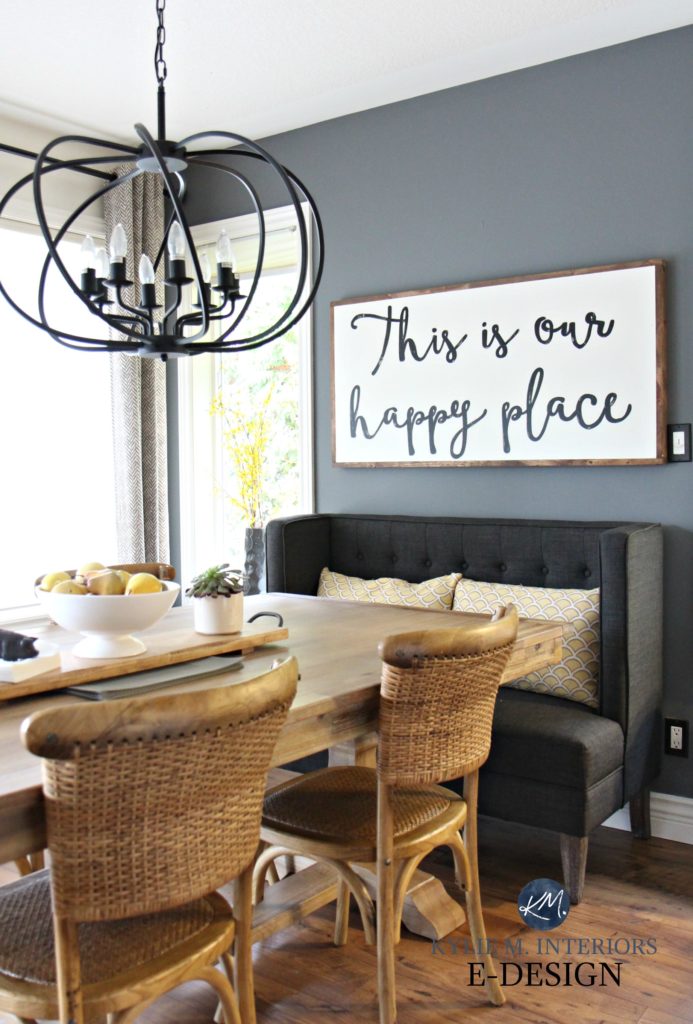
Hello! Where did you get your sign in the kitchen that says ” This is our happy place”? I love it!
Author
Ooo, from a lovely gal named Jenn at Lavish Olive Studio on Etsy – please let her know that you saw it on my site so she knows it worked!
~Kylie
Love your articles–so informative and helpful, and I get a giggle or two! You said you darkened SW Creamy by 25% for your second floor (no photo shown). (1) What trim color did you use with the tweaked Creamy, and are there any undertones after darkening? I have two bedrooms with northwest facing 6 ft. wide windows and am considering Creamy for those rooms to lighten and brighten them up from my current Softer Tan, which in my opinion is too dark in those rooms, and especially in the windowless jack and jill bathroom connecting them. (2) Would Creamy in it’s darkened version shed an undertone in NW exposure, and if so, what would it be? (3) Would there be enough contrast in it’s darkened version using Alabaster trim?
Author
Hi Donna! Yes, I did! I used BM Cloud White with Creamy, just a soft, warm white – they sit really nicely together. As for the undertones, it’s hard to say as that area is south facing, compared to the north facing area that I have Creamy in (where it isn’t darkened). So, it’s really in the evening that I see the shift and I would say it’s just a wee wink warmer looking. I actually love Creamy MORE in the north facing space, i love the perfect, warm – but not TOO warm note that it hits…
Can SW Alabaster be used for trim for the tweaked version of Creamy on walls? i.e. Would there be enough contrast between the two?
OK. NOW I see. Thanks to this particular post scads of pieces from your other posts have fallen into place. Before, I couldn’t really see how to apply your excellent information to white paint. I’ve acquired an RV which will require some renovation (still in progress), and as RV’s are notoriously compact, I decided on a mostly-white scheme to visually expand the tiny space and, hopefully, visually cool it as well. (Hopefully without glare.) We live in south Texas, and hot as it was, it’s hotter now. Plus our exposure is southern and we have a HUGE west-facing window.
Thanks to you I’ve been able to trim my 30-item long list of whites to 5, and have progressed to the point of buying sample paint cans to test on my actual walls with my RV in its actual, hot position. Here choosing the right paint is an important shelter consideration as well as an aesthetic one.
I’ve decided to test eggshell Alabaster and White Duck (Sherwin Williams) for my walls. For an RV, the trim is surprisingly ornate and handsome. On it, I’ll test semigloss versions of Pure White (Sherwin-Williams) and Chantilly (Ben Moore). To keep it simple, I’ll use the same trim color throughout. I’ll match the upper kitchen cabinets to the trim color. For the lower cabinet, I’ll test a soft, duck-eggy blue semigloss. (There’s already plenty of black on the range and refrigerator to “ground” the light colors.)
I’ve already finished white cotton canvas slipcovers for all my upholstered furniture, and plan to make simple , white cotton rod-pocket curtains for all the windows except the HUGE west-facing one. I’m afraid that will require a more carpenterial solution. And replacement by a big mirror.
The floors are very pale gray-white vinyl wood-look planks that read greige around midday.
For summer I’ll pull in duck-eggy pillows, throws, & accessories. For winter, I’ll replace the duck-egg with lots of red, tan, and furry texture.
Meanwhile, I can’t tell you how much women like me owe to you for sharing your knowledge of the Science of Paint & Color with those of us less scientifically inclined. (Whoever said this stuff isn’t brain surgery?)
Thanks for your blogs. I couldn’t even have selected test colors without your help. Now that I have (thanks to you), the heat is off. Thinking about the project is now FUN instead of worry & dread.
For my money, you’re a precious national resource. If you decide to run for President, put me and the rest of your fans on your mailing list and hit us up for donations. You’ll win in a landslide.
Thanks for all you do–and what you’ve done for me.
Super helpful article! We are actually considering Revere pewter for our main floor, our home has dover white trim, doors and cabinets and its one of the only grays I have found that doesn’t make it look drab. My struggle is going down our hallway and our family room. With the hallway how much do you suggest lighting just so its not too dark? With our family room I don’t know if lightening the color is best or just a different lighter gray. It gets some northern light but not much and we definitely need an LRV in the 60s. Any colors you would suggest? Thanks!
Author
Hi Terri, thank you for your note! I actually have an Edesign business that I’ve created for questions like yours! I try to give as much complimentary info as I can on my blog posts and if that doesn’t work, it might be time for a closer look, this way I can see your particular lighting, layout, flooring, etc…otherwise I’m totally guessing!
https://www.kylieminteriors.ca/online-decorating-design-services/
~Kylie
Hi Kylie, I’m wondering if you have seen Accessibly Beige lightened 25% on walls in person? I’m loving the sample of AB on my wall. I love the warmth and freshness but it’s a wee bit darker than I want and Aesthetic White is too light. Any thoughts?
Author
Hi Monica, no I haven’t, but it’s worth trying! And I agree that Aesthetic White is TOO much of a shift…play around with Accessible if it has the bones you’re looking for 🙂
Hi Kylie! Thank you for this SUPER helpful post! Is there an LRV that you would recommend for a room with NO natural light — only two recessed lights in the ceiling?
This is my second comment on one of your posts in an hours time 🙂 you helped me choose paint for our current house and I have loved Wool Skien!
I am not choosing paint for my new build and I should have hired you ????????♀️ I’m waaaay to anal about color to be making these decisions myself. ???? but I’ve run out of time …crappers. I think I’ll buy the exterior package for your help. ANYWHO- what level contrast do you like to see between walls and trim or cabinet and trim?
In the photo showing the doors with BM Revere Pewter 50% darker, what are the wall and trim colors? It all looks so good together! Thanks !
I truly enjoy your take on this all!
B
Author
Thank you Bonnie! That’s BM Edgecomb Gray 50% lighter (I love playing with colour in my own home) with BM White Dove on the trim!
I’m thinking of darkening agreeable gray by 25% for my kitchen/living room and entry hallway. It’s an open floor plan so everything is pretty much connected. My floors are very light (gulf sand) and I wanted something darker on the walls to make the floors pop. But not too dark and suffocating. My dining room behind the kitchen is Colonnade gray. I recently signed up for you emails and I will glean what I can from them. Well wish me luck I hope it turns out well!
Author
Good luck! Remember to send pics!
Hi, Kylie!
I have a question about the color Oil Cloth by Benjamin Moore…
If I lighten it by 50%, do you think the color would retain some of the gray undertone or look more green? I love the color but it’s a bit dark for me, but I love how the green is really grayed out in the color. Thanks!
Joe
Author
Hey Joe! It’s ALWAYS hard to say as every colour is different. It’s also VERY HARD to say because it’s part of the Colour Stories collection. So, whereas most normal colours would have, say, 3-4 colours mixed together, the Colour Stories can have 7-8, which means their undertones can vary WILDLY even at full-strength. I DEFINITELY wouldn’t trust it.
Have you tried lightening a dark color by 25%? I love BM Champion Cobalt, but the room is on dark side and the color tends to look flat and darker than I want. The paint store (an authorized BM retailer) told me today that typically dark colors even lightened by 25% tend to look like a different color. He advised me to just pick something else. But I don’t want something else. I want Champion Cobalt, just a bit brighter. (If it makes any difference, ultimately I’m looking to brighten not lighten necessarily. Is there a way to do that other than just going lighter and getting a higher LRV? Does that even make sense?)
Author
Hi Jen, I have – lots! The thing is, there’s no predictable measurement as it varies depending on the colour. Generally speaking though, 25% is quite subtle and while it’s a barely-there shift, I wouldn’t say it looks like a different colour (I’ve NEVER had that happen). 50% – now THAT’S where you really start noticing a bigger difference (but even then, it’s not as drastic as it sounds). As for BRIGHTEN, well, that would be about finding a different COLOUR, one with less gray in it perhaps? I know you’d think that by lightening it by 25% they’d take some black out, but they take a bit out of the WHOLE recipe (paint colours are generally made with 2-8 colours mixed together, so they’d take more than just black out). Does this help at all???
Pingback: Paint Colours & LRV: The Ultimate Guide You Need to Read - Kylie M Interiors
If I mix 2 paints together and they both have an lrv of 55, after mixing together will the new color have a lrv of 55?
Author
That’s a DARN good question. I would have to say, yes, as with the same LRV, there’s no REASON for one to affect the depth of the other, whether you use a 50/50 split or otherwise.