
Posted on October 25, 2021 by KylieMawdsley
Our 8 Foot Long TV Stand – Because Bigger IS Better
I despise TV stands. Not only do they hold an item that RARELY adds decorative value to a space, but they’re usually pretty darn butt-ugly. So when it came time to make a TV stand for our open-concept living room space, I decided NOT to make a TV stand – but to make a piece of furniture that happens to have a TV on top of it.
THE LIVING ROOM BEFORE: A red hot mess (sounds like me)
We sure as heck didn’t buy our home for the colors. In fact, the colors likely put off a ton of buyers before I came traipsing through, with the ability to see BEYOND a bad color palette.
The red was overpowering and clashed with the beautiful stone corner fireplace. As for the brown racing stripe, don’t even get me started…
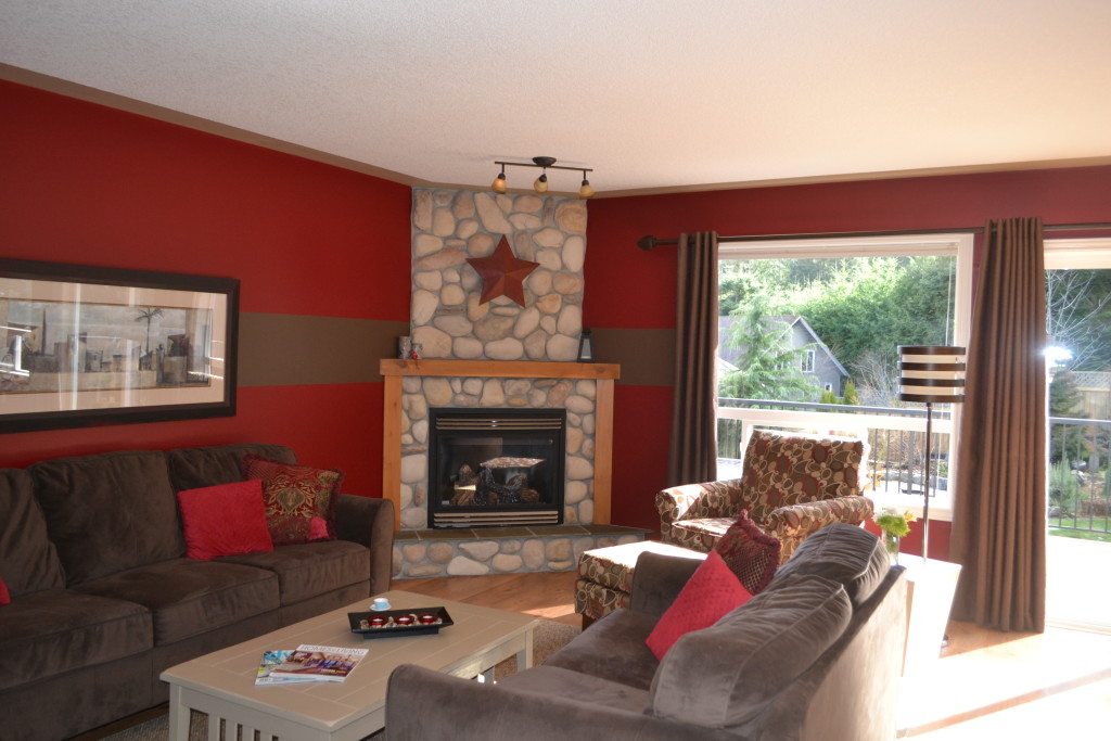
It’s not like it was bad…oh wait, it really was. Here are my main complaints…
- The couches were approx. 5′ apart – the room was jammed with heavy, dark furniture.
- The paint colors didn’t coordinate with the stone on the fireplace.
- The ceiling felt low because of the horizontal brown stripe (which was REALLY fun to sand down). Also, notice the flat area around the ceiling perimeter that was also painted brown.
- The drapery rod was hung RIGHT above the trim, making the ceiling/windows look more squat.
- The mantle was great, but the vertical supports were actually just 1×5 fir boards that were precariously toenailed in place – literally, they were so loose, it was like they used their toenail clippings to hold them in place.
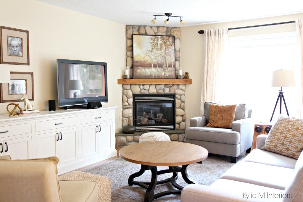
THE LIVING ROOM AFTER A LITTLE KLC
I talked with Old Kranky (no, not Tim), who is a fabulous local furniture maker, and asked him to build me an eight-foot-long buffet-style cabinet. I gave him my drawings, batted my eyelashes, and six weeks later…voila!
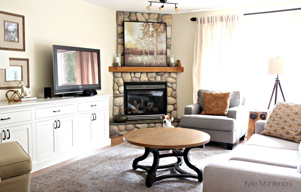

It might not look it in this photo, but this bad boy is 8′ glorious feet long, and in the words of the great Goldilocks – it’s juuuust right.
WHAT COLOR IS THE CABINET PAINTED?
I chose Benjamin Moore Cloud White, the ever-gorgeous, soft, warm, creamy white. It also matches my maple cabinets, which I also painted this color. With an open layout, it’s important that the white is consistent from trims to cabinets, to painted furniture.
White Trims, Cabinets, & Walls: Do They Need to Match?
You might think that eight feet sounds long. But when you have a long wall, it’s best to put something proportional on it – in fact, it’s ideal. Every other TV stand/buffet that I looked at was approximately 60-78″ long, which equals NOT LONG ENOUGH! The height of the cabinet is 33″, which is great for TV viewing, and the 17″ depth is just enough to accommodate the cable box/cords without being TOO deep.
The interior, back, and skeleton are all solid wood and solid good. With three drawers and soft-close cupboard doors, it’s everything I wanted in a TV cabinet and more (but will it fit a wine keg?).
The fireplace insert’s silver finish should be updated with matte black (more ideas HERE).
WHAT COLOR ARE THE WALLS & TRIMS?
Before, the color palette didn’t complement the fireplace stones at ALL. However, being the focal point and BOSS of the room, the fireplace is the most important part! I chose Benjamin Moore Gentle Cream for the walls (my go-to heavy cream) as it nods at the warmth in the stones without going too yellow and provides a simpler backdrop for my furniture and decor…


The 13 Best Cream Paint Colors
As you can see in the ‘before’ photo above, the previous owner put the TV on the end wall, giving this already narrow space a bowling alley effect. By rounding the room out with furniture and placing the TV in the center, the space is more inviting and well-balanced, EVEN WITH a corner fireplace (they’re always a bugger).

And check out this bad boy hunka hunka burnin’ wood…

Along with the sofa table on the other end of the room, this gorgeous side table was made by my friend, Christian – it’s an old factory girder that is now my new side table!
So there you have it! While our home is a revolving door of furniture and colors, I think this palette will stick around for a while!
READ MORE
NEED HELP?
Check out my ONLINE PAINT COLOR CONSULTING PACKAGES!
ORIGINALLY WRITTEN IN 2015, UPDATED FOR GRAMMAR AND WHATNOT IN 2021
Share this!

Comments
Leave a Reply
More Posts

How to Turn Your House Into a Home: A Case Study
5 WAYS TO CREATE A HOMEY-HOME: A case study of OUR house! Between Pinterest, HGTV, Instagram, and design magazines, it’s easy to get caught up in what’s trendy and hipShare
Read More
KYLIE M’S 5 COLORS OF THE YEAR: 2024 Collection
REAL HOMES, REAL PEOPLE, REAL COLORS! When choosing my top colors for the year, I’m looking for colors that INSPIRE. Colors that talk to people (mind you, every color talksShare
Read More

Are White Walls, Cabinets & Exteriors Still Trendy for 2024?
Is the ALL-WHITE HOME still in style? Is white still in style as a paint color and interior finish? Are people still doing white cabinets, countertops, walls, and exteriors? AreShare
Read More


Where is this rug from? Love it!
Author
That beauty is from a Canadian store called Urban Barn. https://www.urbanbarn.com/product/classic+rug+60×96+ivory-grey.do?sortby=ourPicksAscend&refType=&from=fn
I see you have used Cloud White on your cabinets. What white did you use on your trim? I am also going to paint my Maple cupboards Cloud White and we are taking out a wall to make it open concept.
Author
Hi Jeannette – it’s Cloud White trim too!
I’m going through some of your old posts. Thank you for so many details! I would love to see you have a source section at the end of posts. Cabinet hardware, rugs, lighting, etc. Just a suggestion.
Author
Hi Stacy, that is SUCH a good idea. It’s a bit tough locally for furniture as most of my clients are in the US and I’m in Canada. I end up doing a lot of my shopping at Home Sense, which is unpredictable for products or Urban Barn (which is only in Canada). But for everything else, I should start including the links – thank you!
Is the wall color BM – Gentle Cream or SW Creamy darkened 25%? I thought I saw that mentioned in your post about LRV.
Thank you,
Debbie
Author
Hi Debbie! At this point it was Gentle Cream 🙂