
Posted on February 26, 2023 by KylieMawdsley
Why One Color Doesn’t ALWAYS Fit All!
I’ve heard it DOZENS of times, ‘my sister/friend had this gorgeous colour in her living room, so I painted it in my house, but it looks TERRIBLE!‘
It’s easy to be inspired by a decoratively-inclined friend. However, just because something looks good in your friend’s house, doesn’t mean it will look good in yours. It’s like going to the hairdresser and saying, ‘I want my hair colour and style to look JUST like Kate Middleton’s, ‘ without understanding that you and Kate have different face shapes and coloring and simply don’t SUIT the same look. She comes out looking like a princess; you come out looking like a Muppet.
There’s a lot to consider when choosing the perfect paint color, and the very LAST thing to consider is how it looks in your friend’s home! I’m a rude lil’ Ginger, I know. But really, how much YOU like it in your friend’s home can be pretty irrelevant if your home doesn’t like it – and your home has some serious needs, starting with exposure.
PAINT COLORS VS. EXPOSURES
Did you know that most paint colors will look DRASTICALLY different in north-facing rooms compared to south-facing rooms? It’s a lovely little thing called metamerism, which basically refers to when a color changes the way it looks in different environments (exposure being the quality and temperature of the sunshine – or lack thereof, coming in your windows). Not only are there north, east, south, and west, but there are also north-east, south-west – and so on and so forth.

And, of course, there are OTHER forms of metamerism, but for the sake of our sanity, we’re sticking with this one for now.
And do you know what REALLY helps? Wine Examples – I know you’re just here for the pretty pictures and my wit anyway…
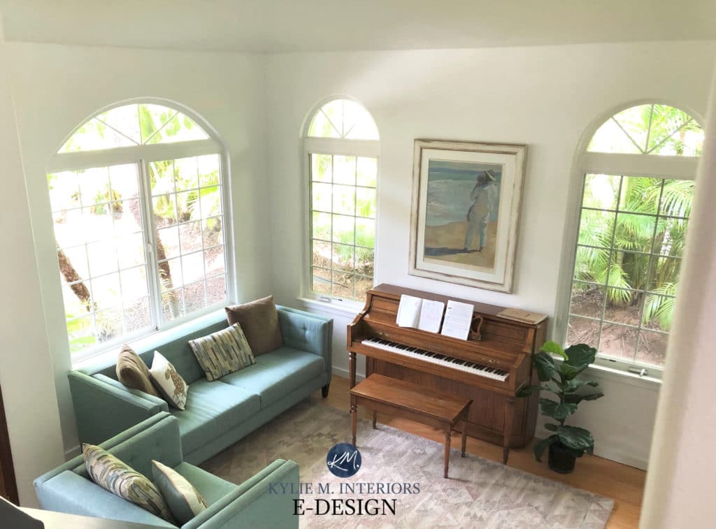
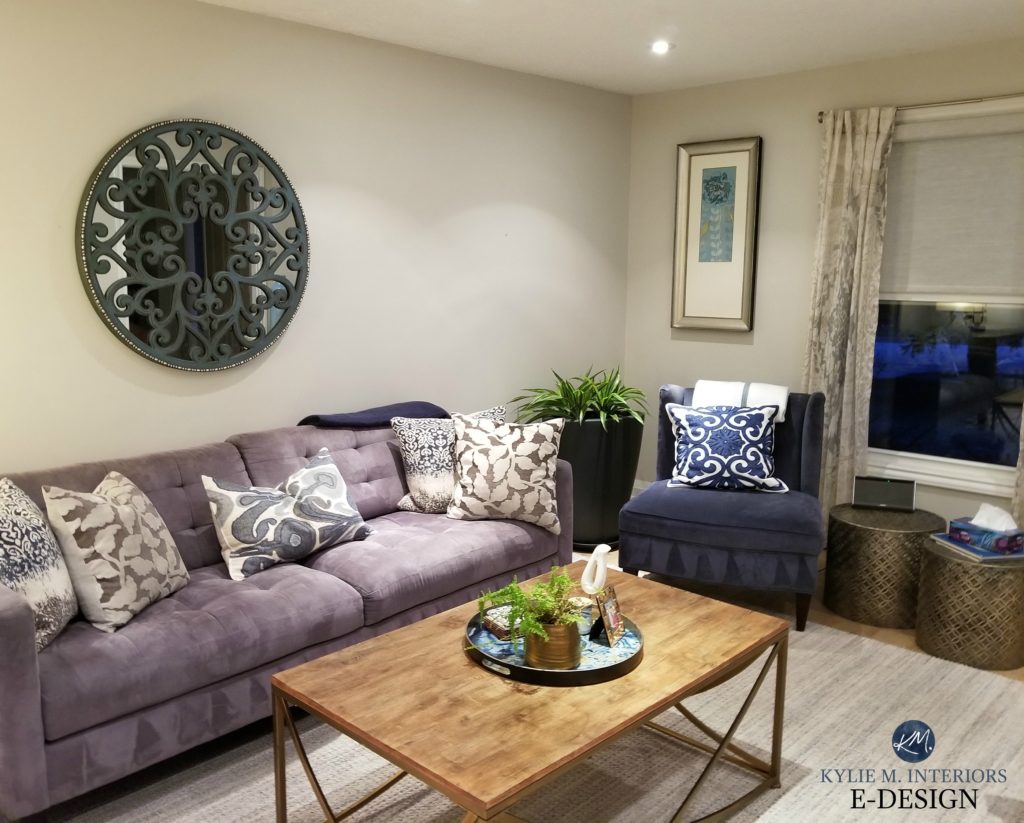
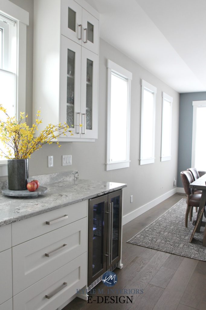
Let’s start with Sherwin Williams Agreeable Gray, one of my fave greige paint colors. Let’s say that Susan painted her south-facing living room Agreeable Gray and LOVED it, and so did her best friend, Nancy!
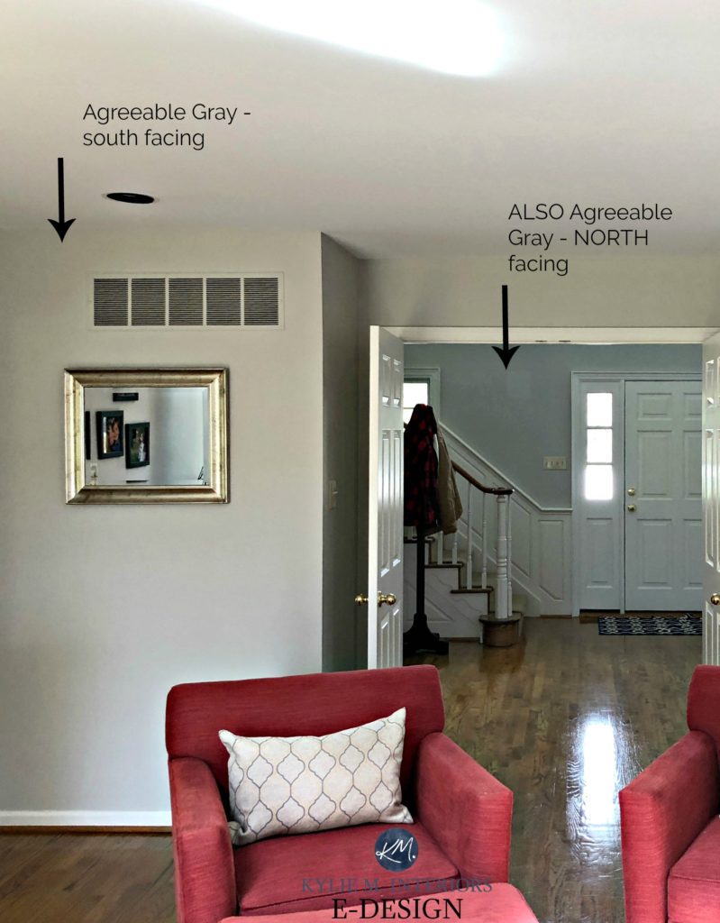
So, Nancy decided to use it in HER living room too, except her living room was NORTH facing, and it turned out WAY different from Susan’s. Now Nancy is left wondering what the heck went wrong! Was it a mistint? Did she get the wrong paint? Should she have primed? Maaaaybe, but regardless, Nancy didn’t consider her space’s specific needs.
Now, let’s pretend that Angela loves the warm creamy look of Sherwin Williams Creamy in Dave’s living room (oh, that Dave, he’s so stylish)…
The 13 Best Medium-Depth Blue Paint Colors
But she’s bummed out when she paints it in her north-east facing stairwell – it isn’t as creamy warm!
Why didn’t things work out for Angela and Nancy? Well, these silly gals didn’t realize that because their rooms had different exposures from their friends and different surroundings, the paint colors would look different!
Want to learn more about exposures? I have articles specific to EVERY direction – north/south/east/west, so you can learn which colors are best for the exposure of YOUR room.
This next exterior shows Benjamin Moore Revere Pewter on an exterior with NO sun on it…

And here it is with a full dose of southern sunshine…

It’s not just the siding that looks warmer, but the shutters and trim do as well.
MORAL OF THE STORY
Don’t be like Angela and Nancy – sample sample sample. Sure, you can check out the same color, but order peel & stick samples before you start slappin’ it on your walls.
North, East, South, West – Which Paint Colour is the Best?
PAINT COLORS vs. LIGHT BULBS vs. NATURAL LIGHT
This is a creature unto itself. In fact, I wrote an entire blog post about paint colors and light bulbs, but here’s the short and curly…
In the olden days (you know, like 1995), if you wanted to change a bulb, you just changed the damn bulb. Nowadays, you actually get to choose the TYPE of bulb and the TEMPERATURE of the bulb – lucky you!
So, let’s say you go to your friend’s house one evening, and she has a beautiful gray paint color on her living room walls. And you love this gray’s warm, inviting look JUST how it is. You might not be considering her light bulb temperature or furnishings; you just like how it looks.
You go home and paint YOUR living room that color. After painting ALLL day (with intermittent wine infusions), you stand back when it’s done, and say, ‘damn, I love that color – personal high-five.’ You go to bed pretty pleased with yourself and wake up the next day to cool gray walls and a mild hangover. You give yourself a few slaps (not so different from the personal high-fives, but to the face) and say, ‘Am I dreaming? That is NOT the colour I painted!’ I’m sad to say it is the color you painted; you just see it in a new light.
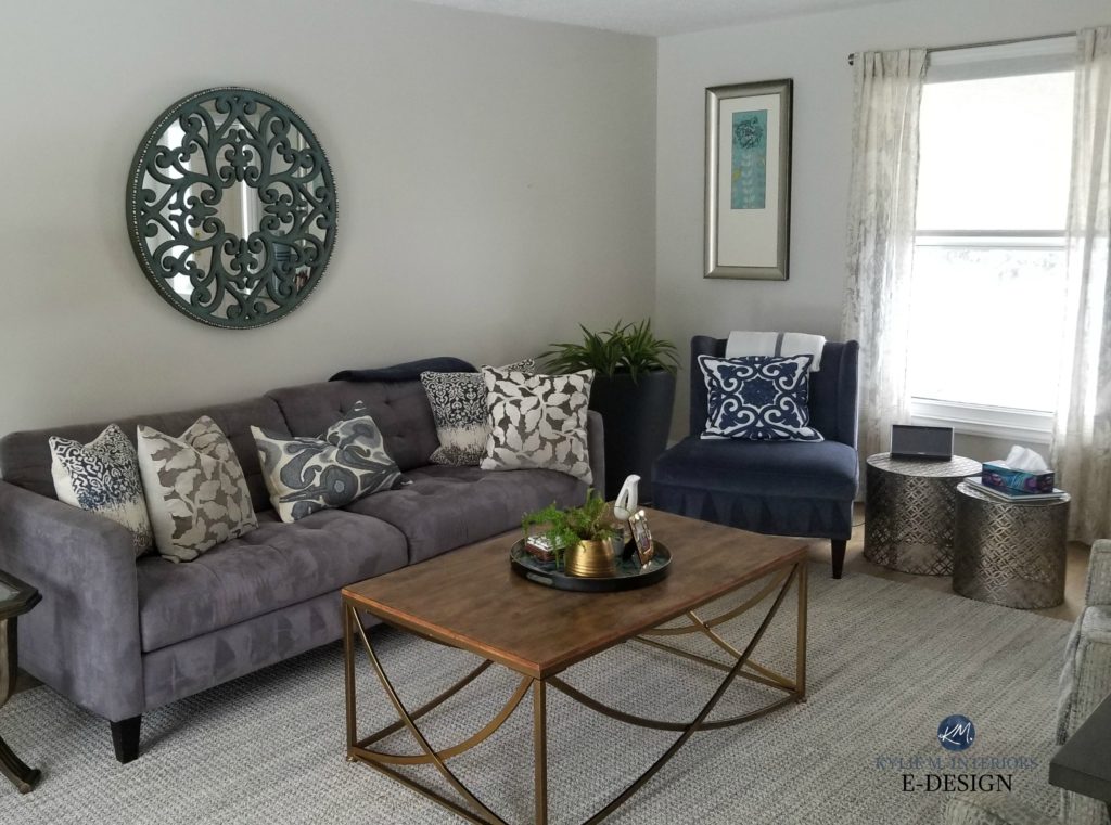
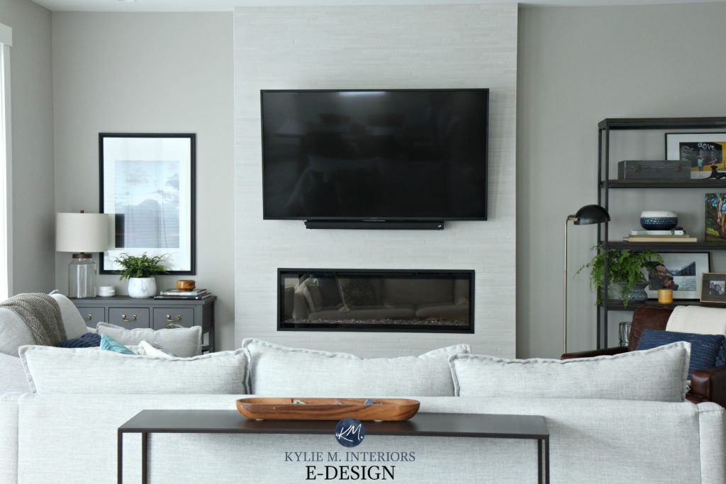
The above two photos are the PERFECT examples of that situation. In fact, you would think that the above living room was painted two different colors; however, you’re looking at Benjamin Moore Classic Gray, a warm gray with a very subtle purple undertone (remember, ALL grays have undertones). In the northwest daylight, you can see how it falls back a bit grayer and cooler, whereas, in the evening, it’s a sure-fire taupe!
This is what happened to my client – the owner of the above living room, and the photos below. She wrote to me because she LOVED her Classic Gray living room in the evening; however, she found it too cold and gray-looking in the daytime.
Here’s the same room, just a different wall…

Cool beans, eh?! I love this stuff. However, I understand that not everyone is as thrilled as I am at the true glory of metamerism #nerdalert.
So yes, I gave her some new paint colors to try, which would hold themselves a bit better against that cooler northern light. These colors might not give her as much warmth as her light bulbs do in the evening hours, but they’ll get her closer. From there, she can consider leaving one light on in the day with a lower Kelvin to take the edge off the natural light.
It’s important to know that NO paint color will look the same day to night unless your room has no windows.
The Best WHOLE HOME Gray & Greige Paint Colors
MORAL OF THE STORY…
Look at your paint samples day and night and on EVERY wall. Remember that the Kelvins of your light bulbs WILL affect how your paint color looks. If you’re seeing somethin’ funky, try changing your bulbs! Or cut back on the wine…
PAINT COLORS VS. FURNISHINGS
Next, look at Sherwin Williams Colonnade Gray, a PERSONAL fave of mine.
Let’s say you go to your friend’s home and see Collonade Gray painted in her living and dining room, and you LOVE its soft greige/warmth.
So, you paint it in YOUR living room and dining room…
Paint Colour Review of Sherwin Williams Colonnade Gray
Only to wonder WHERE in the heck the WARMTH went?! And where did that GREEN UNDERTONE come from?
- The first photo has a different exposure from the bottom two photos (the bottom two are extreme north).
- Notice how the countertop in the middle photo is a bit cooler-toned, with a slightly cooler white cabinet and trim color (compared to the first photo).
- The first example has warmer-toned furnishings and warmer woods, which can ABSOLUTELY change your perception of a color.
MORAL OF THE STORY…
Compare your paint samples to your furnishings. Hang them so that they act as a backdrop to your main furniture pieces; step back and see how they relate.
So, long story short (as usual), THOSE are just a few reasons you shouldn’t paint your room the same color as your friend’s. Could it work? ABSOLUTELY! But don’t count on it…
READ MORE
The Ultimate Guide to Choosing White Paint Colors
The Best Paint NUMBERS for Your Home: 60-70
The 10 Best Light Paint Colors for Stress & Anxiety
LET ME PICK YOUR COLORS FOR YOU!
Check out my E-Design – I’d love to help!

Chat soon,

ORIGINALLY WRITTEN IN 2019, UPDATED TOTALLY IN 2023
Share this!

Comments
Leave a Reply
More Posts

How to Turn Your House Into a Home: A Case Study
5 WAYS TO CREATE A HOMEY-HOME: A case study of OUR house! Between Pinterest, HGTV, Instagram, and design magazines, it’s easy to get caught up in what’s trendy and hipShare
Read More
KYLIE M’S 5 COLORS OF THE YEAR: 2024 Collection
REAL HOMES, REAL PEOPLE, REAL COLORS! When choosing my top colors for the year, I’m looking for colors that INSPIRE. Colors that talk to people (mind you, every color talksShare
Read More

Are White Walls, Cabinets & Exteriors Still Trendy for 2024?
Is the ALL-WHITE HOME still in style? Is white still in style as a paint color and interior finish? Are people still doing white cabinets, countertops, walls, and exteriors? AreShare
Read More


Kylie,
You are an adorable rude lil’ Ginger! I so love reading your articles and learning from you. I look forward to more videos.
Author
Well, thank you Karen!
What a great post! My husband and I purchased a home from an interior designer. At the closing she gave me a long list of paint formulas by room. I was under the impression that all of the rooms in the house were painted the same color. Not so. She had tweaked the colors for each room, but it really did look like all of the rooms were the same color! PS I did hear that two of her painters quit . They ran out of patience! LOL
Author
Good thing she left you the list, otherwise you would’ve been spinning in circles when it came time to repaint! Thanks for writing 🙂
All grey and white rooms look the same to me anyway! Thanks for the post- getting ready to redecorate a north facing room. It has always looked better at night so I think I’m going to go with lots of dark color!
Yep, Kylie, your consult to give me paint options for a light greenish-grayish-blueish wall color on a northwest house with water influence, was perfect! I adore my paint, after 17 trials of my own, it was great to get your advice
Author
Wahoo, that’s what I love to hear – thank you Coleen!
Yet another great post, Kylie! You have such an amazing insight into colour!
Wondering if BM Ballet White would be fine in a powder room with a northern window (with overhang from porch roof). Hallway outside powder room is Edgecomb Grey. Flooring for powder room and hallway has not been determined. May need some advice on that, too!
I have seen Ballet White in another home but not with the northern exposure. Very calming.
Thanks for your help!
Author
Hi Connie, I do love Ballet White and it flows nicely off of Edgecomb! While I can’t say for sure that it’ll work in your bathroom without seeing photos, off the bat I see NO problem. 🙂