
Posted on June 11, 2021 by KylieMawdsley
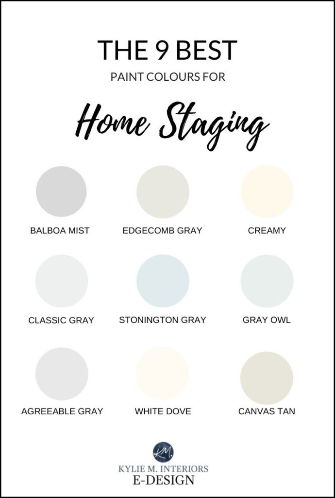
Popular Neutral Paint Colours with MASS APPEAL
BENJAMIN MOORE & SHERWIN WILLIAMS
Other than decluttering and cleaning, painting is the least expensive way to add value to your home. And not only does it add monetary value (as a home that’s well-maintained is FAR more appealing than one with scuffed walls), but it ALSO adds emotional value as the buyer walks through your home, envisions living in it, LOVES it and HAS TO HAVE it!
In my article, The Best Paint COLOURS for Home Staging, Selling I talked more about actual ‘colours’ because there are some slightly stronger colours that are suitable for resale, depending on the room, exposure and style of home. It was also more on a ‘per room‘ basis, rather than a ‘paint your whole home’ basis.
This article is for those of you wanting to paint either one room or your WHOLE HOME a soft neutral paint colour that has MASSIVE mass appeal.
However, let me preface this with the following…
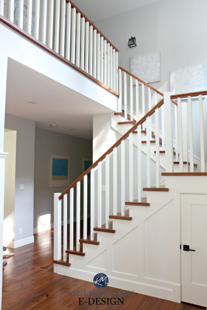
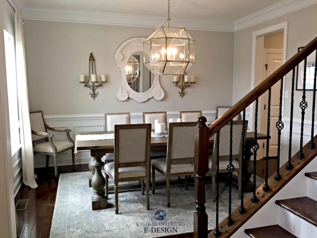
While gray paint colours are still being used in today’s homes, trends are shifting warmer. So while I have some gorgeous grays included below, talk to your Realtor to find out what YOUR demographic and local market are looking for in an ‘updated’ home.
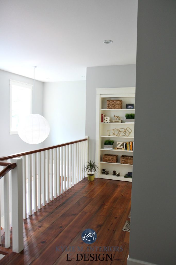
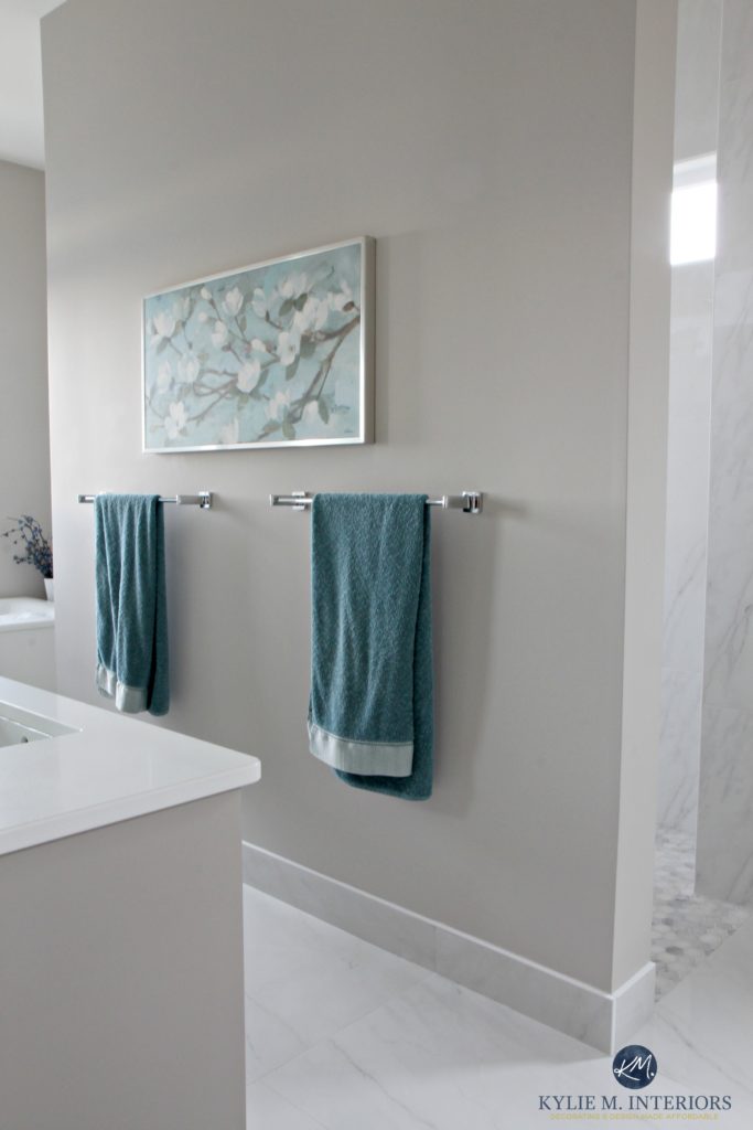
1. BENJAMIN MOORE STONINGTON GRAY HC-170
Stonington Gray IS a light gray paint colour with a stormy blue undertone (sometimes greenish), but with its LRV of 59.75, I might lighten it by 25% just to take the edge off to accommodate hallways and darker rooms.
Not sure what LRV is? You might want to read this article before you go much further as it’ll help you HUGELY in your search for the perfect paint colour.
Kylie M Interiors E-design
WHY IS STONINGTON GRAY SUCH A POPULAR COLOUR?
- Stonington has a nice body and depth to it without going overly heavy
- it has a soft blue undertone that isn’t as dominant as some of other gray-blue paint colours
THE BEST ROOMS FOR STONINGTON GRAY
-
bathrooms
-
bedrooms
- open layout areas
- rooms with strong south-facing or intense western afternoon sunshine
ROOMS WHERE YOU SHOULD AVOID STONINGTON GRAY
-
homes with pink (countertop/toned flooring/furniture), check out Benjamin Moore Classic Gray instead
- in north-facing rooms, the blue may become more obvious. Remember, EVERY gray paint colour has undertones!
Paint Colour Review: Benjamin Moore Stonington Gray
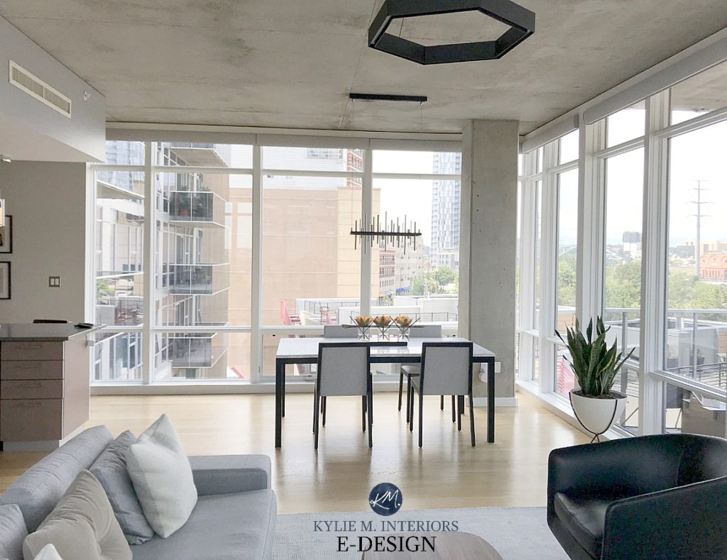
2. BENJAMIN MOORE GRAY OWL OC-52
Gray Owl is a light gray paint colour with a subtle blue-green undertone. This undertone doesn’t always show up, but in the right conditions, it can surprise you!
Kylie M Interiors E-Design
These photos show how soft and pretty Gray Owl can look. Keep in mind, it can look DRASTICALLY different from one room to another, depending on the exposure, furnishings, etc…and easily flexes from a green undertone to a blue one.
Open Layout Makeover – Budget-Friendly and Beautiful!
WHY IS GRAY OWL SUCH A POPULAR COLOUR?
- with the younger demographic it’s a SUPER popular choice
- it’s light enough to add interest without weighing a room down
THE BEST ROOMS FOR GRAY OWL
- south-facing rooms, north-facing rooms with reasonable natural light (knowing the room will look cool)
- wood tones and whites
ROOMS WHERE YOU SHOULD AVOID AVOID GRAY OWL
- if your target market is aged 60+, generally speaking, they prefer more neutral/warmer colours
- in a north-facing, dark room, it could look awfully cold
The 12 Best ‘Whole Home’ Gray and Greige Paint Colours
Paint Colour Review of Benjamin Moore Gray Owl
3. SHERWIN WILLIAMS CREAMY SW 7012
If you are looking for a gorgeous cream without TOO much yellow in it, this is a good one for you. Creamy is a yellow paint colour with a neutral added to calm it down and Creamy has JUST the right amount of both. If you look at the baseboard in the photo below, you’ll see the difference between Creamy and BM Cloud White.
WHY IS CREAMY SUCH A POPULAR CREAM PAINT COLOUR?
- Creamy is a warm colour without being overly yellow
- it’s modern and fresh feeling without having the coldness of a gray
- Creamy has appeal to a younger and older crowd as it’s versatile enough to accommodate both warm and cool tones in decor
- it has more depth to it than White Dove and Cloud White for those who don’t want white walls
- I also love the slightly more subtle Benjamin Moore White Down
THE BEST ROOMS FOR CREAMY
- definitely north or east-facing rooms as the warmth helps to balance out the cooler light
- hallways and darker areas
ROOMS WHERE YOU SHOULD AVOID CREAMY
- if you have intense bright southern sun – it will disappear, unless you want a super soft subtle look. Check out a different cream instead
I am also a fan of Sherwin Williams Alabaster, which is more of a warm white, not quite an off-white…
The waiting room of Eddins Counselling
The 5 Best Cream Paint Colours
Colour Review of Sherwin Williams Creamy
4. SHERWIN WILLIAMS CANVAS TAN SW 7531
Going for a modern and clean, but not TOTALLY boring look? Then Canvas Tan might be perfect for you!

Canvas Tan is a warm light depth tan with a neutral approach as it doesn’t flash obvious warm undertones (yellow, orange, red, green). It’s similar to Benjamin Moore Manchester Tan but is a shift lighter/creamier looking and lacking much of the green that can pop up in Man. Tan.

WHY IS CANVAS TAN SUCH A POPULAR WARM NEUTRAL PAINT COLOUR?
- Canvas Tan offers a subtle warmth without flashing an obvious colour, ie. yellow, red or orange
- it’s a warm tan colour without looking like the Builder’s Beige of the early 2000s
THE BEST ROOMS FOR CANVAS TAN
- it’s awesome in south-facing or north-facing rooms, just make sure the north-facing room has adequate light
- looks great with wood tones that have yellow hues
ROOMS WHERE YOU SHOULD AVOID CANVAS TAN
- if you have a lot of products with a cool gray in them, check out Sherwin Williams Agreeable Gray instead
Paint Colour Review of Sherwin Williams Canvas Tan
Sherwin Williams: 5 of the Best Neutral/Beige Paint Colours
5. BENJAMIN MOORE WHITE DOVE OC-17
White Dove is a great choice for a soft white look. Unlike Cloud White, which has a bit more warmth-yellow in it, White Dove has a more neutral base, while still having the underlying warmth that stops it from becoming flat or gray. However, both are in my top 3 warm white paint colours.
WHY IS WHITE DOVE SUCH A POPULAR WHITE PAINT COLOUR?
- White Dove is warm without having a ‘colour’ to it
- it can be used on trim, walls and cabinets for a seamless look (read more HERE)
- north and south-facing rooms look great in White Dove’s subtle warmth
THE BEST ROOMS FOR WHITE DOVE
- most rooms, as long as you’re going for a soft, warm white look
ROOMS WHERE YOU SHOULD AVOID WHITE DOVE
- dark rooms, or more to the point, White Dove is FINE in a dark room, but it won’t save the day (improve your lighting)
- if you have clean white in your surrounding finishes (ie. white appliances)
Benjamin Moore 8 Best White Paint Colours
Paint Colour Review of Benjamin Moore White Dove
6. BENJAMIN MOORE CLASSIC GRAY OC-23
Classic Gray is NOT exactly what it says, as while it IS classic…it’s not always gray!
As far as light, soft grays go, this is one of my faves. Many of today’s popular light gray colours can go slightly blue or green – not this one. Classic Gray favours a wee purple undertone that softens this colour and gives it interest. Depending on the room and its exposure, Classic Gray can flex from the gray end of things to the more greige end without committing 100% to either. Just be careful, it’s NOT a cool gray and has been known to pick up a ‘barely there’ purple-pink undertone in some lights. Your walls WON’T look pink – but the undertone will be softer than a typical cool gray.
WHY IS CLASSIC GRAY SUCH A POPULAR PAINT COLOUR?
- it gives the illusion of gray without being cold or icy
- the depth (LRV) suits a variety of rooms and conditions
THE BEST ROOMS FOR CLASSIC GRAY
- works well in rooms with any type of exposure
- is flexible to accommodate a variety of tastes
- add a bit more depth and you’ll get Balboa Mist or Collingwood
ROOMS WHERE YOU SHOULD AVOID CLASSIC GRAY
- if you have products with a green undertone (look at Benjamin Moore Revere Pewter)
- rooms with a LOT of natural light will make Classic Gray washout
Paint Colour Review: Benjamin Moore Classic Gray
7. BENJAMIN MOORE BALBOA MIST 1549
Balboa Mist is a slightly warm gray-greige with a warm purple undertone. It’s warmer and more feminine than Classic Gray with its soft and dusky undertone, at times picking up a faint purple-pink hue (nothing OVERLY dominant though – super passive).
WHY IS BALBOA MIST SUCH A POPULAR PAINT COLOUR?
- its undertones are soft and subtle while adding a bit more ‘colour’ than traditional grays
- Balboa Mist has a romantic and soft look while still being fresh
THE BEST ROOMS FOR BALBOA MIST
- south, north, east or west-facing rooms – it holds itself relatively well in most lights as long as the undertones suit the space
ROOMS WHERE YOU SHOULD AVOID BALBOA MIST
- you have products with a green undertone in them., check out Sherwin Williams Colonnade Gray or Benjamin Moore Rodeo instead
Add a bit more depth and you’ll get Benjamin Moore Collingwood or Benjamin Moore Cumulus Cloud
Paint Colour Review of Benjamin Moore Balboa Mist
Undoubtedly, you’ll be heading out in the near future to grab paint samples – stop right there! I want you to check out SAMPLIZE. Samplize offers peel and stick paint samples that are more AFFORDABLE, EASIER and more ENVIRONMENTALLY FRIENDLY than traditional paint pots. Here are just a FEW reasons why I recommend Samplize to my clients…
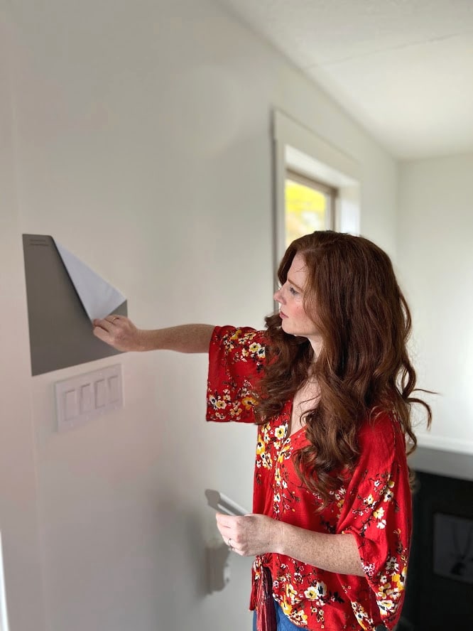
- samples arrive ON YOUR DOORSTEP in 1-3 business days, depending on location
- they’re more affordable than the samples pots/rollers/foam boards that are needed for traditional paint sampling
- if you keep the samples on their white paper, you can move them around the room
Visit the SAMPLIZE website HERE
8. BENJAMIN MOORE EDGECOMB GRAY HC-173
Edgecomb Gray is HANDS-DOWN, one of the most popular warm neutral paint colours – not just for home staging, but for ANY situation.
WHY IS EDGECOMB GRAY SUCH A POPULAR PAINT COLOUR?
- it’s a happy medium for those who love gray and those who prefer beige
- its depth suits a variety of rooms and conditions
THE BEST ROOMS FOR EDGECOMB GRAY
- works well in rooms with any type of exposure so long as the lighting is adequate
- is flexible to accommodate a variety of tastes
ROOMS WHERE YOU SHOULD AVOID USING EDGECOMB GRAY
- if you have products with a green undertone, be careful, as it can look a bit pink in comparison
- in super low light rooms it can look dingy, make sure you have enough interior lighting
WHAT ARE SOME ALTERNATIVES TO EDGECOMB GRAY?
If you want your walls a bit lighter and warmer than Agreeable Gray, check out Benjamin Moore Ballet White or Sherwin Williams White Duck.
Paint Colour Review of Benjamin Moore Edgecomb Gray
9. SHERWIN WILLIAMS AGREEABLE GRAY SW 7029
Agreeable Gray is a gorgeous greige paint colour. Greige is a blend of gray and beige and THIS particular one leans a bit more into gray, especially in north-facing rooms.
WHY IS AGREEABLE GRAY SUCH A POPULAR NEUTRAL PAINT COLOUR?
- Agreeable Gray is great for mass appeal, home buyers love it
- it goes with a variety of surfaces as the undertone are pretty flexible
THE BEST ROOMS FOR AGREEABLE GRAY
- South-facing or west-facing afternoon rooms that have a lot of warm light
- North-facing rooms if you want a warm, but not beige-tan paint colour
ROOMS WHERE YOU SHOULD AVOID USING AGREEABLE GRAY
- If you have north-facing or east-facing, Agreeable Gray WILL look grayer/cooler. Read more: The Best WHOLE HOME Gray and Greige Paint Colours
WHAT ARE SOME ALTERNATIVES TO AGREEABLE GRAY?
If you’re looking for a paint colour that’s more gray, check out Sherwin Williams Repose Gray. On the other hand, if you want more warmth, take a look at Sherwin Williams Accessible Beige.
Paint Colour Review of Sherwin Williams Agreeable Gray
READ MORE
The Best Paint COLOURS for Home Staging
Not sure which colours will be best for your home or investment property?
Check out my affordable Online Consulting Services!

Chat soon,

Originally written 2017, updated in 2021
Share this!

Comments
Leave a Reply
More Posts

How to Turn Your House Into a Home: A Case Study
5 WAYS TO CREATE A HOMEY-HOME: A case study of OUR house! Between Pinterest, HGTV, Instagram, and design magazines, it’s easy to get caught up in what’s trendy and hipShare
Read More
KYLIE M’S 5 COLORS OF THE YEAR: 2024 Collection
REAL HOMES, REAL PEOPLE, REAL COLORS! When choosing my top colors for the year, I’m looking for colors that INSPIRE. Colors that talk to people (mind you, every color talksShare
Read More

Are White Walls, Cabinets & Exteriors Still Trendy for 2024?
Is the ALL-WHITE HOME still in style? Is white still in style as a paint color and interior finish? Are people still doing white cabinets, countertops, walls, and exteriors? AreShare
Read More


Please, can you help me? I’ve tried so many samples in this room. South facing. Everything is either orangy or pink! Im in tears and defeated. Can I send you a picture?
Hi Catherine, thank you for your note! Due to the amount of emails that I get in a day, I do need to refer personal questions to my Online Consulting. It’s affordable and fun! You get to send me photos and fill out a questionnaire and I’m sure I can help you with your room 🙂 If that interests you, here is the link! https://www.kylieminteriors.ca/online-decorating-design-services/
Chat soon 🙂 Kylie
Hello Kylie,
I have decided to paint my walls with Benjamin Moore Manchester tan but am struggling to find the right white for the trim. I have sample of Simply White against Manchester tan but it looks too white. I have honey oak colour floors so what white paint would complement the Manchester paint for the trims, baseboards and doors?
Thanks,
Shelley
Hi Shelly! Check out White Dove which is still warm, but has a much more neutral base – you might like that a bit better 🙂 I also like SW Alabaster!
~Kylie
This is such a helpful article, I’ve referred to it countless times in the past week as I pick out a gray for my living and dining rooms. I had it down to balboa mist and classic gray, and painted a bunch of swatches to see how they REALLY look. Balboa is a bit too dark for the look I want, although it looks better in the daylight. I’m going with classic gray!
My question for you is, what would be the ideal amount to lighten classic gray for the adjoining hallway? I still want it to read as a light gray (not white) but to be distinctly lighter than the living room… Since it’s already quite light, I’m concerned about hitting the ideal in between tint. Thanks Kylie!
Author
Hi Kellie! Well, if it were me using Classic Gray, I don’t know if I’d go over 25% otherwise I’d worry about ‘losing it’ a bit… that is a GOOD choice too, you’ll find it more versatile than Balboa – absolutely.
Repose gray on ceilings and walls with pure white trim? Also rooms with mindful gray and Dorian with repose ceilings ? What do you think ? I’m mentally exhausted and feel like I just need to go with it.
I would like to do pure white on the ceiling too but am afraid and my husband likes the darks so using repose on the ceiling for him is light. Going with agreeable gray in main area where the ceilings are cathedral with black stain on beams and cabinets with island painted Dorian gray. My fireplace has some tan, gray , rust so didn’t want it to look dingy with a grayer tone.
If doing canvas tan walls, will Alabaster be to dull or yellows for the trim? I don’t want an overly bright white. And how about for the ceilings- shall I do Alabaster as well?
Author
Hi Lori, I do love Alabaster. You can ask them to add 4 ounces of white to it, which just cleans it up a stitch – that might help 🙂
I’m surprised Revere Pewter (BM) didn’t make the list 🙂
Author
It was close! I do love RP, but in some homes it can be a touch heavy as it is a slightly darker ‘light’ colour. It’s also a bit unpredictable with its green undertone. I do have mad love for it though, that doesn’t alway show up to the party, but sometimes shows up when you don’t want it to!
Does Classic Gray look good with dark woods?
Author
Hi Annette, it can!
Hi Kylie,
Where would Pale Oak fall in the mix? Our walls are currently Antique White which makes our trim look more white (they’re actually more of a cream), but I’m dying for “gray” walls and don’t want my gray to go blue/purple/green. Any tips? I’m looking for a good whole house light neutral. Our house faces east/west. Thanks!
Author
Hi Kate, Pale Oak is beautiful. It’s a warmer gray/greige tone, but can (if encouraged) pick up a very slight pink that you have to watch for!
Hi Kylie!
I wanted to know if you would review Sherwin Williams Gossamer Veil and Knitting Needles.
Thank You!
Dana
PS, Please make more videos!
Author
Oooo, Gossamer Veil is on my hit list! I will be doing my video NEXT WEEK. Unfortunately, I can’t do a blog post until I have images of it used in a clients home, so that will have to wait – it’s a wicked cool colour though!
Thank you for your guidance with paint. I have learned so much from your blog. Can you make suggestions for colors and whites that go nicely with floors that have a red undertone? Thank you.
Author
Hi Marie, that would make a great blog post – I’ll have to see if I have enough photos to support any entire post…maybe! If not, I do have an affordable E-design service that is fun. This way I can look at your room and make suggestions that actually make sense! https://www.kylieminteriors.ca/online-decorating-design-services/
~Kylie
Hi! Would u use classic gray for exterior . I’m painting brick
Author
Hi Joanne, you certainly can, but it’s a VERY light colour and will wash out with sun on it. Having white trim will help, to show some contrast…
Terrific site – thanks for your really helpful advice! I’m drowning trying to decide on a true neutral (not yellow, pink or green) almost-whole house color to replace BM Pale Almond (too yellow) and Everlasting (too fleshy). I don’t mind a teeny-tiny hint of gray. I have rounded corners (so color has to continue), Simply White trim and kitchen cabinets with Black Absolute counters in bright south and west kitchen and a two-story bright north facing foyer. I’m sampling Manchester Tan (based on your post) and Timson Sand. Any thoughts on TS? Thanks a lot!
Author
Hi Ginny! Due to the number of emails I get every day, I have to pick n’ choose which questions to answer, focusing first on the ones that have mass appeal! I do try to give as much complimentary info as I can on my blog and if that doesn’t help, it might be time for a closer look with my E-design. Otherwise, I’m just guessing as to how the lighting affects the room, flooring and so many other things to consider when choosing a paint colour! https://www.kylieminteriors.ca/online-decorating-design-services/
I hope to hear from you!
~Kylie
Hi Kylie,
I am planning on painting my living room and hallway with BM Stonington Gray. I tried the sample color and like it, but feel it looks a bit dark. I also noticed that it picks up the blue undertone in my south exposed living room. I just read your advise about lightening it up by 25%. If I lighten it up will the blue undertone come through more or will it be the same color just lighter?
Thank you,
Nancy
Author
Hi Nancy, i HAVE found that Stonington Gray does pick up a bit more blue when it’s lightened by 25%! Check out SW Big Chill, see if it feels a bit better 🙂
You mention adding white to alabaster to “clean it up a little”. We are painting the walls canvas tan and the trim and ceilings with alabaster. We did not do anything special with the mixture. Will it look okay?
Author
Absolutely, you’ll be all good!
What would you say are the best whites with Manchester tan? I am painting a large living room Manchester tan and the adjoining rooms are Revere Pewter. I need to paint all my trim and doors so I am hoping for something that complements both. Love your site! So much fresh advice, thank you!
Would you use classic gray in a large living room that is well lit but is north facing? Or would creamy feel more warm and cozy? I love the idea of bright and fresh but I don’t like cold at all.
What is the difference between lightening a color by a percentage and going one color down on the strip of paint swatches, i.e. Benjamin Moore Classic Gray lightened by 25% vs Calm? Thank you.
Author
Hi Judy, that’s a good question! It can change for every colour and the thing is, even though the paint companies put colours next to each other in a colour strip, they aren’t necessarily the same colour just lightened/darkened – they like to fool us that way ;). I’ve found that generally speaking, if you lighten a colour by 25% it’s a very slight shift on the original colour. 50% gives you a more moderate shift, where the undertones can change more noticeably and 50% is sometimes the halfway point between one colour and another on a colour strip. So sadly, there isn’t a really easy answer, but the short one is that 25% lighter is more of a tweak of Classic Gray and won’t give you Calm!
Hi Kylie,
Whenever I am thinking of painting, I always refer to your blog. I almost always agree with your point of view. I have just renovated my kitchen and have painted it and the family room in Balboa Mist. I am about to purchase new sectional and accent chair for the family room and trying to decide whether to go with a darker grey or charcoal colour or to go lighter. The accent chair will likely be a pattern. My accent tables are dark wood and glass. What would you suggest?
Thank you!
Author
Hi Leanne! Well, it can depend on the other finishes in the room like flooring/drapes/rugs/etc… but I might be inclined to go in the middle of the road – nothing too drastic/dark, but nothing overly washed-out. The lighter it is (the closer it is in-depth to the walls) the more bang-on the undertones need to be. I mean, you’ll still need purple undertones in a medium or darker gray, but it’s easier to coordinate ;).
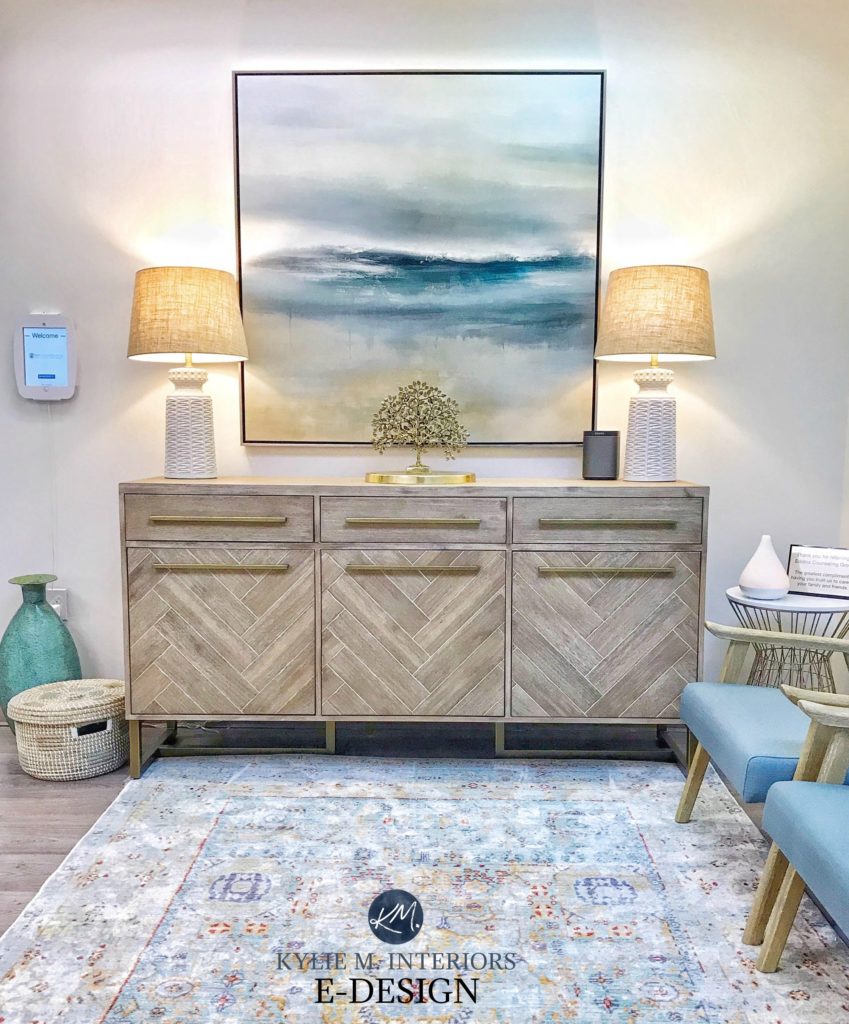
Hi,
In the picture of the buffet with two lamps and two lt blue chairs on the right, is it Alabaster?
Author
Yes it is :).
Hi Kylie,
Always love reading your blog, so helpful!
We have Classic Gray in a bathroom and love it, so neutral and calm. I have also been sampling some other lighter neutrals that you don’t see much about and wonder what your thoughts are – all Benjamin Moore; Wind’s Breath, Gray Mist and Natural Cream.
We painted our west facing bedroom BM Natural Cream, it turned out so lovely, a nice blend of grey and beige. It’s a bit cooler in the morning but warms up nicely as the day goes on without getting too HOT in the afternoon sun. Any opinion to share on these colors?
I also have mad love for Stonington. I’d love to use it in my kitchen with SW retreat accents, but that darn gold granite counter and travertine backsplash! Have you ever seen Stonington work in that situation or best to just stay away?
Author
Oooo, I wouldn’t – Stonington IS so pretty, but if it’s the granite I’m thinking of it just is toooo cool! You might have more luck with BM Cumulus Cloud as a transition between your kitchen and other rooms in Stonington Gray 🙂
Hi,
Is classic Grey and C. Lace a good combination with Red/Brazilian cherry floor ?
Author
Yes, it could look lovely!