
Posted on April 15, 2022 by KylieMawdsley
Our New House: Starting (& ending) with the entryway
Here it is, the FIRST blog post about our new house, and I figured there was no better place to start than the entryway!
UPDATED – THIS IS THE HOUSE THAT ALMOST BROKE ME. WE LIVED IN IT FOR 3 MONTHS AND MOVED, HENCE ONLY ONE POST ABOUT IT.
Oh, this house. I love the view; we BOUGHT it for the view, however, I don’t love the house (note that I say house not home). And while I’m having fun adding my own personal touch to it, I already know that this will be a short-term adventure (well, shorter than the usual 4-year stint anyway). We all know that Tim is really the only thing I’ve kept for a long period of time anyway – lucky bugger.
But, OOOOOH that view…

Every day is completely different from the last! We can see everything from the eastern sunrise to the western sunset, it’s pretty stunning. However, the one thing we don’t see much of is the sun, and my pasty lil’ Ginger self has a BIG problem with that.

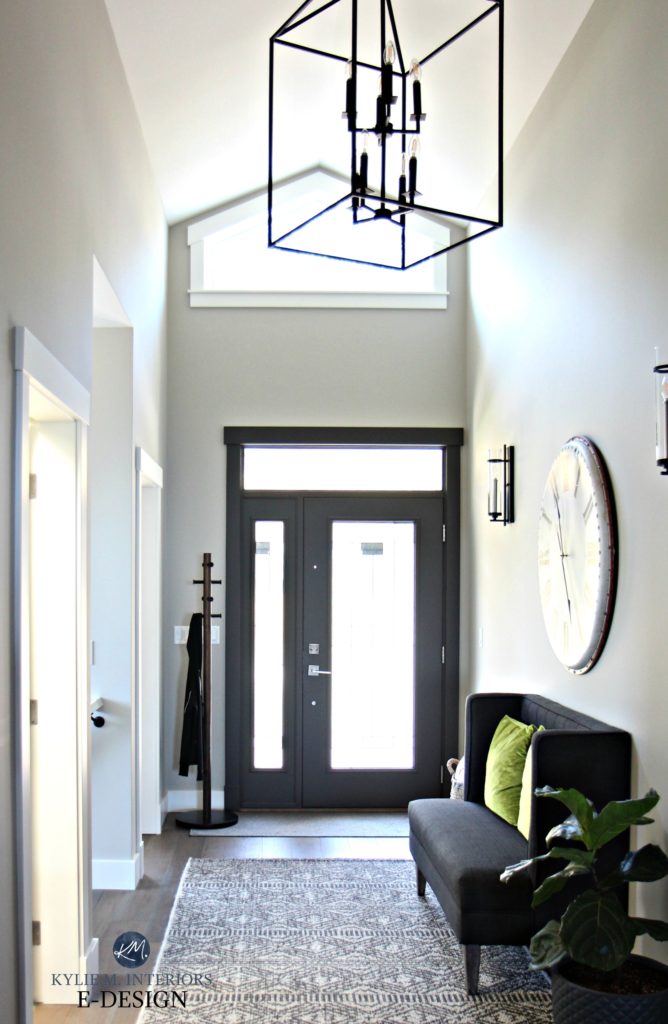
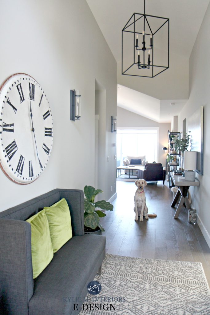
When we viewed this house, I was worried about its northern exposure and the COOL nature of the products that were in the house – products that wouldn’t accommodate my love of warmer colours. And I had a right to worry, these cool colours go against my nature! But I like a challenge and have never bought a new home. I’m trying to embrace it for the experience and for the sake of the view (which really is TO DIE FOR) and it ALL starts with a case of wine the entryway.
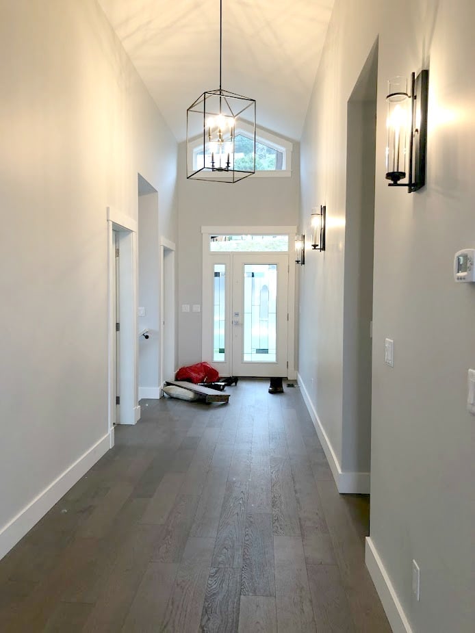
Before, it had great bones with beautiful light fixtures and flooring, but the cool paint colour just wasn’t ma jam.
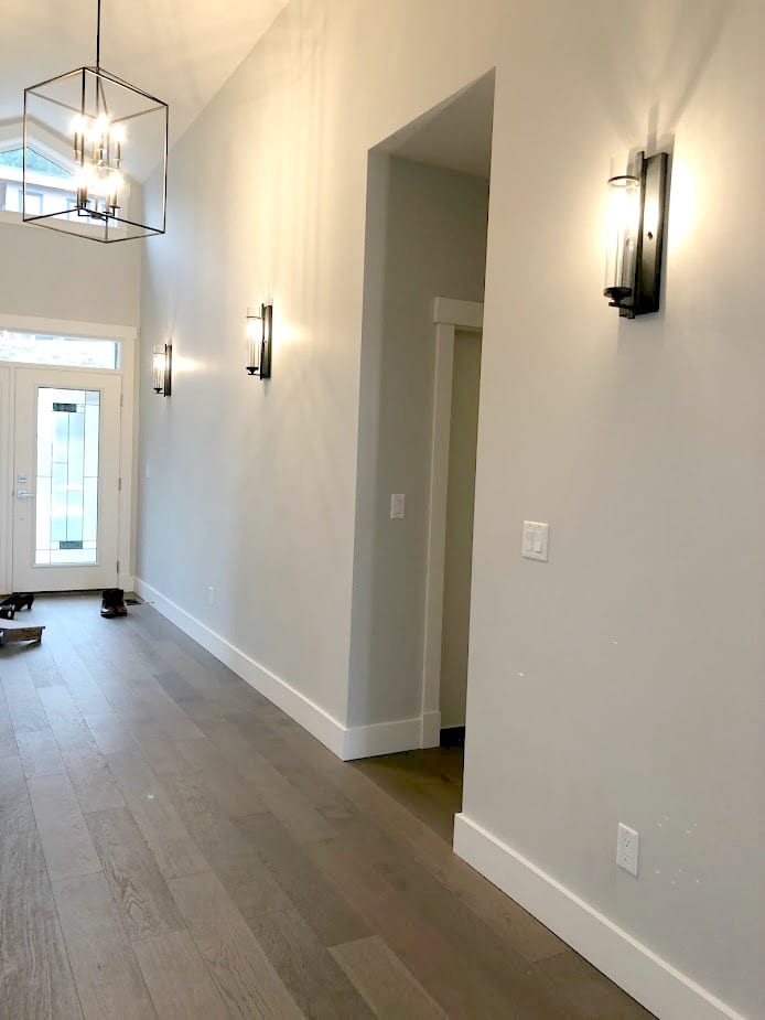
After, I’m loving the softness of the new paint colour, Sherwin Williams Colonnade Gray.
I would’ve naturally chosen a warmer paint colour for this north-facing home, but seeing as it’s open concept, I have other things to accommodate (TONS of gray carpet and quartz countertops). Colonnade Gray is as warm as I can go without alienating the needs of the house (because it’s not all about me ALL of the time…just joking, it is).
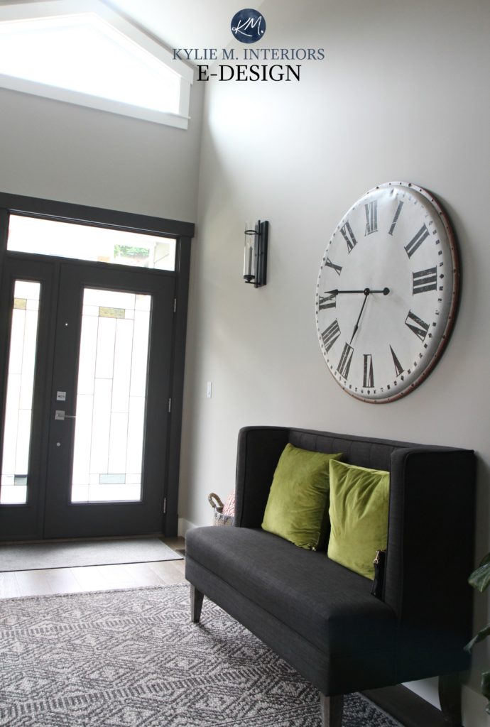
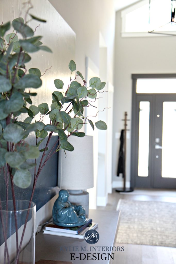
I wanted a dramatic front door colour, so I chose Urbane Bronze, which is a DEADLY dark greige with a green undertone. And rather than keeping the trim white, I painted the trim around the door, adding to the impact but simplifying it simultaneously.
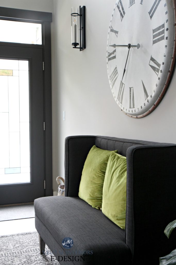
I loved the large clock in the entryway of our last home so much that I decided to buy a new one for this house (what can I say…I like big clocks and I cannot lie).
The original colour, Sherwin Williams Crushed Ice, was throughout much of the house and was too cool for my tastes when compounded by the (ahem) extreme northern exposure in the open layout area.
Colonnade Gray offers a softer approach and takes advantage of the little southern light that we get (only the entryway and my office, the rest is north).
Functional and pretty, what else could a girl ask for? SUNSHINE, SOME FRIGGIN’ SUNSHINE PEOPLE!
Anyway, I’m sure you can feel my excitement over this house (insert sarcasm HERE).
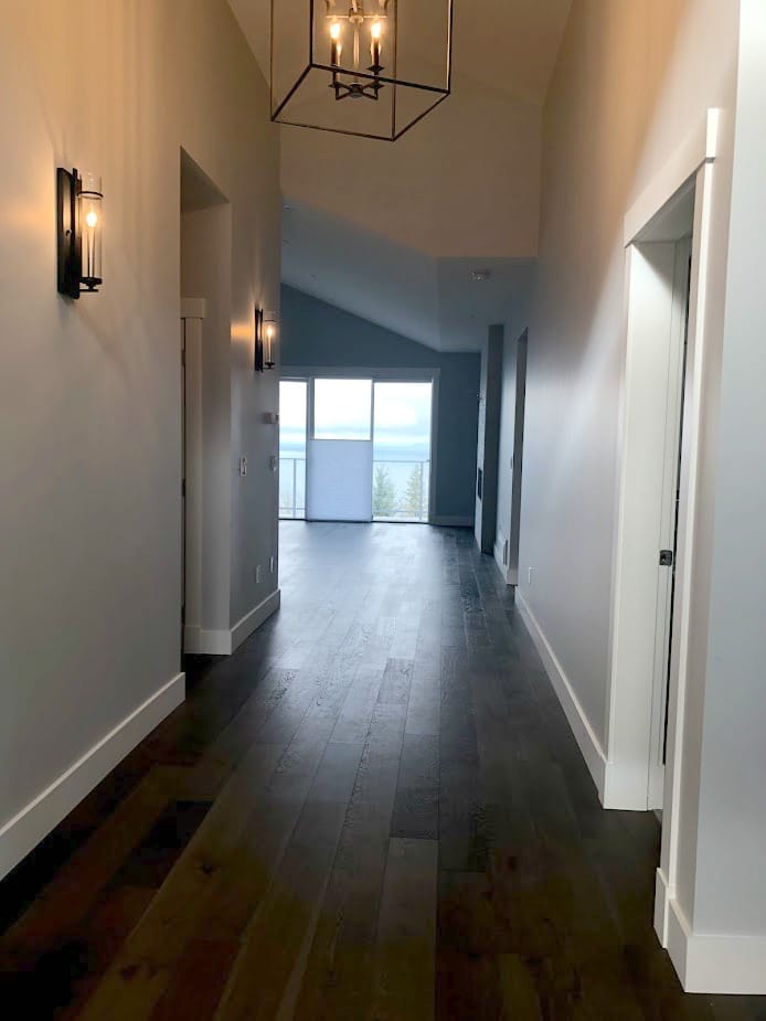
The stairwell was a stairwell. Thrilling, I know.
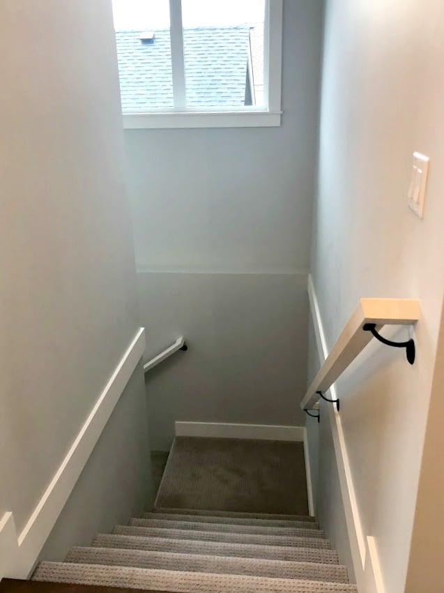
Again, Colonnade Gray to save the day! However, Colonnade CAN pick up a very vague green undertone, which makes me twitch a bit with the gray carpet (which leans to the violet side of gray). HOWEVER, being an open concept, this paint colour also has to suit the kitchen countertop, fireplace tile and OTHER features – I have to make it work. By lightening Colonnade Gray by 25%, I was able to cut back almost ALL of the green for the sake of the carpet, while still having a soft, subtle, warm gray and a seamless transition from the main living area.
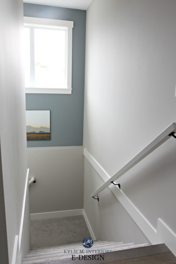
And the funny thing is that I used to despise feature walls. However, this is because I saw so many abused ones – wrong spot, wrong colour. I am, however, a HUGE fan of a well-placed, well-planned colour added to what would otherwise be a pretty booooring transition space. To make an impact without going TOO far, I went with Benjamin Moore Gibraltar Cliffs…MAD LOVE!
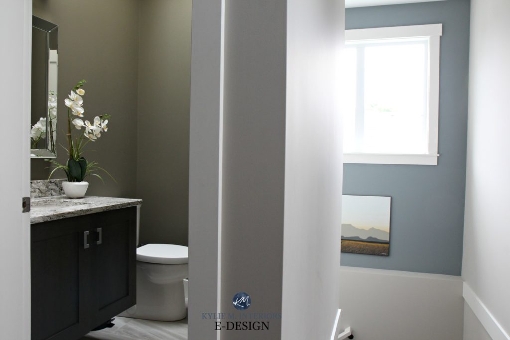
The small powder room is right off the entryway. It’s important that the flow between the staircase, hallway and powder room is BANG-on as they’re all in the same eyeball. The photo above shows how the layered colours create a GORGEOUS West Coast-inspired palette.
Before, the powder room was ‘just fine’, but you KNOW how I love my deeper colours…
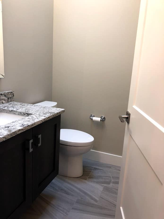
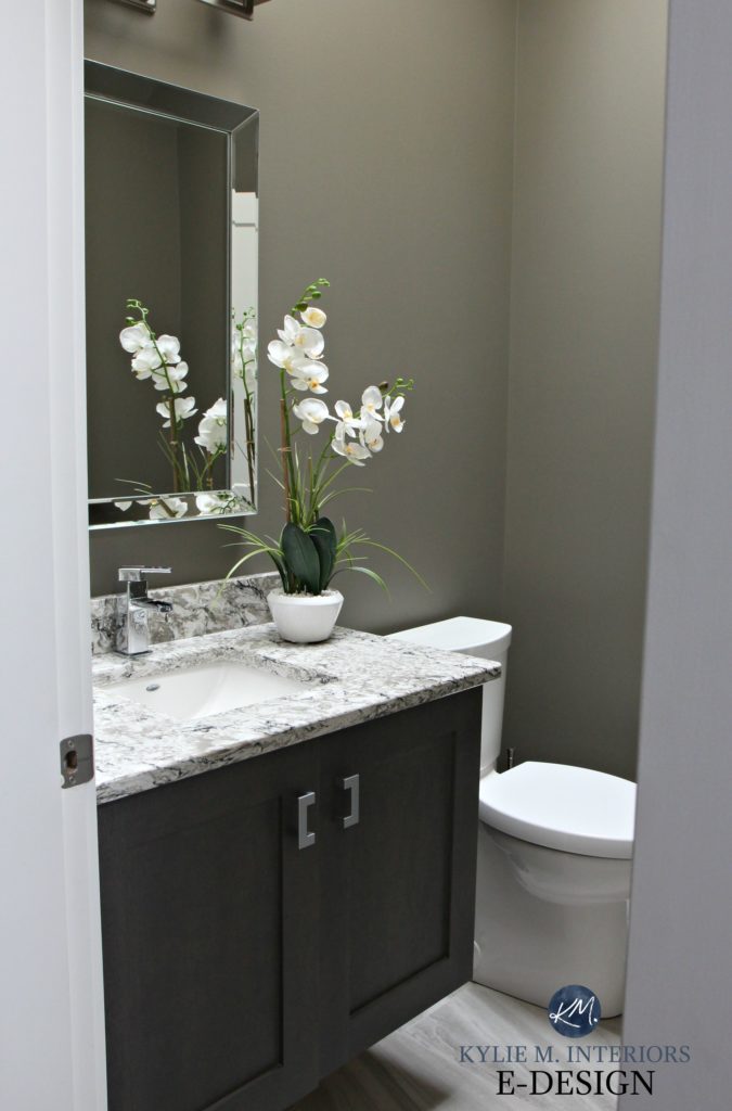
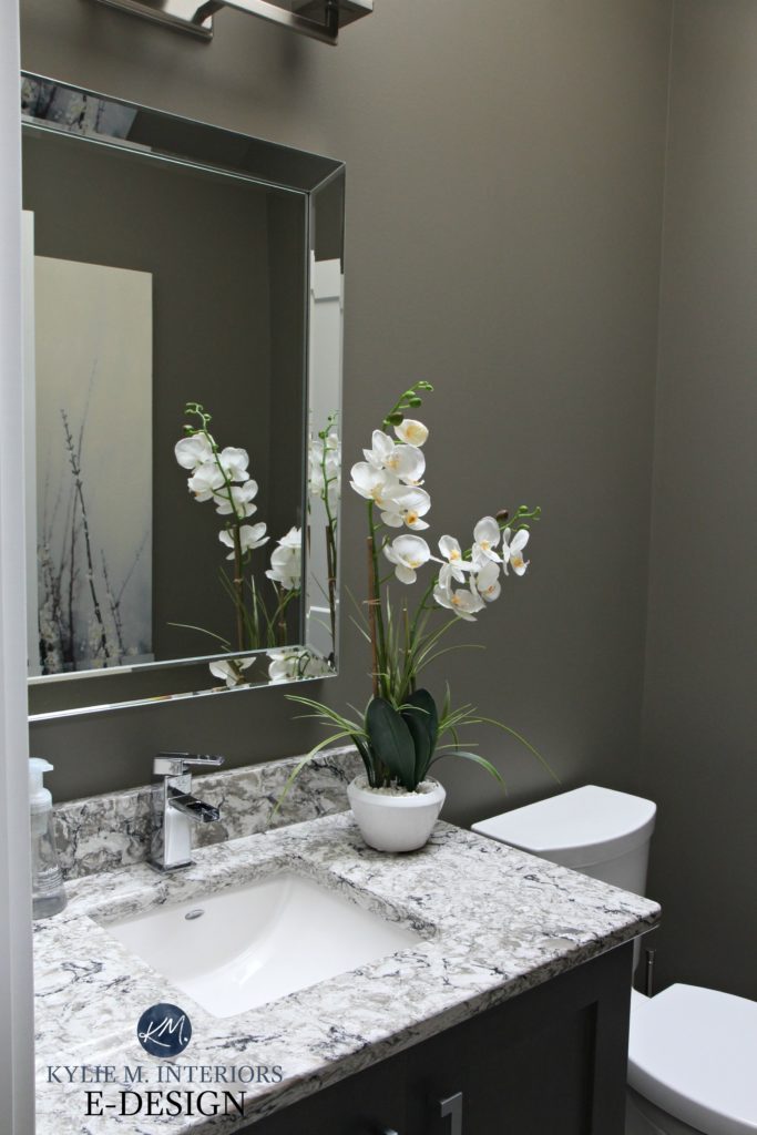
Sherwin Williams Anonymous adds depth and interest to the room and goes fab with my oversize artwork, which you can JUST see in the next photo.
So, whereas I’m not TOTALLY loving the gray nature of this home, by adding cooler colours with some DEPTH, I’m able to make things feel a bit cosier.
My office is ALSO off the entryway, but we’ll save that black beauty for another blog post (or not – hopefully, we’ll just sell this bad boy and move on). That’s right, a black office, just like last time!
Looking from the front door toward the living room is a tricky shot with the light coming in. Out that window is the ocean view, but I definitely don’t have the skills to get that AND the interior at the same time! The best I have is this before shot (with my phone).
In photos like these, it’s hard to see the shift in paint colour as the first photo wasn’t the best quality. And of course, Sir Douglas has to show up to the party…
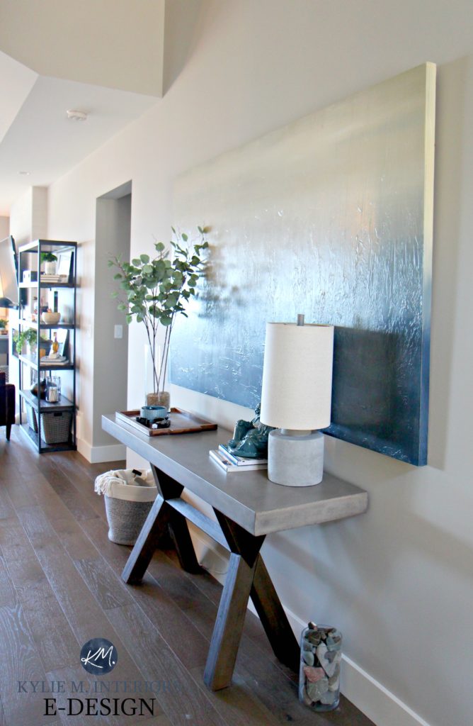
I had used this MASSIVE, seven-foot canvas piece in our last entryway and LOVED it. I’m so glad we have the perfect wall to accommodate it in this house too…
So there you have it – the beginning of our adventures with this house; stay tuned to see whether we keep it or if there’s already a for sale sign on the lawn.
READ MORE
Our Kitchen & Dining Room Remodel
The 12 Best WHOLE HOME Gray & Greige Paint Colours
The Best Warm Paint Colours That AREN’T BEIGE!
4 Tile & Shiplap Ideas for a Small Bathroom
NEED HELP WITH PAINT COLOURS?
Check out my affordable and FUN E-design and Online Paint Consulting packages

Chat soon,

ORIGINALLY WRITTEN IN 2018, UPDATED IN 2022 FOR GENERAL ERRORS
Share this!

Comments
Leave a Reply
More Posts

How to Turn Your House Into a Home: A Case Study
5 WAYS TO CREATE A HOMEY-HOME: A case study of OUR house! Between Pinterest, HGTV, Instagram, and design magazines, it’s easy to get caught up in what’s trendy and hipShare
Read More
KYLIE M’S 5 COLORS OF THE YEAR: 2024 Collection
REAL HOMES, REAL PEOPLE, REAL COLORS! When choosing my top colors for the year, I’m looking for colors that INSPIRE. Colors that talk to people (mind you, every color talksShare
Read More

Are White Walls, Cabinets & Exteriors Still Trendy for 2024?
Is the ALL-WHITE HOME still in style? Is white still in style as a paint color and interior finish? Are people still doing white cabinets, countertops, walls, and exteriors? AreShare
Read More


Links to 7 foot canvas?
Thanks!
Author
Hi Kelly, sad to say, but it’s from Home Sense, I would’ve LOVED to guide you to an online source!!!
Hi! Where is the entryway bench from?
Author
Thanks for asking Lisa, but sadly it’s from Home Sense, so it’s just a random purchase! We don’t have much for shopping around this town…
Love it so much! Question: did you make Collonade Gray 25% lighter everywhere or just the stairwell?
Author
Hey Brooke! Nope, I did it the 25% JUST in the stairwell (and on 2nd floor as well, which is many moons from being shown in a blog post), just to tweak it. With this layout, I wanted the same colour flowing throughout and LOVED it for the main level with hard wood flooring, but didn’t love it with the carpet – the 25% did the trick!
Pardon my ignorance, but how do you make the colour 25 % lighter? Do you add 1 litre of base to 4 litres tinted?
And how do you mix it?
Author
Hi Cathy, it’s all good, it’s hard to know what you don’t know! What you do is ask the paint store to lighten it for you – they then adjust the paint recipe so you don’t have to do a thing!
Does lightening Collonade take the warmth away? I have it throughout my home and love it but think I would like it a tad lighter if it kept the warmth.
Author
I did the 25% lighter and didn’t find a huge change in TEMPERATURE, personally – it was a very soft subtle shift ;).
Okay, I’ve packed my bags and bought a tent and I’m coming to live on your property. You’ll never know I’m there, and I’ll keep the cute doggy for company. This house is fabulous, although the pictures on my computer don’t do any justice to the paint colors, I guess I’ll just have to see it in person. It’s just amazing to me how you are able to choose paint colors and how to alter them to get the color just right. Really Kylie–just lovely! Do we get to see the outside?
Author
Well thank you Valerie, it sounds like you’ll have some company in your tent – we’ll have our own little tent city around here! I am excited to show you guys the rest (but the exterior ain’t no screamin’ glory, i mean it’s cute, but it’s the VIEW that is the selling point on this one 🙂
Hi Kylie,
I just love your post. And this transformation is just as beautiful as the others I have seen. I definitely will have to hire you as my paint consultant! My home faces North. I have had a heck of a time choosing paint and still not successful after referring to all your post regarding that. I too love warm colors which is good, but I am still a Beige girl for wall color. You will be hearing from me.
And I think Sir Douglass is adorable.
Great job again. Would love to live there as well. Maybe my husband and I along with our two dachshunds could pitch our tent next to the other gals. Lol
Author
Hi Penny, thank you! Yes, north facing light can be quite a challenge, that’s for sure (have you looked at the likes of SW Canvas TAn or Neutral Ground?). Anyway, Douglas says thank you and you can grab a tent anytime you like!
The new colors are definitely an improvement, especially the powder bath. That color is perfect with the floor & counter.
Author
Thank you Beth, I am in LOVE with the powder room colour, it’s pretty cool!
Great post! What would you say the closest Benjamin Moore color is to Collonade Gray? Thanks!
Author
Thank you Laura (and my maiden name is Mack, funny!). So, REvere Pewter is ‘similar’ to Collonade, but RP is more inclined to pick up the slightly muddy green tone for sure, same with Seattle Mist. London Fog is ALSO similar, but in comparison, Collonade looks more green as London Fog has a more taupe base!
As always – Love it! I love the accent color on the door, and on the stairwell wall – it makes such a difference! And I hear you about the sun….I crave it. I purchased my current and previous home based on the fact that they faced the south.
Are your interior door knobs/hinges and light fixtures oil rubbed bronze or black? Do you have a link for the door knobs? And I’m thinking the light fixtures might be Ballard? Seems like so many people do brushed silver these days, but I still love the dark knobs/light fixtures and the contrast they make against white/light colors.
Can’t wait to see the rest of your new home 🙂
Looks fantastic Kylie! I love the colours you have chosen. Looking forward to seeing the rest. Just wondering…what colour did you paint your ceiling? I’m painting ceilings these days and always curious about what other people have used. : )
What a beautiful house!!! I would never want to leave that view….ever ! Love your colors and that cute little doggie!
Author
Well, thank you my Deedra 😉
Love your posts and photos and sense of humor! Have learned so much. Though I wonder where you live that the sun rises in the West and sets in the East?
Author
Did I really write that? IT’S A MIRACLE! Or maybe I wasn’t thinking straight…that’s what happens when I have a glass of wine while blogging…
Hi Kylie,
I like it. I went on SW site and can only find colonnade gray. One l and two n’s. Is that the one?
Thanks,
Julie
Holy spectacular view, Kylie!!
Everything looks ah-mazing. On my phone the old paint color comes through as a close revere pewter. Obvi that’s not the case. Beautiful bathroom as well.
I get the sunshine thang. We are adding on a sunroom/family room (call it what you’d like) and a covered deck (timberframed). It faces directly west. My kitchen however is the third room back from the deck. The sunroom has a wall of windows and doors but it’s a tricky deal to make sure to get the light to reflect into ma kitchen/dining area. I feel your angst! All the men say I should leave the wood natural (timbers on deck, wood decking, pine 6” ceilings). But heck NO lol. White ceilings on both the deck ceiling and the sunroom ceiling. And a greige color match for my timber frame. Going for a more refined look. Not a rustic look. The rustic look has its merits as well, but the current lack of light (aka sunshine) lol made my choices a no brainer. Cannot wait for the white painted wood ceilings!!!! Old song from the mamas and the papas comes to mind: “Where’s the sunshine….let the suh-un , shine innnnn” hehe. RobinSorry. Had to lol. Anywho, can’t wait for the rest of your story. Hurry so we can see more! Your dog looks so dignified in that pic lol. He totally owns that shot. Thanks for sharing. Inspiring to say the least.
I always look forward to your posts and this one yielded stunning results! Those views would have been difficult for me to pass up as well even with the northern exposure. When I bought my house 2 years ago a northern exposure was my number one ‘nope’! I’ve learned to live in harmony (though still don’t love it) with Edgecomb Gray. My struggle has been too much green in my sw facing bedroom from Anew Gray. I recently picked a sample of Collingwood and so far am pleased with the color board…if this doesn’t work I’m going to hire your services because that bedroom is killing me!
Author
Thank you Mickie! It is quite lovely and like you, I’m learning to love it…kind of. And that’s funny that Anew Gray is flashing green on you, do you have decent trees/landscaping outside your window? Anew Gray is just generally not a greenish colour! And I DOOOO love Collingwood. You’ll find it lighter and a bit more fresh than Anew Gray as it’s a warm gray with a wink o’ purple undertone in it. Now i don’t know what your room looks like, but locally, I went to a client’s home to get some photos where we did Balanced Beige in a south facing room and DAAAAMN it’s pretty! I can’t attach photos here, so I’m going to send a few to your email for you to see the general vibe, maybe it will help!
What a different entryway form your last home!
Both beautiful but this one with nature popping out in front of you WOW! beautiful view and colors.
Oh, those gorgeous views! Kylie, thanks for the sneak peek and sharing the process of transforming your new place into one in which you feel more comfortable. Hearing what’s going on in your head regarding your paint selections and your challenging light situation is very interesting to me and provides valuable information from which to learn. Looking forward to more.
Oooh, I really like this one! Do you think it will work with a east facing home with minimal natural light? I tried accessible beige, but it is too golden for the look I am trying to achieve. I was about to tell my painters agreeable gray. eeek! how do
Collanade and agreeable gray compare?
Author
Hmmmm, well, you might find it a touch heavy, but that being said I haven’t seen your home and it’s finishings! Between Collonade and Agreeable they are both a bit tough for eastern light that is super low…keep in mind that AGreeable can look a bit gray-blue at times. Collonade can too, but tends to prefer a very (very) vague green…
You wrote that Canadians wishing to hire you can drop you a line to have a CDN dollar invoice but I can’t figure where to do that? Looking for front door consult.
Author
Hi Lee, I’d love to help! Send an email to kylie@kylieminteriors.ca and we can get that going!
~Kylie
Another great post! I LOVE what you have done so far. I’m usually a BM girl but really like how Collonade Gray looks in all of your pics. (I am burned out on Revere Pewter) …and your bathroom? Hard to believe just a color change can improve it so much. You are fabulous! Can’t wait to see what is next!
Author
Well thank you Mindi! I’m loving the SW colours and quality of their paint – definitely!
Beautiful! Could you share the link for the light fixture in the foyer?
Author
Hi Mary, it was a few years ago now, but I believe it was Bm Black 2132-10!
What color trim did you pair with Colonnade Gray? Looks great!
Author
Hi Sarah, thank you for asking! It was there when we moved in and it’s BM White Dove (my FAVE go-to white trim colour…)
Hi Kylie, what color is the ceiling? Love it!
Author
Ooo Jen, good question. The ceiling colour was there when we moved in and I’m inclined to say that is was similar to the trim, which I’m sure was BM White Dove :). What I might do, if I were to PICK a white to go with Colonnade is to take White Dove and have them add 4-6 drops of white to the gallon, just to clean it up a wink ;). I might also check out SW Pure White which is whiter and cleaner :).
Hi Kylie, Can I ask a few questions about your powder room
Powder Room Vanity
What kind of wood is the powder room vanity made of is it Maple? Where did you purchase it? We are having a very hard time finding a 30 inch vanity in a espresso finish with shaker style doors like yours.
Powder Room Mirror
May I ask where you purchased the mirror from
Thanks so much! Beautiful House!
Author
Hi Marie! That vanity was actually in place when we bought the home. It is maple with a shaker style door and I’m sure it would have been Merit Kitchens or maaaaybe Mid Island cabinets – I’m sure it was custom made vs prefab :). As for the mirror, it also came with the house, but I’ve seen some like it on Wayfair, Home Sense and sometimes Lowes/Home Depot!
What paint color is the white trim?
Author
Hi Jenae, that’s BM White Dove!
I have this color in my living room that’s north facing and I love it but hate it in my kitchen. My kitchen has cherry cabinets and it looks so dull and dark. Should I try cutting 25% all over or just go with a different color? I’ve been looking at accessible beige if I change.
Author
Hi Tiffany! I did Colonnade Gray lightened in one area of our home and liked it, I lost a bit of the green undertone, but it wasn’t a HUGE shift and it sounds like you want more of a change, which means you may want to explore another colour!
Hi Kylie!
Would you ever do an accent wall (the geometric wood ones) in a dining room using urbane bronze (Colonnade walls, pure white trim and urbane bronze front door)?
Love your home and advice! It’s been super helpful!
Hi Kylie, Thank you for sharing pictures & paint colors of your beautiful house. I would never leave! SW Collonade Gray’s LRV is 53, when lightened 25%, does the LRV or color becomes much lighter (around 60 LRV)? Or just barely noticeable difference in terms of lightness? Trying to get a paint color around 60 LRV that’s neutral and relaxing and Collonade looks really nice here!
Author
Hi Aggie! Well, I find that 25% is more like 3-4 points, more subtle for sure, but it does shift depending on how much black is in a colour :). What about Agreeable Gray?
Hi , I’m wondering if you have the link for the big entryway light. It is so pretty and I love how it has 2 rows of light. We need an entryway light that gives off a lot of light.
Author
Oh I’m sorry, I don’t – it was there when we bought the home, but I do know that there’s a VERY SIMILAR one on Wayfair!
Super! Thanks so much!