
Posted on February 18, 2022 by KylieMawdsley
Gray & Gorgeous: A Classic, Contemporary Home
Creating a beautiful home from the ground up is one of the most satisfying parts of my work and this STUNNING home was no exception! Working with a palette of predominantly gray, white and black, we created a home with warmth, class and the perfect backdrop for the homeowners exceptional art collection.
And while some gray homes are already out of style as they went TOO hard into the gray trend, the majority of the finishes in this home will withstand the test of time.
Why?
Because they’re classic and timeless – not just trendy.
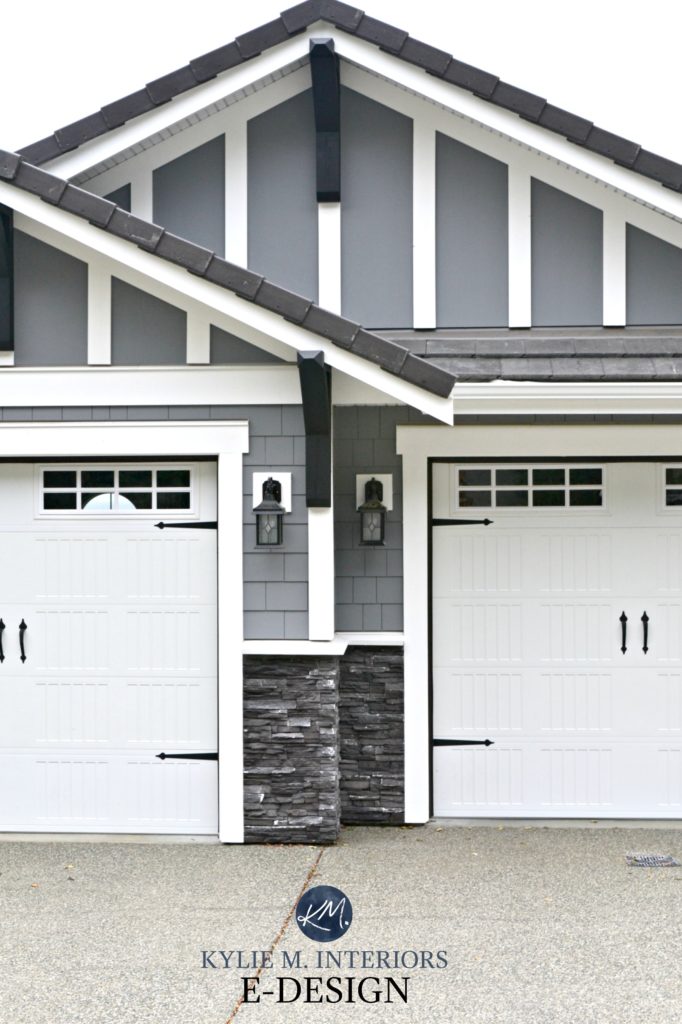
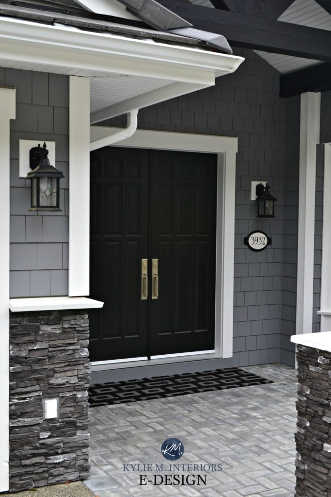
The color of the exterior is similar to Benjamin Moore Dior Gray with stark white trim and dark gray ledgestone. The striking black double front door is a focal point to this beautiful tone-on-tone home.
THE STYLISH ENTRYWAY: ARTWORK & AMBIENCE
The entryway is the space most people see first when they enter a home, and the one they see LAST when leaving a home – make sure your entryway leaves an impression!
With the double-front doors being tucked into a bit of a niche, we added a touch of drama and formality with a striking black colour (Sherwin Williams Tricorn Black) and beautiful black marble tile that was inset into the wood floor. It’s a sharp, clean palette paired with Benjamin Moore Oxford White wainscoting.
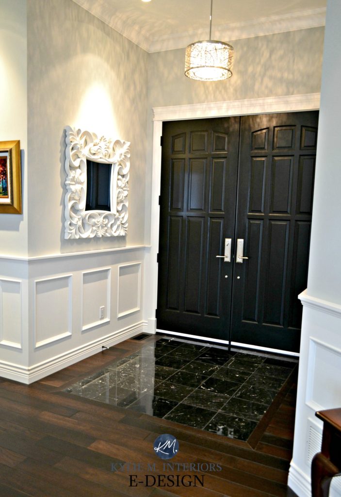
A home doesn’t need to be your personal style, for you to appreciate its beauty. So, while this style isn’t quite my jam (not even with peanut butter on it), I know we created a stunner. However, I would change the light to be softer, so it casts a less graphic light (I don’t get a say in EVERY choice). Even then, the overall look is curated, collected, and classic…
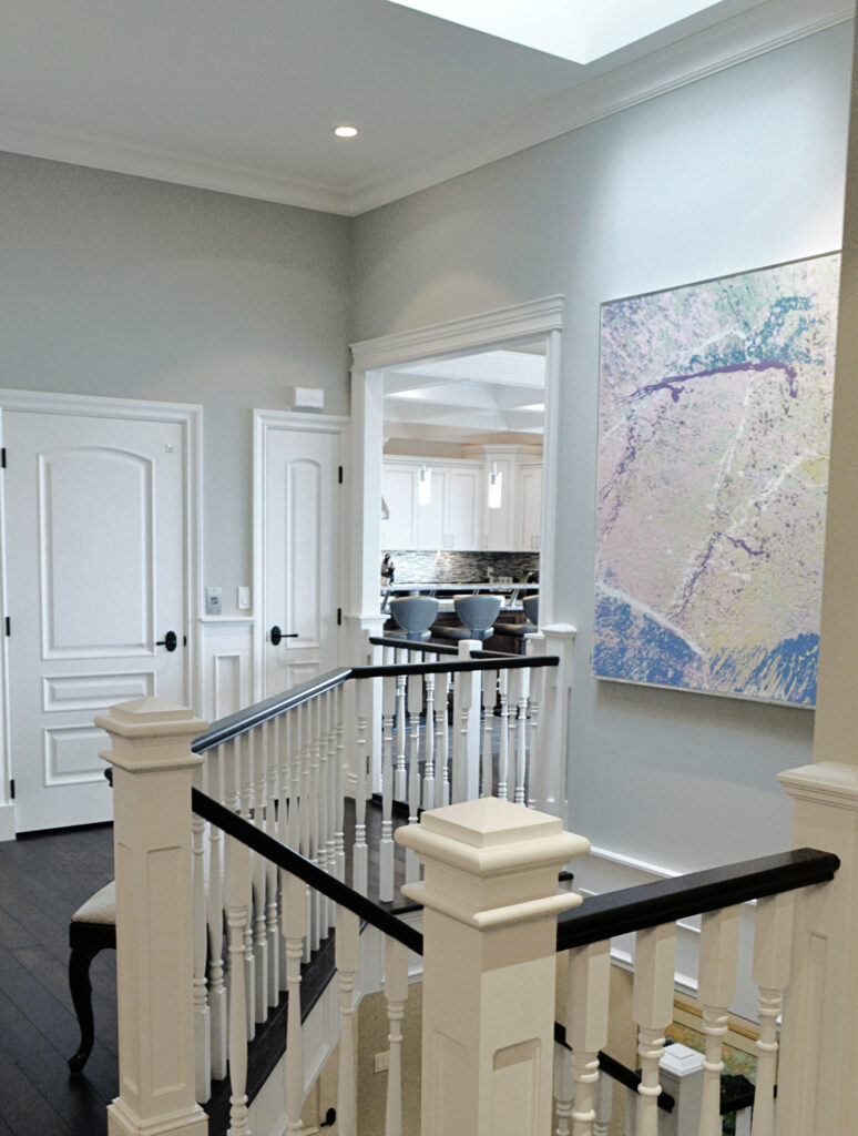
These homeowners have a HUGE art collection in a variety of genres. Many collectors lean towards classic shades of white when painting their walls. My clients wanted a slightly softer approach, using gray as a consistent backdrop. We chose Benjamin Moore Stonington Gray as the main color and supplemented it with a few different colors in secondary spaces.
Stonington Gray is a light shade of gray (on the HEAVY side of the light range). While it can look cool, it’s more of a stormy gray with subtle blue-green undertones.
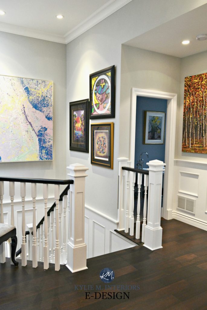
Stonington Gray is a great choice as it easily transitions into other spaces, as seen in the 1/2 bath (to the right in the above photo).
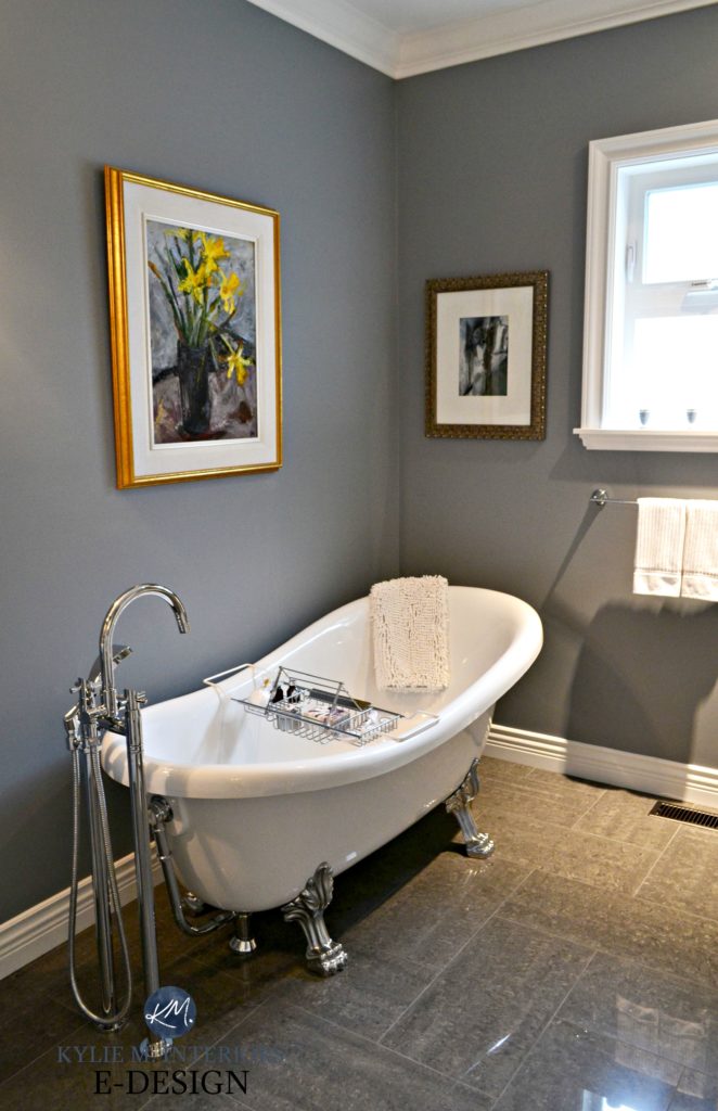
THE HALF-BATH/POWDER ROOM
In keeping with the gray theme but adding some drama, we chose Dior Gray for the powder room. Now, most 1/2 baths or powder rooms won’t have a sink, toilet, and free-standing tub, but my clients had particular needs for their home and this set-up was one of them!

Leaving the powder room and returning to the entryway, these next photos show how nicely the entryway transitions into the kitchen area…
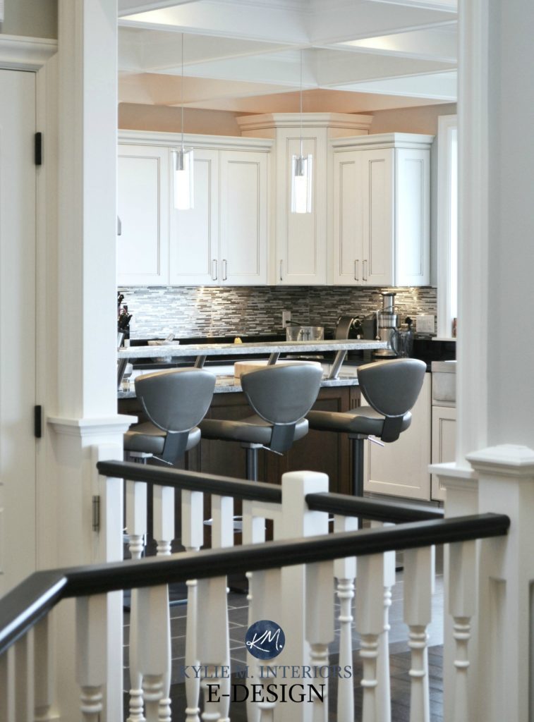
THE KITCHEN – GRANITE, MARBLE, & MORE…
This kitchen is a Chef’s DREAM with black granite perimeter countertops, Vancouver Island Marble on the island, and coffered ceilings. Because the kitchen is open to the dining room, living room, and entryway, the eating bar gives a small visual barrier between daily living and the messy bits (although, PERSONALLY, I’m not a huge fan of it).
The cabinets are painted Benjamin Moore Oxford White with a soft gray glaze to take the edge off. All trims, including the coffered ceiling areas, are Oxford White as well.
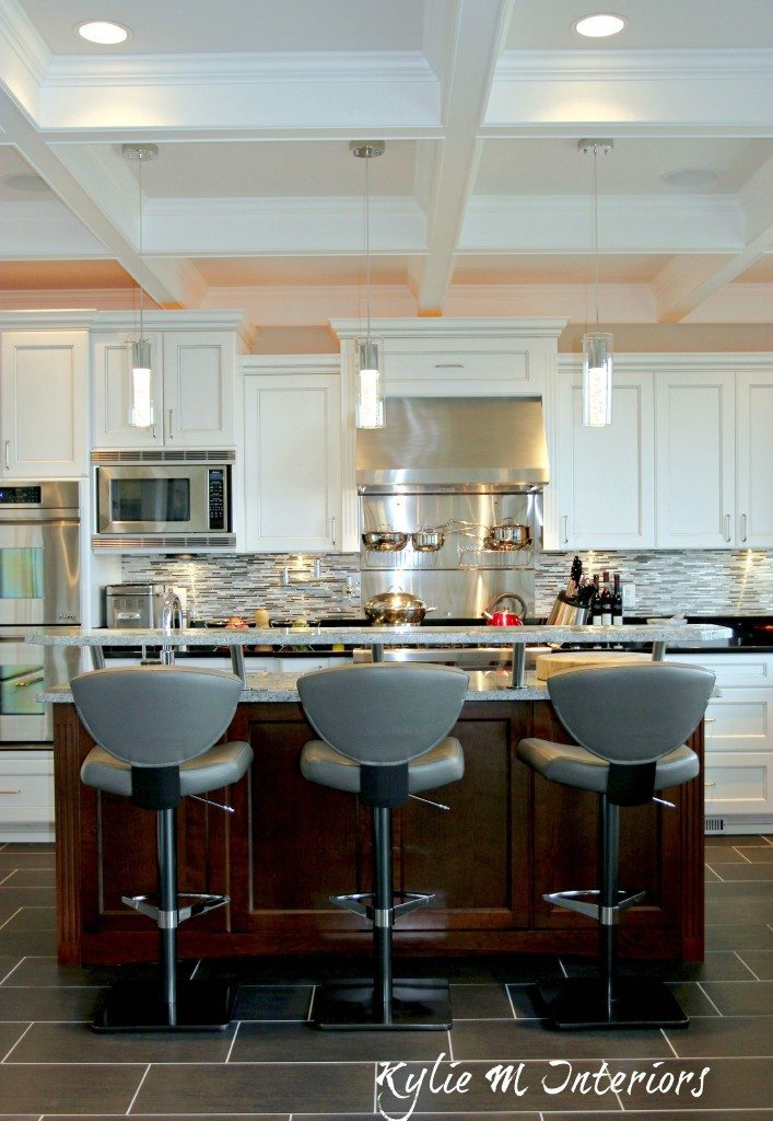
Many people wouldn’t do white grout in a kitchen, but for this super tidy, low-key couple, white grout won’t be a hassle!
As for the sink area, I wish I had the photography skills to show you the GORGEOUS ocean view outside their windows – you’ll have to settle for the INSIDE view!
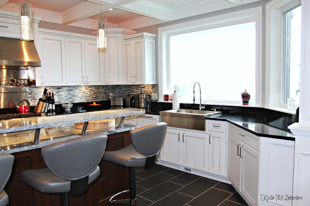
This kitchen was designed almost ten years ago and the owners planned on living in it for a looooong time, so they wanted to love it for themselves!

However, for mass appeal and CURRENT trends, a few things could be updated (without spending a TON of money). Sure, I’d love to see all new countertops and would run the wood floor right through the kitchen, but often, there’s a good happy medium with a few smaller changes…
- the glass and stainless steel mosaic tile backsplash – either run the black granite up the backsplash or do a subway tile
- remove the raised eating area on the island and possibly do a new island slab – not that marble isn’t timeless, but you’d need a bit more depth for eating once the raised area is removed
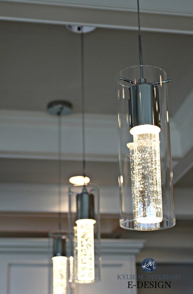
- do solid white pendant lights, not champagne-style ones
- consider repainting the cabinets white WITHOUT the glaze
- soften the look with less modern/contemporary bar stools
- less open wine storage
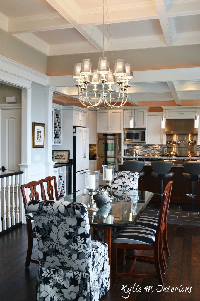
Moving along to the dining room and living room…
How to Create a Timeless Home – 4-PART SERIES
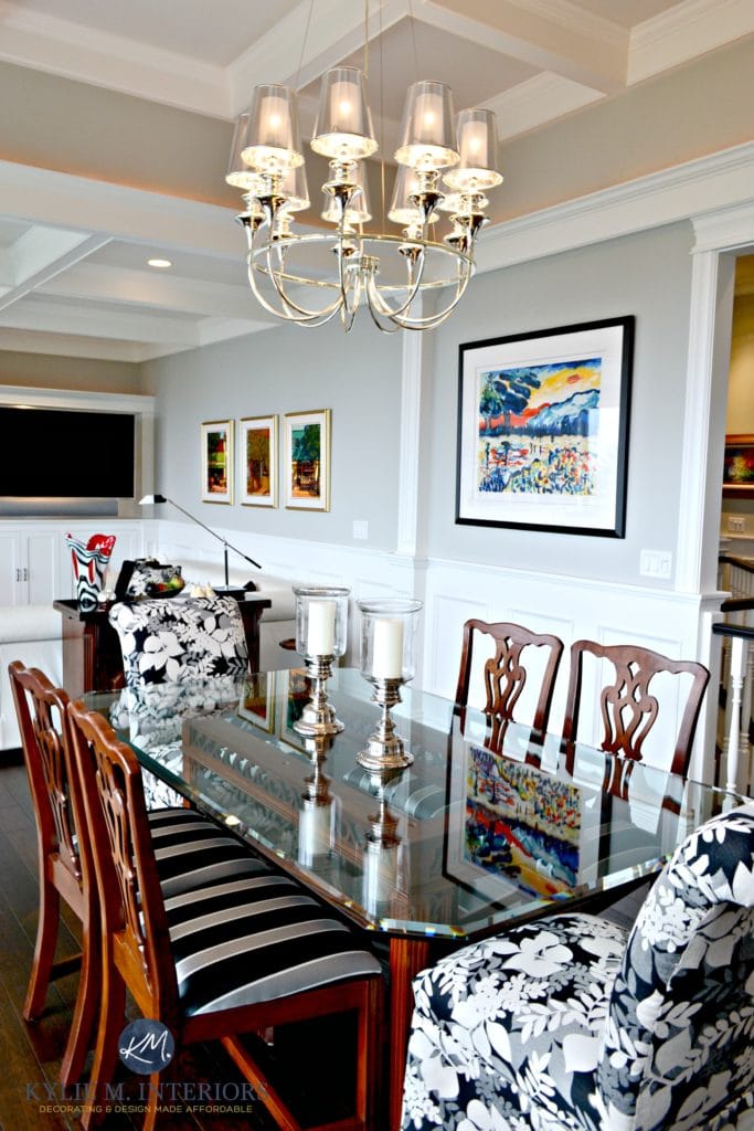
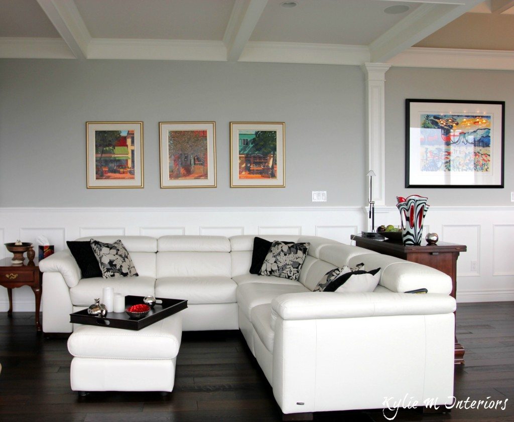
A CONTEMPORARY-STYLE LIVING ROOM & DINING ROOM
The homeowner wanted to use her old dining table and chairs, which have a less contemporary, and more traditional vibe. In the ideal world, the chairs would be a bit more modern, but this set gives the space a bit more of a homey, collected look…
The Right Height to Hang Artwork & Mirrors
As for the living area, their beautiful art collection is, once again, in its glory with white wainscoting, gray walls, and a classic marble fireplace surround…
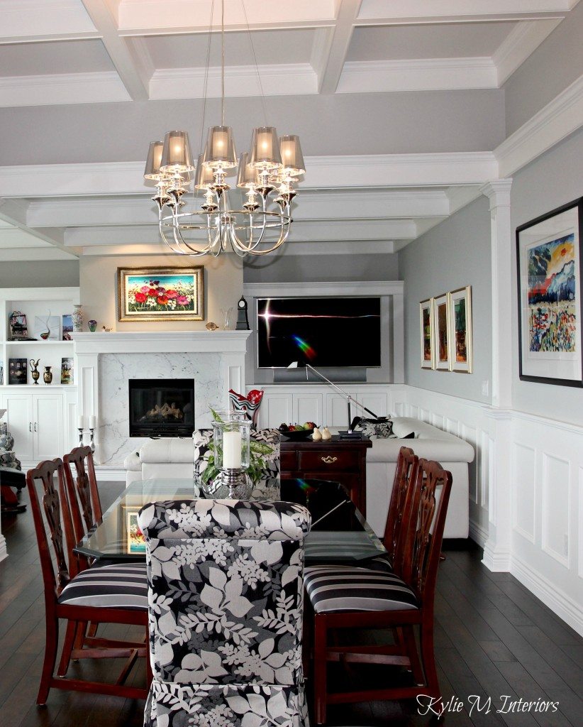
The living room is simple and understated. Sadly, I don’t always get full control of the furnishings and decor (even when my soul is BEGGING to intervene!)…
How to Choose Your Home’s Best Shade of White
Here are a few suggestions to make this living area even more beautiful…
- a textured, solid-color rug to add some softness and anchor the furniture pieces
- I would also simplify the toss cushions with more solid colors
- a table lamp on the left with a matching floor lamp on the right
- OR, a longer sofa table/console behind the sectional, with a lamp on either end of it
- nothing on the ottoman
Thank you for visiting – I hope you enjoyed this home as much as I did!
READ MORE
Is Gray Outdated on Walls, Cabinets, & Exteriors?
The 12 Best WHOLE HOME Gray & Greige Paint Colors
The Ultimate GUIDE to Choosing White Paint Colors

NEED HELP?
Check out my Online Decorating and Colour Consulting Services – I’d love to help!
ORIGINALLY WRITTEN IN 2016, UPDATED FOR GRAMMAR AND WHATNOT IN 2022
Share this!

Comments
Leave a Reply
More Posts

How to Turn Your House Into a Home: A Case Study
5 WAYS TO CREATE A HOMEY-HOME: A case study of OUR house! Between Pinterest, HGTV, Instagram, and design magazines, it’s easy to get caught up in what’s trendy and hipShare
Read More
KYLIE M’S 5 COLORS OF THE YEAR: 2024 Collection
REAL HOMES, REAL PEOPLE, REAL COLORS! When choosing my top colors for the year, I’m looking for colors that INSPIRE. Colors that talk to people (mind you, every color talksShare
Read More

Are White Walls, Cabinets & Exteriors Still Trendy for 2024?
Is the ALL-WHITE HOME still in style? Is white still in style as a paint color and interior finish? Are people still doing white cabinets, countertops, walls, and exteriors? AreShare
Read More


Absolutely love your style! Your truly a gifted artist! Thank you for share! Would love to see even more! View Nig your work is like my Disney land! Mrs. G
The exterior stone looks great. Can you tell me the maker?
Author
Hi Joe, sorry I can’t – it was several years ago from a different supplier!
Where can I find those awesome lights over the kitchen island?
Author
Hi Dixie! Now it was QUITE a few years ago and they actually came from Costco! Amazing, since the walk-in closet light was $800 – these bad boys were affordable and did the trick!
Gorgeous home!!
Author
Thank you Danna! It was fun to work on something more contemporary!
Where did you purchase the oval house number with the white background?
Author
Hi Jamie! It was actually my clients who purchased that, but I do know they sell similar ones on sites like Wayfair!
Beautiful home! What height were the ceilings for the decorative trim? Thank you!
Author
Oh it was many moons ago now, but I believe the ceilings went from 9′ up to 11′, depending on the room!
I really like the way you did to this house inside and outside!
Do you know where I can get the siding from? the shape and the color are excellent!
I love the BM Dior Gray!! We are in the process of building and I am desperately trying to find the perfect gray. My builder only uses Sherwin Williams colors. Any idea if SW has a color very close to Dior Gray?
Thanks!
Author
YOu know, Dior Gray is wicked cool, but I’ll warn you that’s not quite the perfect gray as it does have quite a bit of purple in it (understatement)! If you like that general look though, check out SW Pewter Cast, Summit Gray and Gray Shingle. I don’t know what you’re using it for (interior/exterior/whole home/1 room) but these colours can be a bit more liveable as the undertones drop back 🙂
What color are the windows? Are they white or black? You have any pics the whole exterior of the house?