
Posted on October 10, 2017 by KylieMawdsley
Pay close attention to my blog post title…
2018 Colour of the Year: Behr – In the Moment
Usually I would say…
Behr’s 2018 Colour of the Year – In the Moment
There is importance in the order of those words as not only is this BEHR’S colour of the year, I think it is THE colour of the year.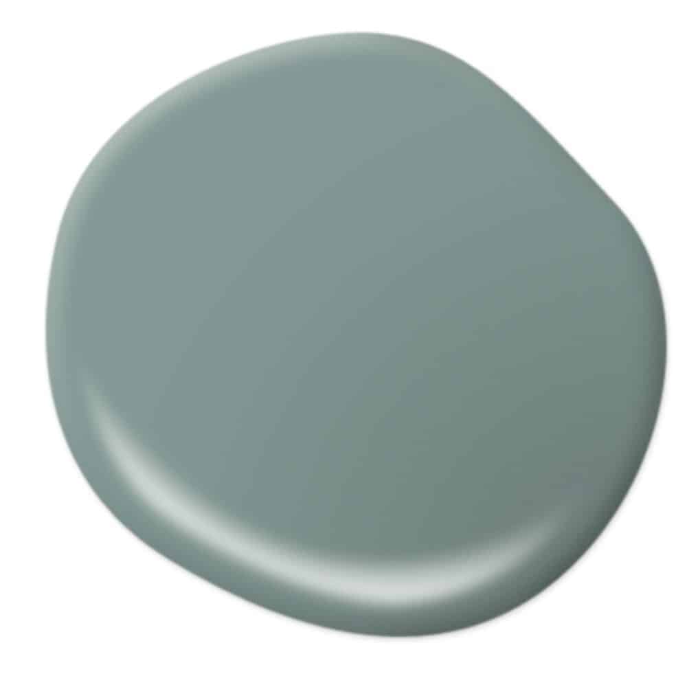
Why? While I might have a hankerin’ for SW’s colour of the year – Oceanside, and am SURPRISED by BM’s colour of the year – Caliente, I feel like In the Moment is THE colour of the year because it does something that the others don’t – it talks to us.
Read more: Colour Review of Benjamin Moore Caliente
Read more: Kylie’s Colours of the Year – Real People, Real Homes
Wait, maybe that’s the wine because Doug (my dog) is also talking to me. Really though…
In a world full of so many unknowns, with so much turmoil, I think we NEED a colour like In the Moment to remind us of a few things…
That all that matters is right here…
To be grateful for what is…
To worry less about what might be…
And to pick the prettiest gosh darn colour for our walls as we can…
A colour that soothes, a colour that calms. A colour that is the backdrop to a room filled with people that we love. A colour that makes us take a deeeep breath and even if just for a second – helps us stay in the moment.
HOT DAMN, you don’t see me get that serious very often – TIM, GET ME MORE WINE!
Now let’s take a closer look at this bad boy…
What type of colour is In the Moment?
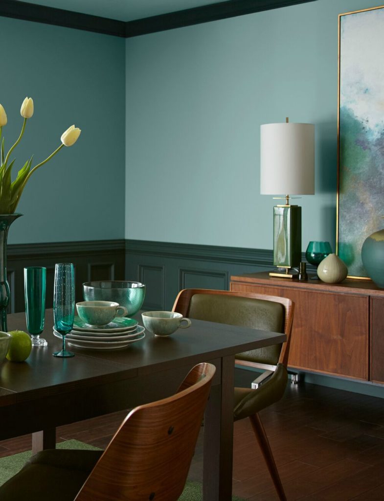
It is a medium toned, blue/green/gray blend. Which way does it lean? You know, it’s hard to say. I haven’t experienced this colour hands-on in my home and I only have a wee nugget of a swatch in front of me, but what I see is a pretty well-balanced blue/green colour with a neutral gray backdrop. Some might call it sage, others might call it an earthy kind of teal. I call it just lover-ly.
What is the LRV of In the Moment
If you don’t know what LRV is, you should take the time to read my blog post ‘LRV – Everything You Need to Know‘, as you’ll find it helpful when trying to pick a paint colour.
The LRV of In the Moment is approx 30-32 (I’m just waiting on an answer from Behr). This means that it has more visual weight to it than the average colour (which might sit between 55 and 65). It would be more of a ‘medium tone’ rather than a light tone.
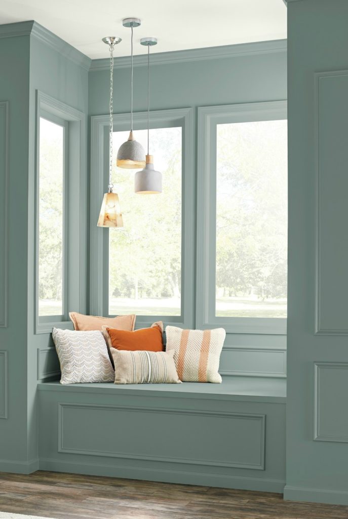
Where will In the Moment work?
Because In the Moment is in the 30-ish LRV range you could consider it for the living room, dining room or kitchen, but I wouldn’t use it in ALL 3. Why not? Colour can get overwhelming. It’s the same reason that I (as a Ginger) don’t wear red or orange very often – there’s something to be said for ‘too much of a good thing’. Colours come to LIFE when you create a well-balanced palette AROUND them, rather than committing to them on a scale that is maybe a bit too big (and just to clarify, there really is NO such thing as too much Ginger…).
Photos via Behr
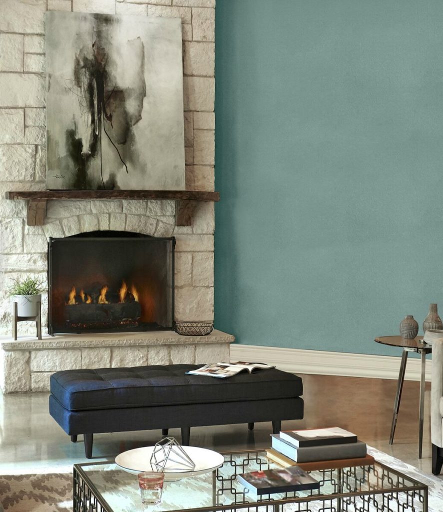
In the Moment as an accent or feature
Whether you do a feature wall or painted furniture, In the Moment is a great way to shift things without being too punchy or high contrast.
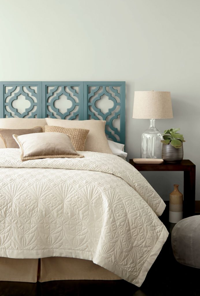
Photo via Behr
I love it on the headboard above, but would love it even MORE as a feature wall or in the WHOLE room!
BTW, for painting furniture, I’ve had TONS of luck with Behr Ultra (eggshell finish, surprisingly enough). I HAVE found that Behr paint sheens are slightly more enhanced than many of the other brands, which is why when I use Behr paint I often use their flat/matte on my walls and eggshell on furniture.
SHUT THE FRONT DOOR!
I LOVE the idea of In the Moment on the front door – inside OR out!
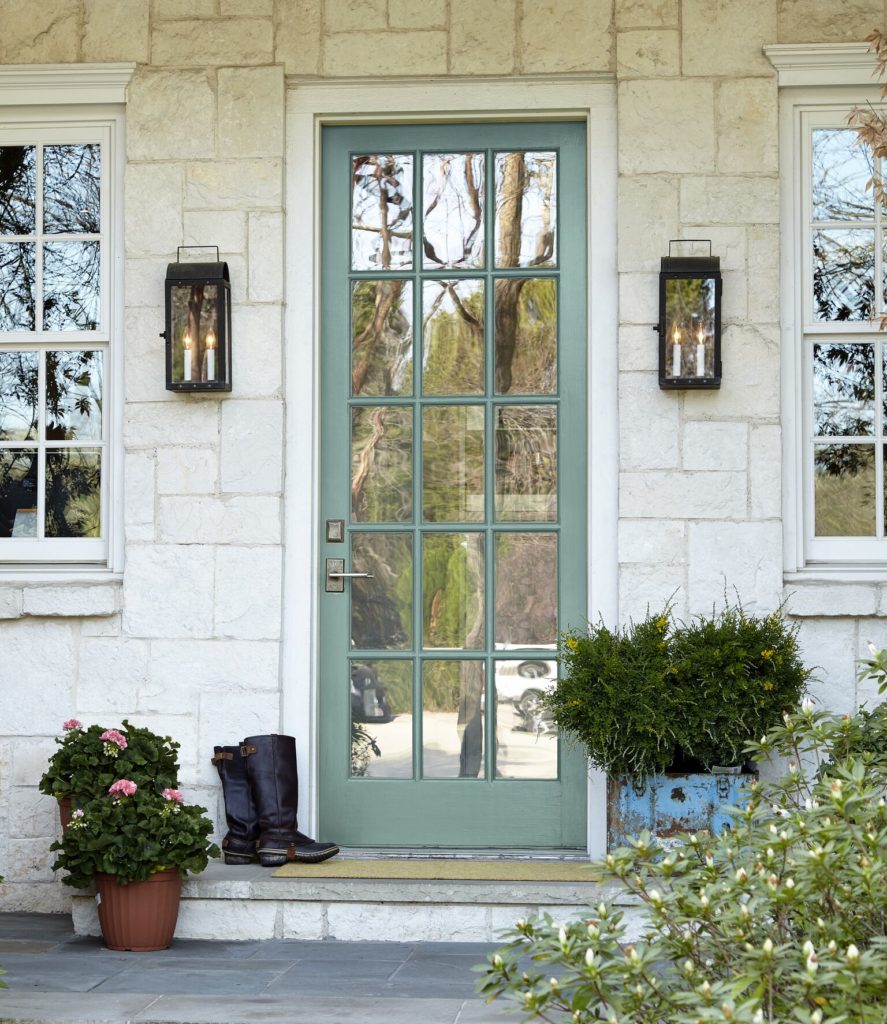
On the inside, it would add a beautiful touch to a beachy, neutral palette. On the outside, it would add a bit of colour to a neutral home without being too punchy or like it’s starving for attention.
In the Moment on the exterior
MAD love.
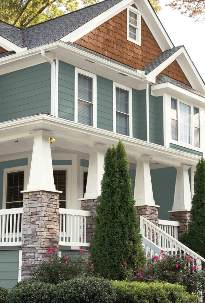
I love this blue/green blend on the exterior and how it BOUNCES off the cedar shingles and white trim!
In the Moment in a kitchen (walls OR cabinets)
A lot of my E-Design clients are looking for that PERFECT blue/green for their farmhouse, country home and this one could certainly fill the bill!
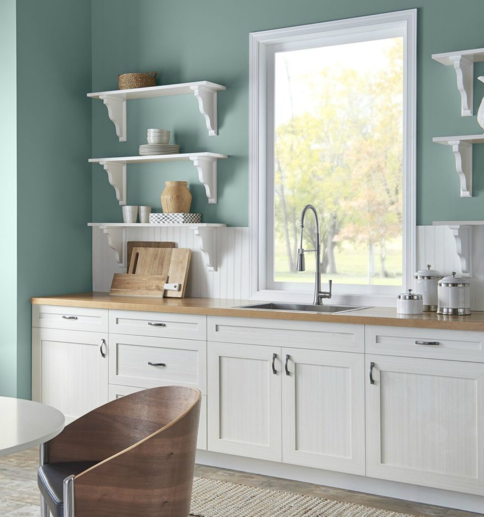
In the Moment is a great backdrop to white cabinets, giving a fresh, family-friendly vibe!
My fave colour with In the Moment
Well, there are a LOT, but I would say my fave colour, which bounces nicely without COMPETING would be Graylac T18-03. This is a beautiful, soothing purple/gray blend that plays well with the more cool, beachy vibe of In the Moment.
And BTW, I don’t get paid for ANY of these blog posts. No moula, no wine, no sensual massage or pat on the back. Just personal high fives to myself and the satisfaction of knowing that you guys are getting info that is easy to understand and applicable to your homes.
Read more: The 8 Best Blue and Green Paint Colours
Want to know if this colour could work for you?
Check out my fun and affordable E-Design and Virtual Colour Consulting Packages

Chat soon,

READ MORE
Read more: Colour Review of Benjamin Moore Caliente
Read more: Kylie’s Colours of the Year – Real People, Real Homes
Share this!

Comments
Leave a Reply
More Posts

How to Turn Your House Into a Home: A Case Study
5 WAYS TO CREATE A HOMEY-HOME: A case study of OUR house! Between Pinterest, HGTV, Instagram, and design magazines, it’s easy to get caught up in what’s trendy and hipShare
Read More
KYLIE M’S 5 COLORS OF THE YEAR: 2024 Collection
REAL HOMES, REAL PEOPLE, REAL COLORS! When choosing my top colors for the year, I’m looking for colors that INSPIRE. Colors that talk to people (mind you, every color talksShare
Read More

Are White Walls, Cabinets & Exteriors Still Trendy for 2024?
Is the ALL-WHITE HOME still in style? Is white still in style as a paint color and interior finish? Are people still doing white cabinets, countertops, walls, and exteriors? AreShare
Read More


I like these blues! And I think I saw that the BM color of the year is Caliente.
Author
Oooooh it is. I just put out a blog post about it – I was TOTALLY caught off-guard. Not too sure I agree with it as the Colour of the Year. I think I should do ‘Kylie’s Colours of the Year’ – you know, to tap into what the ‘everyday homeowner’ might actually use. Hmmmm……
Gorgeous! Would you recommend for a basement?
Author
Hi Rachael, you know, I just might! Even if it’s a bit darker (few windows) if there is enough interior lighting it could be really inviting as it isn’t too gray or flat looking.
I agree, Kylie. Definitely THE colour of the year. I was just reading earlier about BM’s colour of the year and though it’s a beautiful red, I wouldn’t want to do a complete room in it. I could see using it as an accent or a front door. I love “In the Moment”. I’m going to be checking it out.
Enjoy your post, as usual. Thanks.
Author
Hi Bert, I actually JUST put out apost re: BM’s colour of the year and how ‘it isn’t for everyone’. You actually touched RIGHT on those thoughts with your comment and i’m RIGHT with you on that!
Beautiful color; and my gray/ green leanings feel confirmed. And I have to agree, “there is no such thing as too much Ginger.” 😉
Author
Oh touche!!!! It is beautiful and could be lovely for YOUR home too!
Well bless your little ginger heart! What a fabulous post! I’ve been stressing BIG time trying to pick the perfect blue for my front door but tomorrow I’ll get In The Moment.! It’s perfect! Thanks, Kylie. 🙂
Author
Well, this is a great note to get, thank you Dori! It is pretty stunning, isn’t it (btw, you should send me photos when it’s done 😉
From your Ginger friend, Kylie
What a lovely shade! I just started painting by bedroom with Behr’s Silver Shadow, and WOW, is it full of tones of gray, green, purple and blue! HOW does Behr pack so many shades into one color? It is just amazing how this paint changes from wall to wall, and from morning to night. I hope you get a chance to look at this too.
Kiley, you’ve given me such courage to experiment with colors. Thank you!
Author
Oooo, that sounds like a good one for me to check out – I love sneaky colours! And I’m glad you’re feeling courageous – paint can be SO fun!!!
Hi Kylie. I have beach glass (BM) in my bedroom… very similar, but lighter than the In the moment, but it is great with white and green accents. also have similar to caliente (BM) in the downstairs “cave” as a feature wall… I am glad to see we are not too outdated… love the colors!! Marina Jones, Summerland PS – so enjoy getting your updates!
Oooh, yes, that colour is right up my alley! That just may be my new #1 choice for when we update the downstairs powder room. I think it would tie in nicely with the rest of the house!
If we are painting the whole house except bedrooms repose gray , is that too much gray ? Lack of color?
What would be a good color to complement repose , like for dining and kitchen ( we have pretty much a open concept home , except for a dividing wall that does not go to ceiling
Author
Hi Donna, Repose is lovely, but i might find it a bit heavy EVERYWHERE. I would be inclined to lighten it by 25% for some rooms, maybe even 50% just to take the weight away and give a bit of a shift.
If you’d like me to suggest some alternatives for you I’d refer to my E-design so that I can look at photos and your questionnaire, otherwise I’m just guessing! It’s affordable and fun if you’d like to check it out. I do try to give as much good info as I can on my blog and if that doesn’t work, it might be time for a closer look! https://www.kylieminteriors.ca/online-decorating-design-services/
Hi. Love your posts!! Would you recommend Agreeable Grey or Accessable Grey to compliment sage green accents/Behr color of the year?
Author
Hi Cathy, it would SOOO depend on the room and it’s furnishings/products/exposure. Particularly the exposure! Off the top of my head, probably Accessible Beige…
If you’d like me to look at your room, I’d refer to my E-design so that I can look at photos and your questionnaire, otherwise I’m just guessing! It’s affordable and fun if you’d like to check it out. I do try to give as much good info as I can on my blog and if that doesn’t work, it might be time for a closer look! https://www.kylieminteriors.ca/online-decorating-design-services/
Hi Kylie,
Your blog is amazing. I actually learnt a lot about paint colors.
I really like this Behr In the Moment color and plan to use it as an accent wall in my bedroom. So, I bought a sample and painted a square on the wall. Strangely, it looks darker than the photos from Behr…(actually a bit way darker). I am wondering if you recommend to lighten this color? Thanks
Author
Hi Jeremy! This can happen if you have say, a north facing room with lower light or a room with less interior lighting. Online images (especially pro ones) are edited and usually brightened. Try 25% lighter and see if that takes the edge off of it for you!
~Kylie
I LOVE this color! Quick question… I’m a Benjamin Moore junkie! I will soon be painting my very large open-concept formal living room/den/kitchen area. Would you use flat or eggshell based paint???
Author
Welllll, if you have kids/dogs I might do an eggshell. If you don’t, then a matte finish is nice. Matte also looks nice if there are walls that get a good amount of natural light, however it’s just not as washable as eggshell!
We just finished my husband’s office in Urbane Bronze (the flooring is a hickory, rustic looking). The sitting room, which walks into my husband’s office via an almost roomwide opening — so the rooms are partners, not at all separate — I want color in that room. Wondering if this would seem too dark or a strange contrast.
Author
Hi Eve! It depends on how dark/coloured you want to go in the sitting room and what the natural lighting situation is. As long as it is different enough from Urbane to be noticeable, if it’s too similar I think it could be odd.
If you’d like me to take a close look, I do have really affordable E-design, this way I can a look at photos of your room(s) and come up with some wicked options! https://www.kylieminteriors.ca/online-decorating-design-services/
Would you ever paint cabinets In the Moment? I would love a soft blue/gray cabinet color, but I have black appliances and thought In the Moment might be a good compromise without being too dark or cold gray.
BTW – you should check out Behr Smoked Oyster, it’s my favorite color right now in all my living areas! Soft, warm, red-toned gray (can sometimes look pinkish but not in an obnoxious overwhelming way), looks beautiful with brown uphostered furniture!
We discovered In The Moment here on Pinterest a couple weeks ago and (on the pages) fell in love with it! So…as we’re in the middle of a total home remodel decided to paint our dining room this color and we LOVE IT! You described it beautifully Kylie! It looks gorgeous against our huge window trim and also gorgeous with our dining room furniture! The rest of our house is all done in greige (neutrals) however we wanted a “signature” type room and In The Moment has created that! It’s been fun picking out “happy” colorful material to recover our dining room chairs with too!
Thanks for your post here! It’s a great color!
Laurie
Author
Well Laurie, that is just an awesome note to get – THANK you for letting me know! And you KNOW that I’d love to see photos of it all done 😉
So glad you’re pleased!
~Kylie
Thank you Kylie for this and all the great reviews! It really seems like Behr got it right this year! My wife and I were considering using this as an accent color for our upstairs hallway for a 2 story foyer (with tons of beautiful east facing light shining in) against something like Gray Owl, Shoreline or Wickham (or maybe Whisper – we’ll sample all 4). Curious if you’d just suggest having Ben color match, or would a BM color like Atmospheric, Mystic Lake or Sea Star look similar?
Hi Kylie.. I am doing this color in my kitchen ..would a greige go good in my living room which is next to kitchen ( open concept) and which greige would you suggest.. lot of lighting everywhere also. I have lighter oak distressed floors and this is lakehouse. I am thinking accessible beige or agreeable gray. Or Edgecomb Gray.
I bought a sample of In The Moment paint to test in my front hallway that leads to the kitchen. I love this color, yet it appears very darker than the advertised pictures. I bought this color in the Behr Ultra Satin is it possible that the Marquee Flat be a bit light than the Ultra Satin?
Author
Hi Patricia! What you see online vs what shows up on your walls can be quite different as online images are always edited – often OVER-edited. They’re also taken in rooms with VERY good lighting, whereas most hallways won’t have that type of lighting, and this can ABSOLUTELY make it look darker than you’d think. Also, sheen tends to make a colour look a BIT lighter and can enhance the ‘colour’ of it more than it normally would, so it wouldn’t be that. My best recommendation would be to ask them to do a few samples – one sample at 25% lighter and one sample at 50% lighter. Now this CAN shift the undertones, but you might find that the depth better suits your lighting situation 🙂