
Posted on July 2, 2019 by KylieMawdsley
Comparing Two of the Most Popular Gray Paint Colors: Undertones and More!
For those of you who’ve dabbled in paint colors, I’m sure you’ve heard of Benjamin Moore’s Revere Pewter, THE go-to gray paint color.
Well, I’m here to turn the color world on its purdy lil’ butt and introduce my new UBER fave gray paint color…and I will preface this all by saying that I still have maaad love for Revere Pewter – but it’s more like my dirty mistress now as Sherwin Williams Colonnade Gray is my new MAIN SQUEEZE!
If you looked at these two colors side-by-side, you might say, ‘hey you crazy Ginger, these are basically the same color’.
The keyword here is ‘basically’. They ARE basically the same color for the following reasons:
- They’re similar depths – sitting in between light and medium
- They’re neutral grays with a very slight greige feeling to them
- Both are warmer looking than many of their cooler cousins like Gray Owl and Stonington Gray
Read more: The 10 Best Gray and Greige Paint Colors
BUT (Kardashian sized…) there is one main difference, so let’s dive a bit deeper
Exploring Colonnade Gray and its undertones
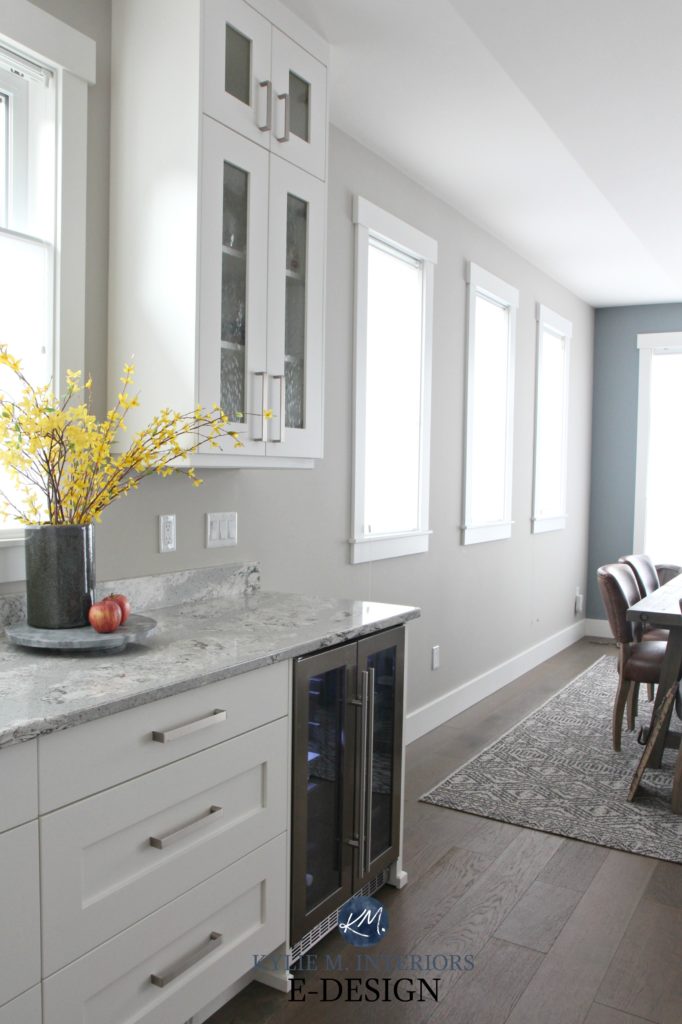
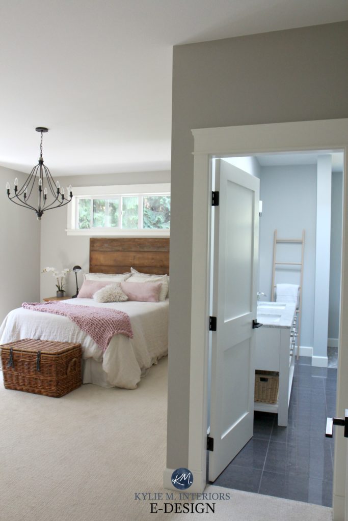
Colonnade Gray will ‘look like gray’ – it just won’t look like a typical cold and icy gray. With its soft greige undertone, it will neutralize a space without changing the visual temperature of it.
This room had mostly northern light and some eastern
Colonnade Gray has a slightly warm base to it. As for undertones, every gray will have either blue, green or purple undertones – even warm grays. Colonnade Gray has a VERY mild tendency to favour green, however, more so than some other gray, it can EASILY wink at the other undertones, depending on your exposure.
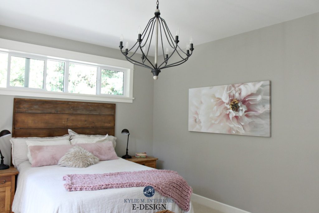
This space gets MOSTLY southern light
When those subtle cool blue and purple undertones pop up, it’s more often in north or east-facing rooms, whereas Colonnade is more likely to favour that mild green in south or west-facing light. However, all said, the undertones are quite subtle.
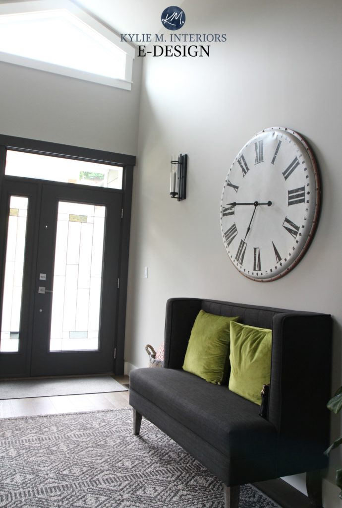
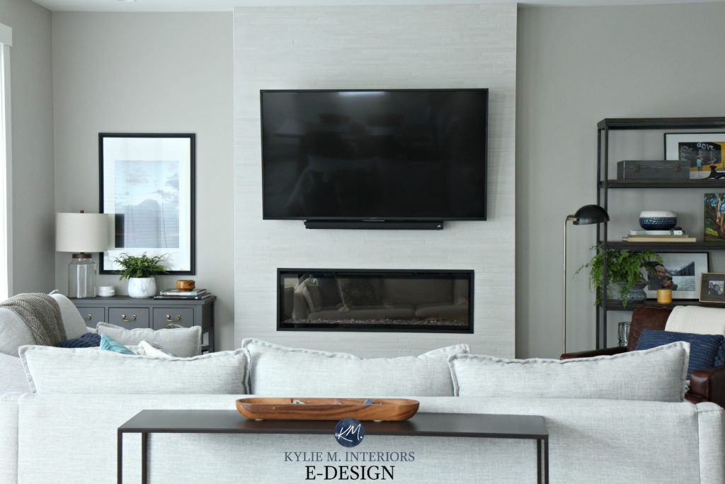
The above photo really shows Collonade Gray and how it will act in a room with moderate lighting. Remember, when people take photos of rooms, they often add a TON of light so things look light, fresh and clear – personally, I think this photo is the best representation of Collonade and how it should look in an ‘average’ room.
Exploring Revere Pewter and its undertones
Just like Colonnade Gray, Revere Pewter CAN flex into any of the cool undertones, BUT – it has to try a lot harder. Most of the time, Revere Pewter heavily favours a warm, earthy green undertone and only rarely flashes into blue or purple. However, even with the green being more dominant, it certainly won’t punch you in the face – it’s quite passive…but it’s there.
Let’s look at it with a vague blue or blue-green undertone first…

Revere Pewter at its coolest in a north-facing room
Do not expect it to look this cool-toned for you, these rooms are the exceptions – not the norms. Of the DOZENS of times I’ve used Revere Pewter in my E-design, only three times has it come up more cool-blue toned. It’s like the perfect storm of exposure/trim color/lighting/etc…which can cause this and there’s really no fixing it short of picking a different color.
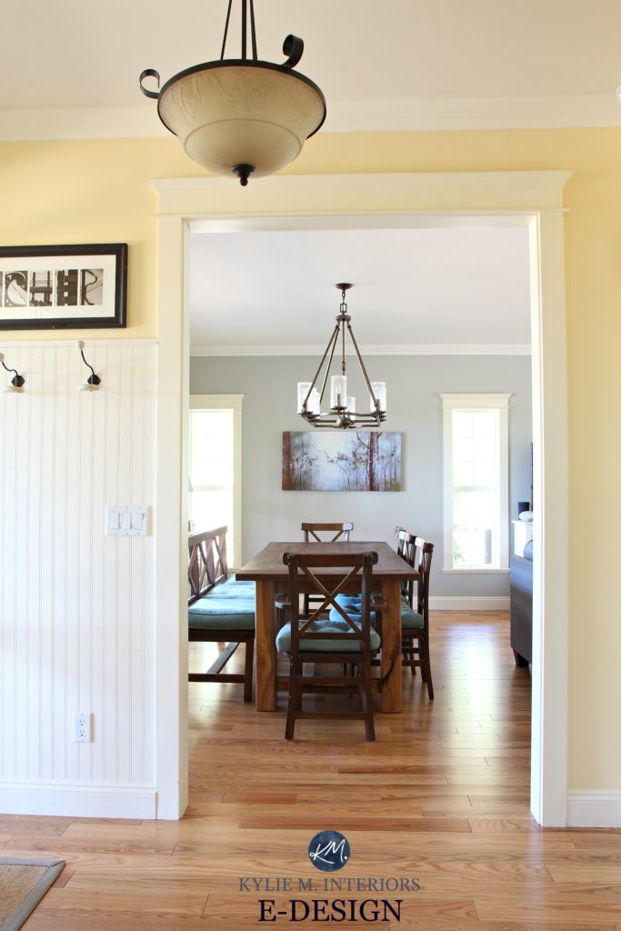
This next bedroom is an example of Revere Pewter at its best…
Ahhh, there it is – our green undertone. This is a great example of Revere Pewter at its greenest (left side of the photo). Notice that even when the undertones come to the surface, it’s STILL a beautiful color.
What is the LRV of Colonnade Gray?
Colonnade Gray has an LRV of 53. If you’re wondering what the HECK LRV is, I highly recommend you get out your reading glasses – it could save your color-pickin’ life.
Read more: The Ultimate Guide to Choosing Paint Colors with LRV

An LRV of 53 means that Colonnade Gray sits nicely in the light-medium range. It’s not a fresh and light color, but it’s also not heavily weighted. It would be too dark for most hallways, but a great depth for a reasonably well-lit room.
What is the LRV of Revere Pewter?
Revere Pewter’s LRV comes in at a hot 55. It’s close. For all intents and purposes, they have very similar depths, but if you were to compare them side-by-side, you WOULD see a subtle shift with Revere Pewter looking a wink lighter.

Click HERE or on the above image to see available packages!
Let’s take a quick break to talk about paint samples…
Undoubtedly, you’ll be heading out in the near future to grab paint samples – stop right there! I want you to check out SAMPLIZE. Samplize offers peel and stick paint samples that are more AFFORDABLE, EASIER and more ENVIRONMENTALLY FRIENDLY than traditional paint pots. Here are just a FEW reasons why I recommend Samplize to my clients…
- Samples arrive ON YOUR DOORSTEP in 1-3 business days, depending on location
- At $6.99, they’re more affordable than the samples pots/rollers/foam boards that are needing for traditional paint sampling
- If you keep the samples on their white paper, you can move them around the room
Revere Pewter (slightly darkened) on kitchen cabinets!
Which gray paint color is better for…
- Partnering up with marble: SW Colonnade Gray
- If you prefer warm, earthy grays: BM Revere Pewter
- For a north-facing room: BM Revere Pewter, if you want to try to balance the cool light a bit
- For a south-facing room: SW Colonnade Gray, if you want to balance the warm light a bit
- Mass flexibility: I’ve got to give it to Colonnade Gray, by a wink
So what do you think? Does Colonnade Gray give Revere Pewter a run for its money? I think so!
Want to learn more about Revere Pewter? Check out my Youtube video for more!
Chat soon,

Check out my Online Color Consulting E-Design for your own Personal Consultation!

READ MORE
The 10 Best Gray and Greige Paint Colors
The 12 Best Gray Neutrals for Your WHOLE Home
KYLIE M INTERIORS E-DESIGN VIRTUAL, ONLINE PAINT COLOR, DECORATING AND DESIGN CONSULTING SPECIALIST IN SHERWIN WILLIAMS AND BENJAMIN MOORE PAINT COLORS DIY DECORATING BLOG
Originally written in 2017, awesomely updated in 2019
Share this!

Comments
Leave a Reply
More Posts

How to Turn Your House Into a Home: A Case Study
5 WAYS TO CREATE A HOMEY-HOME: A case study of OUR house! Between Pinterest, HGTV, Instagram, and design magazines, it’s easy to get caught up in what’s trendy and hipShare
Read More
KYLIE M’S 5 COLORS OF THE YEAR: 2024 Collection
REAL HOMES, REAL PEOPLE, REAL COLORS! When choosing my top colors for the year, I’m looking for colors that INSPIRE. Colors that talk to people (mind you, every color talksShare
Read More

Are White Walls, Cabinets & Exteriors Still Trendy for 2024?
Is the ALL-WHITE HOME still in style? Is white still in style as a paint color and interior finish? Are people still doing white cabinets, countertops, walls, and exteriors? AreShare
Read More


Hi Michael, thank you SO much for the compliments and I’m so sorry about the delay, I got a bit back-logged with 100’s of comments and am playing catch-up now (thank God for wine…;).
Now I’m sure it’s likely too late as you’ve probably painted but you know, Collonade Gray would be on the border for me. While I think there are slightly softer/lighter grays that would work, there are also grays that WOULDN’T work and Collonade is NOT one of them. Really, it’s LRV is smack-dab in the middle of things so it doesn’t necessarily make things brighter/warmer, but it won’t suck the life out of your room either. It also depends on how much light you have in the room. If it has very little natural light then it might not be so hot, but if its’ North facing, but reasonably bright then I think you’re okay!
If I’d responded in time (slap with a wet noodle) I might have suggested lightening it by 1/4, but again like you said, maybe it would just make things more complicated. Sometimes it’s about ‘feeling’ a colour and if you guys feel good about it, then you’re A-Okay!
Chat soon,
~Kylie
What would be softer lighter grays that don’t hav3cthecblue and green undertones jumping out at you. I have a living room that is southeast facing and want to keep it neutral. Beiges,grays etc thanks
Author
Hi Joyce, thank you for your note! When it comes to questions like yours, I actually created an Edesign business – this way I can look at photos/questionnaire and come up with ideas that work, otherwise I’m TOTALLY guessing on what things look like on your end! It is affordable and fun! If you find that the complimentary blog post info isn’t working, it might be the next step! https://www.kylieminteriors.ca/online-decorating-design-services/
~Kylie
I am so glad someone else has the same love for Collanade Gray as my husband and I do. We joke when we are painting a room now, would it be bad to paint the whole house with it? It’s the perfect gray and we looked at 30-40 of them.
Help! I so want to use Revere Pewter but I don’t feel confident about it. My kitchen opens up into our family room. Our house faces east and our kitchen cabinets are of a reddish cherry. It looks dark in these rooms especially in the afternoon. Do you think Collonade Gray would be a better choice?
Thank you
Hi Linda! You know I’m a big believer in gut instinct, so if Revere Pewter isn’t sitting right, there is a reason for it. I do love Collonade Gray, but perhaps you’d find it a bit dark on those gloomy days. You could consider having it lightened by 1/4, just to take the edge off of it. Or, if you can entertain a gray with even more taupe in it, check out Benjamin Moore Collingwood Gray as it’s a ‘bit’ more fresh feeling and might hold itself a bit better in the afternoon light.
Hope that helps!
Hi Kylie! Thank You for verbally dissecting what I visually articulate. We are in the process of wrapping our colonial home on Long Island, NY’s north shore in all tones of gray. Currently the first floor is Benjamin Moore Bath Salts and our den Benjamin Moore Chameleon. The den is sunny east facing . The remainder of the home has west and east exposure. All trim painted Benjamin Moore Simply White. Our floors are red oak stained MinWax Provincial , we are considering either leaving that or updating to Jacobean. We are wanting to give our home a beachy Hampton’s vibe while still respecting the colonial limitation. This is our sanctuary, retreat in the woods that we use to decompress. We both adore atmospheric colors, which clearly Bath Salts has provided, but we’re parting ways. Would Gray Owl be the best option for the west and east facing areas and Collonade Gray for the den? We want non yellow tones and calm without total sedation. Thank You!
Hi Lauren, thank you for your note! Now for questions personally related to your home, I would definitely have to refer you to my Online Consulting! This way I can see photos and we can do a questionnaire so I can make the right recommendations 🙂 If you’re interested you can see my packages here! https://www.kylieminteriors.ca/product-category/interior-paint-colors/
~Kylie
I just painted my fireplace revere pewter and the green is definitely coming out! Its my go to color and I’ve never noticed it before now. I had to laugh when I read this article! I’ll try colonnade next!
Hi Jenn! I know, it does seem weird that I’d compare them, but the funny thing is I get SO many clients who tell me that they are deciding between Gray Owl and Revere Pewter and can’t decide which is best! It came up often enough that I decided to run with it!
~Kylie
we just painted our upstairs bonus area and stairwell Collonade Gray and I feel like it has a strong blue tone also! since you suggested changing lighting, what wattage of bulbs to you suggest? and you are saying go with the old fashion standard bulb style, correct?
Hi KK! Isn’t that funny! YOu must have JUST the right exposure (or the wrong one if you aren’t lovin’ the blue tone ;). Try a warmer bulb, something in the 3200 range and see if that helps things a bit… 😉
Hi Kylie!
I’ve been on your website several times now in the past few weeks and I’ve learned so much! My husband and I just bought our first home and we have a lot of painting and furnishing to do. We would like to paint our living room gray. We have medium (orange/yellow) oak floors and a dark blue stone fireplace with a reddish/wine color sprinkled throughout the stone. It is a small room with medium light. So far we have looked BM’s Apparition and Revere Pewter. Revere Pewter seemed a little bit too muddy. Apparition had a bit of a lavender tone next to our fireplace and it seems like it might be a more challenging color to furnish around. Do you have any suggestions? We don’t want anything too cool/icy. Thank you for your expertise and insight!
Author
Hi Jennifer, thank you for your note! NOw when it comes to personal questions I do need to refer to my E-design as then I can spend some time with your home and you (via a questionnaire) and give you suggestions that will actually SUIT your space – rather than just guessing! It’s affordable and it’s fun and if the info on my site isn’t quite enough, it might be the next step!
If you’re interested at all, here’s the link!https://www.kylieminteriors.ca/online-decorating-design-services/
~Kylie
First, thanks for your advice. It’s so helpful.
I plan to use BM Colonnade Gray in a living/dining/sun room, (which is a south/west/north exposure). Then I plan to use SW Sea Salt in a northern exposure master bedroom. Do you have a suggestion for the guest bedroom, which is a southern exposure? Each bedroom has its own bathroom as well.
Author
Hi Gayle thank you for your note! When it comes to personal questions, I have to give priority to my e-design clients. If you are interested, I can look at photos of your room/questionnaire and come up with paint samples that actually make sense with your room and it’s flooring/lighting/etc…, rather than just guessing at it. If this interests you, here’s the link… https://www.kylieminteriors.ca/online-decorating-design-services/
~Kylie
Kylie,
Love this article.
I have a little rent house that is over 100 years old. When the renters moved out I wanted to update to a modern color and not the typical “rental” colors. I was warned not to do this but I held my ground.
I’d heard all the rave reviews about Revere Pewter but didn’t want to pay the price, especially for a rental. I poured and labored over colors for months. I kept being drawn to Collonade Grey; I would come back to that color sample every single time. I took the plunge and ordered the many gallons to paint the interior and what do you know? It’s so similar to RP and I prefer it not having the green tone; it’s also not so pricy.
My little couple that moved in was delighted and everything they own blends beautifully with the CG.
It’s my favorite color and I appreciate the comparisons on these two paint colors.
Author
Good job Zanetta! I do LOOOVE Collonade Gray and I think it’s smart to listen to your guts – a colour like Collonade can add more visual value to a home just because it’s not a typical ‘bland and boring’ rental colour!
~Kylie
Having trouble picking out gray colors for my home . I have an open floor plan two story home. I was thinking about colonnade gray for the walls and my kitchen cabinets are white as well all trim . But my hardwood floors are a light in color . Down the road I wanted to get them restrain a darker shade my home faces east so I have tons of light. Would you do a satin finish or semi gloss. Thank you
Author
For flooring I’m a big satin fan- I find that the semi-gloss look is higher maintenance!
How would Collonade Gray work with oak trim (I’m renting and can’t paint the woodwork).
Author
I would think it would be lovely!
Have you ever used Thunder by BM. I was considering either Collande gray or Thunder. We live on the lake and wanted your thoughts.
Author
Hi Melody, I LOVE Thunder, it’s a beauty! Would I do a whole home in it? Probably not, as it is a stitch heavier than Collonade. Collonade has a much easier to depth to live with in multiple rooms… 🙂
Hi, I am trying to replace a Beige (Barcelona Beige) with a grey for my open living area. The kitchen is painted in an aqua color (don’t know the name of it). I read that Collande gray does not go well with green tones? Would Collande grey work?
Author
Hi, I would think that Collonade Gray could look quite lovely!
Hi Kylie. I love your blog! I have a semi open floorplan house. Just redid my kitchen with off white cabinets and painted itvBM Van Courtland Blue. The dining room (which can be seen from both the kitchen and the living room) has white wainscoting and a white tray ceiling. I just painted the upper wall portion BM Re ere Pewter at 150% as the room has a large bay window which. Faces southwest. The original RP seemed too light. While I like the RP in this room, it definitely has a slight green undertone here. Not so bad as the couch in the living room is a sage green but I was hoping for a more gray tone to go with the VC Blue.
My dilemma is this. I now have to choose a color for the living room. It has white angled ceilings, two windows flanking the fireplace that also face SW and a class sliding door perpendicular to one of the windows. That faces west. I was going to o use RP original strength but do not want green undertones here. I need a color to go with the RP, but also with the VC Blue as part of the Living room wall carries into the entryway and can be from the kitchen through a doorway and large opening that overlooks this area.
To complicate matters, there are steps down to the main entryway (which has high vaulted ceilings and a large Palladian window. If I carry the living room color down here, most colors look washecout. The large window faces Northeast. This color must go with the VCB as the opening in the kitchen overlooks this area. I tend to like BM Pashmina here. Contemplating whether I should paint the focal wall here with the window a complimentary color – perhaps BM Rockport or Chelsea Gray.
Plaster give me your advice for paint color for both the living room and entryway. I want everything to flow. I was looking at Thunder, Pashmina and now your. Ollenade Gray or any other suggestions. I want a very relaxing feel. These undertones and different lighting are really skewing things. I really need some advice.
BTW, the kitchen , LR and DR all have Mirage Birch hardwood (similar to Maple) and the lower level main entryway has light gray marble ceramic tile.
Author
Oy vay! When it comes to detailed comments like yours, I definitely can’t come up with some answers without seeing the space – otherwise I’m TOTALLY guessing. I do try to give as much free advice as I can on my blog and if that doesn’t help then it might be time for me to take a closer look via my e-design. This way I can spend some time on your room via photos/questionnaire! If you’re interesting the link is here… https://www.kylieminteriors.ca/online-decorating-design-services/
~Kylie
I was thinking of doing that, but the true color does not show well when I take pictures of the rooms. If I have RP 150% in the dining room, should I do the same in the living room (2 south facing windows and one west facing slider) or do you think the original strength RP, Thunder, Collonade Gray Or Pashmina would work better. Need some direction with undertones. Thx
Author
Hi Diane, I’m sorry I just can’t do it without photos! After seeing literally THOUSANDS of rooms (in person and online) I’ve seen dark rooms galore so know what to expect when looking at photos. I’m sorry that I can’t do much otherwise, otherwise I’m just shootin’ in the dark – literally!
Do you think BM Harbor Gray or Alaskan Gray go with Revere Pewter?
Hi Kylie,
I’m am painting our dinning room that is north west facing. It has 3 large windows but is dark with Brazilian Cherry floors. I’ve tried Colonnade Gray and Revere Pewter. I feel the Colonnade compliments our red floors better, but it’s a bit dark. Do you think lightening up 25% would help?
Thanks so much!
Author
Hi Laura, it might help! The undertones can shift just slightly when lightening, but not by much. It should be more or less a slightly ‘lighter version of what you had.’
Hi, I am wanting to paint my living area (open floor plan) a grayish color. The whole house is an eggshell color right now (except for one living room wall that is a mustard color (was supposed to be khaki!!) We just purchased a brown leather sofa with some orange tones and plan to purchase a chair with a brighter pattern. I was tempted to go with a gray that has a lot of green, but don’t want it to look green. I was considering Benjamin Moore Revere Pewter, Arctic Gray, or Grey Owl. It is a very bright room – lots of windows. Any suggestions?
Thanks,
Debbie
Author
Hi Debbie, thank you for your note! It sounds like you have a few things going on there…when it comes to personal questions, it’s best if I can look at photos and spend some time with your home, otherwise i’m TOTALLY just guessing. If that appeals to you, I have a fun and affordable E-design package that could work for you! https://www.kylieminteriors.ca/online-decorating-design-services/
~Kylie
I’m late the party on this one, but I came across your post and had comment my whole hearted agreement! I’m at this very moment working with a client who wanted to use Revere Pewter, but it goes SOOO cold on her walls. Colonnade all the way! I’ve used it on everything from walls to cabinets (including the cabinets in my own office), it hasn’t failed me yet.
Author
Wahoo! Sometimes it is just a subtle tweak that makes it or breaks it! I’ve got so many fave warm grays now that Revere Pewter is a bit lower on my list 🙂
Hi Kylie,
I’m so happy I found your website. Thank you for this great recommendation! I was going to go with Revere Pewter, but I’d really like to avoid the green. Can you recommend a white trim color to go with Collonade? Also, what would you recommend for ceiling paint?
Thank you!
Author
Hi Sara! I do love Collonade! I love the soft look of BM White Dove (I know, switching brands) but otherwise might go for the more bright SW Pure White which is white, but has a tiny wink of yellow in it (like weeee tiny). I know some people like to do the whites like Snowbound and what not, but the undertones in those are trickier…
After reading your post and testing both colors, I’m leaning towards Collonade Gray to avoid the undertones in Revere Pewter. I would still like to use BM Aura paint. What is your experience with matching SW colors in a BM paint? I have heard mixed reviews about how closely it will match if you use a different base. I worry if it’s even a little off, it might not get avoid the slight green undertone like I’m hoping to. Thanks!
Author
Well, I would say that I love the way Sherwin Williams colour matches, but not AS confident with BM’s colour matching.They aren’t bad at all, I just haven’t had as much experience with matching SW into BM as I tend to go the other way. If it were ME and I needed something done where it really had to be BANG-on, I would just go with Sherwin Williams, they have some pretty fab paints, like their Emerald line…
I own a small ranch home with my kitchen open to my living room. I painted my living room, dining room ,hallway and kitchen Colonade gray, I looked at a lot of gray’s before choosing.
I have heard some say that there is a touch of green, I really dislike green and i have never seen a green hint in my home.
My finished basement is getting done in Agreeable gray.
I love Collonade gray!!!!!!
Author
Well Kathy I’m glad to hear this! It’s this kind of info that helps readers decide if it will work for them – thank you!
Can you mix Collanade grey with cool greys? OR is that a complete NO.
Author
Hi Erika! I would, as long as they are softer ones, so ones that aren’t to crisp/clean – ones that have some decent blue/green undertones in them would be quite pretty! (ie: Magnetic Gray)
Hi Kylie,
Can I use Collonade Gray if I have antique white moldings, trim, doors, woodwork all throughout my home?
Author
Hi Margaret, it does depend on how creamy/warm the antique white is. If it’s super subtle than probably yes, but if it’s creamier, it could just be too warm…
I have colonnade gray in my living & dining room. Almost a year since I painted, I haven’t seen that green peek through. However the beige undertone comes forth every so often. Its great in the dining room because I have large windows but in the living room, its somewhat dark. Overall, I like the color. No major sneakey undertones and I think it commits to a grey for the most part.
SN: Colonnade gray LRV is 53 and RP is 55.
Author
Hi Julie, thank you for letting me know! I JUST painted the main floor of our new home in this colour (north facing) and i LOOOOVE it. There’s only 1 part of 1 wall where a minor green comes up in the later afternoon, but fractional. It is really just an awesome greige!
What is this hate for a gray paint that has a green undertone? The most beautiful neutral paint I ever had in a living room was Martha Stewart’s Cord. The tone was a bit beyond light. Cord was such a chameleon that guests would ask, “What color is it? Gray? Green?” I’d love to use it in my present home, but it no longer exists. I’ve called Martha Stewart and Valspar, the company that manufactured it, hoping to get the formula, with no luck.
Author
Hi Joan, I do like a gray with a green undertone – including Revere Pewter! However, I’ve found that with my E-design clients, on the questionnaire that they answer, it is one of the more common preferences, to avoid a ‘gray with a green undertone’! Purple and pink undertones also rank high as colours that they want to avoid – each to their own! 😉
I have used SW Colonnade Gray in our last two houses. I’ve yet to pull any green undertones, but it does pull quite a bit more blue than the swatches or online pics show! Obviously I don’t mind that bc I continue to use it, mainly to keep things simple. Quite a few of my friends have went with it as well and are happy. One time down the gray paint sample hole was enough for me lol
With that being said, we got some granite in our master bath and it’s a lot more gray/blue than I expected and just too close to the Colonnade paint color. (I got frustrated and let my husband make the final decision on the granite-last time that will happen) Our bathroom window is shaded and frosted-so little natural light (this may be the ONLY room I’ve noticed Colonnade pulling the tiniest bit of green). Is there a similar color maybe with higher LRV you would recommend swatching? I’ve tried PPG Fossil Gray, Valspar Cool Slate, Olympic North Beach and a couple others. I may try some whiter tones, any suggestions which ones to start with?
Author
Hi Brittyn! I’m sorry, but without seeing the granite and the bathroom itself, I really can’t begin to tell you what would look good! If you’re interested, I do have affordable E-design services, might do the trick? https://www.kylieminteriors.ca/online-decorating-design-services/ Then I can look at photos and questionnaire answers and come up with some options that actually make sense!
~Kylie
My husband and I remodeled our kitchen a couple of years ago—white cabinets, golden oak hardwood floors, and white/taupe/grayquartzite countertops. I was leaning toward Revere Pewter for the walls, but wasn’t 100% sure. Then I found BM York Gray, which to my eye was ALMOST the same as RP but just a very tiny bit different. I can’t really say how because side by side paint chips look virtually the same, but I just seemed to go for the YG instead and it looks awesome on the walls. Now I’m looking for something for the adjacent LR and FR. Collonade Gray is nice but is there a BM color like it (sorry, SW). Honestly, I’m a huge fan of BM paints and have always used them, and I have no desire to try any other brand!
I’ve been obsessing over your site since we decided to paint our house and used a lot of your suggestions with doing my SW color consult. BUT we have tinted windows because of East/West facing rooms and Colonnade Gray at 50% looks icy blue! I was convinced until they did a sample wall for me this morning and now…lost…and they come tomorrow.
Author
Oooo, those tinted windows are tricky. I wonder if a subtle shift to Amazing Gray would help?
Awesome post Kylie. Many years ago I chose cream blinds (actually I now think they have yellow undertones). I love the Colonade Gray but have concerns about painting the room in CG because of the blinds. My trim is also beige and will be painting them Decorater White BM. Am I making a big mistake since blinds are this creamy/beige/ yellowish color? Love love love your blog.
Author
Oooo, I don’t know Vivian, the Decorator White trim makes me AWFULLY nervous with cream/beige/yellowish blinds, it will definitely highlight them via the contrast with the white. I worry about THAT more than I do the Collonade!
Hi,
I am planning to paint my bedroom and would like to do one accent wall with a navy blue such as Hale Navy or Gentlemen’s Grey (something along those lines) and I am looking for a color that coordinates. I was considering Revere Pewter or Collanade Grey but I’m worried about any undertones they might pick up from the dark blue. I do not want the bedroom to end up looking baby blue next to navy. Would either of those colors work? The room is south facing. I am looking for a greige to go with the navy and not an icy/cool grey.
Thanks for any help!
Author
Hi Jaime, I think those are a great place to start! If you go much warmer you risk losing the pretty navy/greige connection!
EEeeekkkk! Decided on Anew Gray (over agreeable or amazing) for my light floors, they are birch, have turned to a yellow/honey color….NOW I think Colonnade may be the better choice! I want “gray” to tie into my kitchen and addition, but know my colors are warm, so looking for the coolest warm gray there is! LOL
Thoughts Anew or Colonnade for light floors, decent light – dark brown leather furniture! Have SW barn red and SW ramie on the walls now…
Thanks!
Author
Hi Susan! If I were to choose between the 2 (and I have, because I have Collonade in my own home!), it would be Collonade as you’ll get a bit less of a greige/taupe effect up against the more yellow/honey coloured wood 😉
I have honey oak cabinets and honey oak floors – would Collonade Gray work with all the honey oak? My appliances are the new black stainless steel.
Author
Hi Diane! It actually depends MORE on your countertop/backsplash, but generally, Collonade can be quite pretty with the warmer woods 🙂
Love this blog. Don’t see any comments for exterior color. I’ve had my heart set on Revere Pewter for my florida home – contemporary with no trim contrast. The contractor prefers Sherwin-Williams. I have lots of sunshine and greenery. Should I go with revere pewter, colander gray or worldly gray?
Author
Hi Daryl! For the exterior, Revere can be beautiful, but it will probably look a bit warmer than you expect, I’m always surprised by it! You might find that Colonnade holds that colour just a WINK more as it’s a touch grayer. And of course it depends on your exposures/stone/brick/roof, but generally I do like Colonnade.
Hi! Would any mauve or pink type shades go with this color?
Hello,
I have a dark basement with only one tiny window on the northside. I’m looking for a gray that will lighten up the room, but don’t want it to look tan or beige. Can you recommend one.
Thanks .
Hi Kylie, how does SW skyline steel compare to collonade gray? I’m thinking either one for the main body of our house.
Hello,
I am torn between Revere Pewter and Collonade Gray. My living room furniture is a suede royal blue and the flooring has touches of brown, gray, and tan. Trying to see what color paint will look best in that room to brighten it up and the undertones won’t clash.
Author
Off the top, I lean more into Colonnade than Revere Pewter from what I’m hearing, just because it’s a bit cleaner :).
I’m so bummed. I’ve waited a long time to be able to use Revere Pewter and Edgecomb Gray.
No matter what room I tape the paint swatches up on the wall in,, and in multiple places in each room, they both look majorly purple toned to me. Doesn’t matter if I have them up in a south, west, north or east facing room- all very purple looking.
Such a bummer
I thought it’s maybe the paint swatch being funky (the ones from the BM store) and that maybe getting the actual sample paint would make a difference but I’m not so sure since they look so purple.
Author
Hi Stephanie, they really SHOULDN’T be looking that way, and certainly not in every room, which leads me to think you might be placing the samples right on your old paint colour. Perception can really skew things and it’s SO IMPORTANT that you surround your samples with white (poster board is great because it’s thicker) to separate the OLD from NEW!
You mean you had the paint lightened 25 percent? I’m debating between that and 50, so you happen to have a pic?